



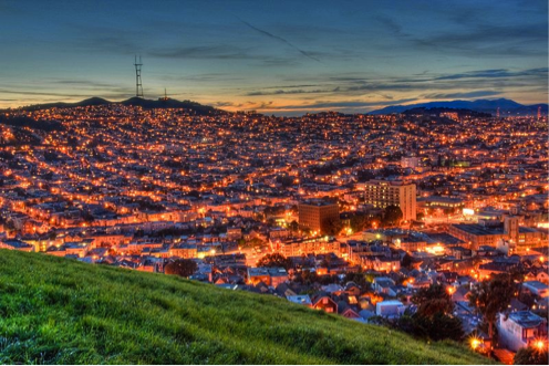
How Hot is My Valley
Noe Valley that is. The place I’ve called home since May 1991 when I bought a vacant two unit building with a monumentally dreary exterior, deeply embedded cat-pee stains in the hardwood floors, and rooms with great volume and light.
This month’s newsletter is dedicated to the Noe Valley market, and the nearby areas of Eureka Valley (aka the Castro) and Cole Valley, which have a similar feel and housing stock. Continue reading “How Hot is My Valley”
More signs of an extraordinary market: 90% of listings sold in April sold without any price reductions, at an average sales price 7.5% over list price. Huge demand is chasing a too-small supply of homes for sale.

The San Francisco Homes Market
Paragon’s May 2013 Snapshot
April’s market was basically more of the same of what we’ve been seeing for the last 12-16 months in San Francisco. Virtually all of our statistics are at historic or near-historic readings: number of homes for sale way down, months supply of inventory way down, percentage of listings accepting offers way up, days on market way down — all leading to overall house and condo median and average prices climbing to perhaps the highest points they’ve ever reached. We will add the usual caveat that no one or two months of data should be considered definitive until confirmed over the longer term: though there is no doubt that San Francisco is experiencing a red hot market, prices can fluctuate for various reasons, including seasonality.
We will have to wait and see if the current heights reached in home prices are the new baseline, a springtime blip, or a way station to even higher real estate values.

May 2013 Update
Below are 3 maps delineating recent median home sales prices and/or average dollar per square foot values for San Francisco neighborhoods and communities around the Bay Area. These statistics are generalities which may fluctuate for a variety of reasons, but still give an idea of comparative home values in and around the city.
Generally speaking, home price appreciation is continuing and indeed accelerating in 2013, extending the upward swing that began in 2012. This is being supercharged by increasing demand meeting inadequate supply. For more information about current market conditions and trends, please click on the “Market Dynamics Charts” link above.
In the maps below, “k” signifies thousands of dollars; “m” signifies millions; “$/sf” means average dollar per square foot; and “N/A” means there wasn’t enough data to generate a reliable number.
Home Values around the San Francisco

San Francisco Neighborhood HOUSE Values

San Francisco Neighborhood CONDO Values

Real estate statistics in the Bay Area are based upon that relatively unique basket of homes that happen to sell within any given period, so instead of being exact measurements applicable to specific properties, they should be considered indications of the direction and approximate scale of market trends.
Median price is that price at which half the sales occurred above and half below – a single additional sale can sometimes make a 3-5% difference in overall median price, especially when the number of sales is low. Dollar per square foot is based on “livable space”, which should not include decks, patios, yards, garages, unfinished basements and attics, or rooms built without permit (“bonus rooms” and “in-law apartments”). Square footage figures are often unreported, measured in different ways or simply unreliable. Both these statistics can be affected by other factors besides changes in value, such as seasonality, available inventory, variations in buyer profile, changes in the distressed and luxury home markets, and variations in average home size (all things being equal, a smaller home will have a lower sales price but a higher dollar per square foot value than a larger home).
These analyses were performed in good faith with data derived from sources deemed reliable, but they may contain errors and are subject to revision. If you have any questions, please contact us.


San Francisco: A Hot Market Getting Hotter
1st Quarter 2013 Market Report
In 2012, the market turned with a vengeance and grew very hot very quickly. Now in 2013 it has grown even hotter. Recent deal-making stories almost make the seemingly crazy, multiple-offer tales of last year appear sedate. The supply of listings is drastically low against buyer demand, and the pace of price appreciation looks to be accelerating. Some city neighborhoods appear to be surpassing the previous peak values reached in 2007-2008. As seen below, the first quarter’s numbers reveal big increases in home values year over year. And the month of March alone saw a particularly big jump of almost 9% above February’s median price.
March sales prices reflect the heat of the market 4-8 weeks earlier, when the offers were actually negotiated. Much of the first quarter’s sales data reflects offers negotiated in late 2012. In a rapidly changing market, we’re always looking in the rearview mirror.

 How Does Supply & Demand Affect Prices?
The past 18 months give a text book example of how the supply and demand dynamic affects home values. Months supply of inventory (MSI) measures the strength of buyer demand against the available inventory of homes to purchase: the lower the MSI, the hotter the market. The hotter the market, the greater the upward pressure on prices.
This link shows the details of the recent increases in median sales price:
SF Median Home Price by Month
 Sales Prices Over & Under List Price
As the market has strengthened, the percentage of SF homes selling for over — and sometimes far over — list price, has soared to almost unbelievable levels. In the last 2 months, 30% of SF house sales have sold for 15% or more above asking price.
This link shows the huge decline in inventory since the market turnaround began. Typically, we see a surge in early spring. Not this year, at least not so far:
Inventory of Listings for Sale
 Percentage of Listings Accepting Offers
This is another excellent indicator of demand vs. supply, and it is now at the highest levels in memory for virtually all property types.
This link goes to our chart on average days on market. Generally speaking, the hotter the market, the faster listings go into contract and that is what we are indeed seeing now:
Average Days on Market
Continue reading “Real Data SF: San Francisco Prices by Neighborhood”