Winners and Losers: A Heat Map of San Francisco’s Neighborhoods

I’m back!  (More on this later….)

I’m so excited to present this heat map of San Francisco neighborhoods, which I believe may be the first of its kind.  I’ve been thinking about this idea for a while:  thank you Claude, and a shout-out to my son, too, who helped me bring the coding part of this project to fruition.

Be sure to click on the “fullscreen” button on the map below to expand it. We will get into the qualifications shortly, Continue reading “Winners and Losers: A Heat Map of San Francisco’s Neighborhoods”

SF Real Estate Heats Up as the Weather Cools Down

Generated with Claude.ai using a photo taken by Misha Weidman
Image Generated with Claude.ai

In my last post, I wrote that San Francisco’s residential market, fueled by the booming economics of local AI companies, was bucking the trend of most Bay Area counties by showing clear signs of strength while other counties stayed flat or faltered.  Recent data suggests that this trend could be accelerating.

In Contract, Pendings, Sales Volume All Up

First, let’s recall that the music stopped in Spring, 2022, when the Fed started aggressively raising the Fed funds rate to cool economic activity and accelerating inflation after having kept interest rates near zero during the Covid Pandemic.

Fed funds rate since 1981
Fed Funds Rate

The resulting rise in mortgage rates correlates precisely with a massive slowdown in the Bay Area residential market  as we entered 2022 (chart below).

Mortgage Rates vs Bay Area Home Sales
Bay Area Sales volume vs Mortgage Rates

With that background in mind, many of our statistics are now at or approaching levels they had reached before that 2022 slowdown.  Continue reading “SF Real Estate Heats Up as the Weather Cools Down”

The San Francisco Residential Real Estate Update: An Ai Generated Glimmer of Hope?


AI generated imaged
An AI Generated Glimmer of Hope

Back in May 2018, when pundits everywhere delighted in sounding the death-knell for SF’s residential market due to a host of local challenges including lack of affordability and rampant homelessness, I suggested they might be a bit premature. In the summer of 2020, months into the Covid pandemic, Zillow published data suggesting that SF was again on the skids.  Again, I suggested that “this too shall pass.”  Condo and home prices proceeded to hit record highs until 2022 when higher interest rates brought the real estate party to a stop, leaving a hangover from which much of the Bay Area — indeed the country as a whole — has yet to recover.

Interest rates are still high, albeit with indications that they may be coming down “any day now.”  Add in such challenges as the economic uncertainty engendered by Trump’s tariff wars; an enduring change in the remote/on-site work model; and a persistent narrative of SF’s “doom loop” decline, and it’s fair to ask whether SF can once again pull off a Houdini-like escape. Continue reading “The San Francisco Residential Real Estate Update: An Ai Generated Glimmer of Hope?”

Bay Area Housing Affordability: A Grab-Bag of Charts

In my July Newsletter, I did a wrap-up of the year so far and concluded that the market, for the moment at least, seems to be going sideways. Post Labor-Day inventory has already shown a big jump in anticipation of the short buy/sell season between now and the end of November. It’s too soon to say whether the new inventory will excite buyers to loosen their wallets or simply cause them to be pickier.

So with the market on “pause,” I thought I’d put together a grab bag of charts that cover SF housing affordability, both from the standpoint of owning and renting. Many view housing affordability as a central concern for San Francisco’s long-term future. Changes in the rental Continue reading “Bay Area Housing Affordability: A Grab-Bag of Charts”

Real Data SF July Newsletter

Mid-Year Report – A Soft Landing For San Francisco Residential Real Estate?

With the data in for the for the first six months of 2016, the cooling trend that I’ve noted in recent newsletters is increasingly clear. Since sales typically dip in the middle of summer due to seasonal factors (everyone, especially those who own or are looking to buy higher end homes, is on vacation), it’s best to compare 2nd quarter results with those of a year ago.

2

In Q2 2016, the year-over-year appreciation rate was 4% for houses and less than 1% for condos, as compared with 2014 to 2015 rates of 20% and 18%: A significant slowdown. However, median home prices are still at their highest point ever. Continue reading “Real Data SF July Newsletter”

It’s Now a Buyers’ Market for Higher End Homes and Condos

“Months’ Supply of Inventory,” or MSI, shows the theoretical number of months needed to “absorb” available homes for sale in a given month based on the number of homes going into contract in a given month. The shorter the time period, the stronger the market for sellers, leading to upward pricing pressure.  Longer time periods indicate slower absorption and a buyers’ market.

The chart below illustrates the dramatic difference in MSI for homes up to the median price ($1.3 million for houses, $1.1 million for condos) and in the next price segment higher, versus the luxury home segment, defined here as houses selling for $2,000,000+ and condos for $1,500,000+. (By this definition, luxury sales currently make up about 20% of San Francisco’s home sales.)
Continue reading “It’s Now a Buyers’ Market for Higher End Homes and Condos”

San Francisco Autumn Real Estate Market Dynamics

SF Luxury Home Sales Hit New Peak

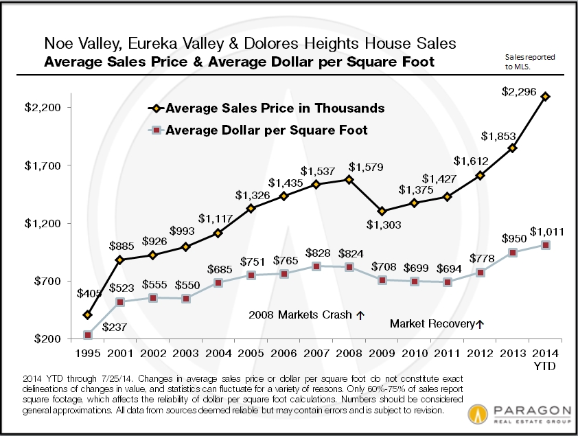
Neighborhood Snapshots: Noe & Eureka Valleys, South Beach
& Yerba Buena, Richmond District, Bernal Heights & Sunset/Parkside

November 2014 Update

The San Francisco market definitely cooled after the overheated feeding frenzy of the first half of the year. The competition between buyers for new listings declined to more rational levels: Homes that might have received 5 to 10 offers earlier in the year received 1 or 2 or 3. Values in many of the city’s neighborhoods plateaued or even ticked down a bit after spring’s big spike – the exception being districts with the most affordable house prices (under $1.2 million) where prices generally continued to tick up. The number of expired and withdrawn listings jumped 18% August through October when compared to last year, to over 460 listings, as buyers decided many sellers were pushing the envelope on prices too far.

On the other hand, as seen in the charts below, the autumn market has been very strong by any reasonable measure, just not one of utterly crazed competition. The number of house and condo sales was a little higher in October 2014 than October 2013, and that doesn’t include a very large number of high-end, new-development condos that went into contract. Most of the city’s listings have continued to sell quickly for well over the asking price and luxury home sales hit their highest number ever.

The market for multi-unit buildings did decline dramatically, but that was due to Prop G fears. Since the proposition failed on November 4, that effect should quickly dwindle. Meanwhile, buyers have a large inventory of 2-4 unit buildings to choose from.

General Market Dynamics
1

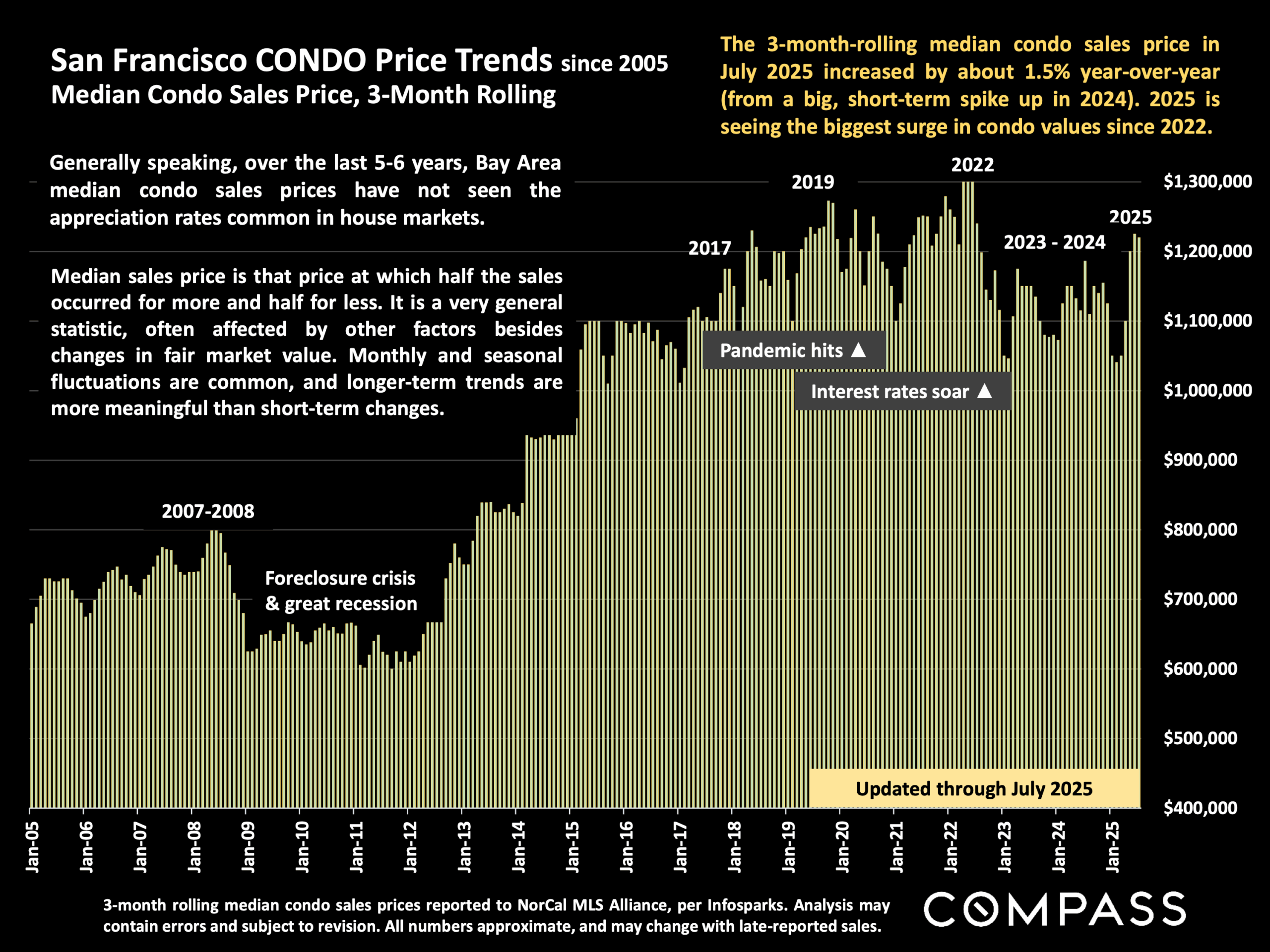
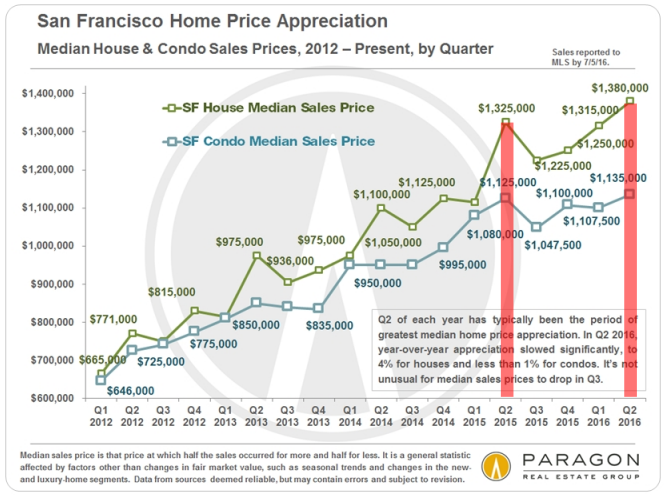
Median Sales Price by Month: Median prices are affected by other factors besides just changes in home values, such as seasonality, inventory available to purchase and significant changes in the luxury market. It often jumps up and down by month and season: It is the longer-term trend which is most meaningful. In this chart above, the spring spike, summer decline and early autumn increase are clear. Among other factors, luxury home sales usually jump in spring and autumn and drop in summer and mid-winter, and this rise and fall affects the overall median price. For the last 3 years, the general trend line has been dramatically up.

Homes Selling Over & Under List Price: As seen in the 2 charts below, an astounding percentage of San Francisco home listings continue to sell over, and sometimes far over asking price. However, an increasing percentage of listings aren’t selling at all: A hot market doesn’t mean buyers will pay any price sellers dream up. This first chart looks at SF houses, condos, co-ops, TICs and 2-4 unit buildings, breaking down sales by those that sell with and without price reductions, and the difference that makes in sales price and average days on market. Pricing correctly right from the start reaps significant rewards for sellers.

2

This chart breaks down SF house and condo listings by the percentage of list price achieved upon sale. Even if the autumn market isn’t as white-hot as last spring’s, these are incredible statistics. It should be noted that some of this phenomenon is certainly due to strategic underpricing of homes by some listing agents, which became increasingly popular in 2014.

3

Months Supply of Inventory (MSI): At just under 2 months of inventory, San Francisco’s MSI is up from spring 2014, but still indicates a very strong seller’s market.

4

———————————————————————

San Francisco Luxury Home Market

Luxury Home Sales Soar Again: October saw a big autumn surge in luxury home sales: It was by far the biggest month ever for SF house sales of $2m+, with 61 sales. Luxury condo sales were also quite high at 55 sales, a figure which doesn’t include market response to the new “ultra-luxury” Lumina project in South Beach, where 80 to 100 very expensive condos went into contract amid almost frenzied bidding – these units won’t close escrow until construction is completed in 2015 or early 2016.

The average days-on-market (DOM) for luxury houses sold in October was 21 days, and for luxury condos, it was 28 days: These are very low DOM figures, indicating quick market response to the listings purchased.

5.

Luxury House Values: House sales of $2,500,000 and above, charted here by average dollar per square foot, cluster in a handful of areas in the city. The Pacific Heights-Marina district has the most sales and the highest median sales price for such sales: Historically, this district has been the city’s nexus for big, luxury houses. However, the greater Noe, Eureka & Cole Valleys district now sees a substantial (and growing) number of sales in this segment, though at a significantly lower price point. This area is becoming popular with the young, high-tech, ultra-wealthy (such as Mark Zuckerberg) and record prices are being achieved. Russian & Telegraph Hills have very few house sales, but very high values, as seen below. And the greater St. Francis Wood-Forest Hill area is by far the best value for big homes (often on big lots) by how much house you get for your money.

Average house size varies from approximately 2700 square feet in Russian & Telegraph Hills to 3260 in Noe, Eureka & Cole Valleys to 4200 in Pacific Heights-Marina. All things being equal (which they rarely are), a smaller home will typically sell at a higher dollar-per-square-foot than a larger one.

6

Luxury Condo & Co-op Values: The Pacific Heights-Marina district currently has the most luxury condo and co-op sales – but not for long: With all the new, high-rise condo construction in the greater South Beach-Yerba Buena district – already featuring the highest average dollar per square foot values in the city – this new residential area will soon dominate sales volume too. The prestigious condo and co-op neighborhoods of Russian, Nob and Telegraph Hill also feature some of the most expensive units in San Francisco. With new, luxury condo construction surging across the city, such sales – at very high dollar per square foot prices – are growing in neighborhoods such as the Mission, Hayes Valley, Duboce Triangle, Mission Dolores and Potrero Hill – and there’s a lot more coming.

Average unit size for luxury condos ranges from about 1650 square feet in South Beach/Yerba Buena to 1900 – 2100 square feet in the older, northern neighborhoods such as Pacific Heights. Older buildings usually feature larger units.

Perhaps as many as 30-40% of luxury units in the city are being purchased as pied e terres and second homes by the very affluent, or even as investments (often by wealthy foreign buyers).

7

———————————————————————

Bay Area Real Estate Prices

These two charts come from our recent report on Bay Area Demographics, covering issues such as ancestry, income, housing and education.

Square Footage for $1,000,000: At average county values, you’ll get double the square footage in Sonoma and Contra Costa as you will in San Mateo and San Francisco, and, of course, in other parts of the country, that can double or triple again.

8

Average Asking Rents: In terms of rental-rate appreciation, the Bay Area has 3 of the 4 hottest rental markets in the country in Oakland, San Jose and San Francisco. High rents, of course, are one of the big factors behind high home prices.

9

———————————————————————

San Francisco Neighborhood Snapshots

A look at long-term home-value trends in selected city districts. Please call or email if you’d like information on another neighborhood. Median and average statistics are generalities which summarize a huge range of underlying, individual sales.

10 11 12 13 14

Updated S&P Case-Shiller Home Price Index for San Francisco Metro Area

The Case-Shiller Index for the San Francisco Metro Area covers the house markets of 5 Bay Area counties, divided into 3 price tiers, each constituting one third of unit sales. Most of the San Francisco’s and Marin’s house sales are in the “high price tier”, so that is where we focus most of our attention.” The Index is published 2 months after the month in question and reflects a 3-month rolling average, so it will always reflect the market of some months ago. June’s Index was released on the last Tuesday of August.

The 5 counties in our Case-Shiller Metro Statistical Area are San Francisco, Marin, San Mateo, Alameda and Contra Costa. Needless to say, there are many different real estate markets found in such a broad region, and it’s probably fair to say that the city of San Francisco’s market has generally out-performed the general metro-area market.

The first two charts illustrate the price recovery of the Bay Area high-price-tier home market over the past year and since 2012 began, when the market recovery really started in earnest. In both 2012 and 2013, home prices surged in the spring and then plateaued in the summer-autumn. The surge in prices that occurred in spring of 2013 was particularly dramatic, reflecting a frenzied market of huge buyer demand, historically low interest rates, increasing consumer confidence and extremely low inventory. In San Francisco itself, it was further exacerbated by an expanding population and the high-tech-fueled explosion of new wealth. The market then calmed down somewhat in the second half of 2013, but then heated up yet again in early 2014. In fact, the spring 2014 market was, if anything, even more ferocious than last year’s. Typically, the market cools off for the summer months and that is what we are starting to see in the Case-Shiller numbers (which, again, are some months behind the current market). The next big indication of market trends will come after the autumn selling season begins in mid-September.

For more regarding how seasonality affects real estate: Seasonality & the Real Estate Market

Case-Shiller Index numbers all reflect home prices as compared to the home price of January 2000, which has been designated with a value of 100. Thus, a reading of 198 signifies home prices 98% above those of January 2000.

Short-Term Trends: 12 Months & Since Market Recovery Began in 2012

image002 image004

Longer-Term Trends & Cycles

The third and fourths charts below reflect what has occurred in the longer term (for the high-price tier that applies best to San Francisco and Marin counties), showing the cycle of recession, recovery, bubble, decline/recession since 1996, and since 1988. Note that, past cycle changes will always look smaller than more recent cycles because the prices are so much higher now; if the chart reflected only percentage changes between points, the difference in the scale of cycles would not look so dramatic.

Case-Shiller_from_1990 Case-Shiller_HT_1996-2011

Different Bubbles, Crashes & Recoveries

This next chart compares the 3 different price tiers since 2000. The low-price-tier’s bubble was much more inflated, fantastically inflated, by the subprime lending fiasco – an absurd 170% appreciation over 6 years – which led to a much greater crash (foreclosure crisis) than the other two price tiers. All 3 tiers have been undergoing dramatic recoveries, but because the bubbles of the low and middle tiers were greater, their recoveries leave them well below their artificially inflated peak values of 2006. It may be a long time before the low-price-tier of houses regains its previous peak values. The high-price-tier, with a much smaller bubble, and little affected by distressed property sales, has now exceeded its previous peak values of 2007. Most neighborhoods in the city of San Francisco itself have surpassed previous peak values by substantial margins.

It’s interesting to note that despite the different scales of their bubbles, crashes and recoveries, all three price tiers now have similar overall appreciation rates when compared to year 2000. As of May 2014, as seen below, appreciation for all three tiers since 2000 ranged from 93% to 97%. In June (not shown below), this range narrowed further to 96% to 98%. This suggests an equilibrium is being achieved across the general real estate market.

Different counties, cities and neighborhoods in the Bay Area are dominated by different price tiers. Bay Area counties such as Alameda, Contra Costa, Napa, Sonoma and Solano have large percentages of their markets dominated by low-price tier homes (though all tiers are represented to greater or lesser degrees). San Francisco, Marin, San Mateo and Santa Clara counties are generally mid and high-price tier markets, and sometimes very high priced indeed. Generally speaking, the higher the price, the smaller the bubble and crash, and the greater the recovery as compared to previous peak values.

Remember that if a price drops by 50%, then it must go up by 100% to make up the loss: loss percentages and gain percentages are not created equal.

The two “2014″ readings for each tier in the chart below, refer to January 2014 and May 2014.

Case-Shiller_3-Tiers_Trends


San Francisco County

And then looking just at the city of San Francisco itself, which has, generally speaking, among the highest home prices in the 5-county metro area (and the country): many of its neighborhoods are now blowing past previous peak values. Note that this chart has more recent price appreciation data than available in the Case-Shiller Indices. This chart shows both house and condo values, while the C-S charts used above are for house sales only. Median prices are affected by other factors besides changes in values, including seasonality, new constructions, inventory available to purchase, and significant changes in the distressed and luxury home segments. Short-term fluctuations are less meaningful than longer term trends.

Median_SFD-Condo_by-Qtr_Short-term

And this chart for the Noe and Eureka Valleys neighborhoods of San Francisco shows the explosive recovery seen in many of the city’s neighborhoods, pushing home values far above those of 2007. San Francisco, San Mateo and Santa Clara counties are most effected by the high-tech wealth effect on home prices. Noe and Eureka Valleys are particularly prized by this buyer segment and the effect on prices has been astonishing.

Noe-Eureka_SFD_Avg-SP_DolSqFt_by_YEAR