San Francisco’s “Value” Neighborhoods Take Off as Inventory Remains Low

April Newsletter

I’ve been opining for some time that many of San Francisco’s previously overlooked neighborhoods are seeing rapid home-price appreciation as buyers are being priced out of their first and second choices. I now have data to confirm it.

When the SF market recovery began in 2012, the more affluent neighborhoods led the way in rapid home-price appreciation. This is what you’d expect to happen as the “haves” tend to see their prospects improve before the “have nots.” But starting in 2014, the more affordable neighborhoods have taken the lead. Of course, there are few places outside San Francisco where houses of $1.2 million would constitute the “affordable” segment of the market, but as median house prices in the greater Noe, Eureka & Cole Valleys area Continue reading “San Francisco’s “Value” Neighborhoods Take Off as Inventory Remains Low”

Here We Go Again?: Signs Point to Another Feverish Spring Market

Spring-shoots-dollars

It’s easy to sympathize with potential buyers who are sitting the market out in the hope that … “sanity will prevail” …”…the market will stabilize…” “…prices have to come down sooner or later….” Alas, for buyers at least, our analysis indicates the contrary: 2015 looks like it’s getting off to a very strong start.

Below are key takeaways from our recent analysis of sales trends over the last few months, which include the seasonally quiet year-end holiday period, along with what we’ve been seeing since the start of the year. These preliminary statistics, and, even more so, reports “from the trenches,” suggest that we may well be looking at the fourth intense spring season since the market recovery began in early 2012.

Continue reading “Here We Go Again?: Signs Point to Another Feverish Spring Market”

What San Francisco Home-Buyers Bought in 2014

Penthouses, Probates, Lofts, Mansions & Fixer-Uppers

What San Francisco Home-Buyers Bought in 2014

How many San Francisco home sales were… Victorians, Edwardians or Art Deco? Condos in doorman buildings? Artist live-work lofts? Probate or bank sales? Without parking? Under $500,000? Over $5 million? Tenant occupied? Had Golden Gate or Bay Bridge views? What were the oldest house sale, the biggest condo sale and the median sales price for a 2-unit building?
Continue reading “What San Francisco Home-Buyers Bought in 2014”

San Francisco Neighborhood Appreciation Rates

Which Neighborhoods Have Appreciated Most and Why?

4th Quarter 2014, Paragon Special Report

———————————————————————
Percentage Appreciation Rates

2010/2011 – Present

This analysis is based upon review of both median sales price and average dollar-per-square-foot data. However, there is no San Francisco or Noe Valley median or average home that one can use as the unchanging basis for comparison year after year, only differing collections of unique homes selling in different times and circumstances. Please see notes at the end of this report regarding our methodology.

Adjusting your screen-view to zoom 125% or 150% will make the charts easier to read. A San Francisco neighborhood MAP can be found at the bottom of this webpage.

Appreciation-Percentages_by-Neighborhood

The above chart illustrates the approximate home value appreciation from the bottom of the market (2010-2011) to present (2014 YTD), as illustrated by the dark gray bars, and the overall appreciation or depreciation to date since the last market peak (2006-2008), as illustrated by the red numbers.

Over the past 3 years, in our latest market recovery, San Francisco neighborhoods have typically appreciated 40 – 50%, with an overall increase of approximately 44%. This correlates well with the Case-Shiller Index for the Metro Area, which estimates appreciation in the range of 42% – 46% for Bay Area mid and high-priced homes. As one can see in the percentages in red, most of the city’s neighborhoods have now exceeded, often by substantial margins, their previous peak values before the bubble popped. However, some of the neighborhoods hit hardest by the subprime crisis are still below their previous peaks.

Looking at the 3 neighborhoods with the highest appreciation rates from the bottom of the market to present, there are distinctly different reasons why they stand out:

  • Bayview: Up 75% from 2010/11; but still down 12% from its market peak in 2006. Due to subprime lending, Bayview’s bubble was so big, its market crashed terribly when it popped. During the downturn, its housing market became dominated by distressed sales and it fell so far that now, with the disappearance of the subprime effect, its recovery has been equally dramatic. But because its bubble was so large, it is still below its 2006 peak value. The markets in the Bayview and nearby neighborhoods are quite strong, because they contain the most affordable houses in the city.
  • Inner Mission: Up 63% from 2010/11; up 46% from 2007 (pre-crash peak). The Mission’s appreciation rate is explained by a huge change in its buyer demographics over recent years: Though it had been slowly gentrifying since the nineties, more recently it became a highly sought-after home location for young, hip, affluent, high-tech buyers. They love the Valencia Street corridor, being close to Dolores Park, the sunny weather and the (disappearing) edginess – and the speed of gentrification shifted into a feverishly high gear. This change has also entailed the construction of expensive, new, condo projects (typically selling for $1000 per square foot and up), which is also pushing up average and median values.
  • Bernal Heights: Up 57% since market bottom; up 24% from its previous market peak in 2007. Bernal Heights has become one of the most popular, more affordable, go-to neighborhoods for house buyers who like the neighborhood ambiance of the general Noe Valley area, but were priced out there by its rocketing prices. Bernal Heights’ houses – with a median price about 45% lower than Noe Valley’s – have looked likeextremely good values in comparison. Buyer competition for new listings became particularly fierce in the past year or so.

———————————————————————

To give context to the appreciation rates, this next chart delineates actual 2014 YTD median home sales prices. In the second half of 2014, after a frenzied spring market, appreciation generally flattened or even ticked down a little in the more expensive areas of the city, but continued to tick up in the more affordable districts. On the other hand, the more expensive neighborhoods began their recoveries in late 2011 and early 2012, much earlier than the less affluent districts.

Appreciation-Analysis_Median-Prices

———————————————————————
Dollar Appreciation Rates

Whether you are a buyer, seller or real estate agent, dollars are more real than percentages: Hearing that a home has jumped hundreds of thousands of dollars in value in a relatively short time period grabs the attention more than a percentage change. The higher priced neighborhoods sometimes have lower percentage appreciation rates than less expensive areas in a given time period, but the dollar-amount changes can make the eyes pop:

In Pacific & Presidio Heights, the theoretical “median house” now costs over $1.3 million more than it did 3 years ago. In Noe, Eureka & Cole Valleys, the increase is over $700,000.

Appreciation-Dollars_by-Neighborhood

———————————————————————
Boom, Bust, Recovery

2000 – 2014

Different neighborhoods and price segments experienced bubbles, crashes and now recoveries of significantly different magnitudes. The city’s less affluent neighborhoods – on this chart illustrated by Bayview, Excelsior & Portola – had much bigger bubbles and subsequently much bigger crashes, both inflated by subprime lending issues. Bayview saw an astounding 136% appreciation from 2000 to 2006, followed by a huge 50% drop from 2006 to 2010/2011. Excelsior and Portola were an order of magnitude behind with 90% appreciation and 30% decline. Generally speaking, the mid and high-end segments of the city’s market appreciated 60% – 70% from 2000 to pre-crash peak, and then dropped by 15% to 20% subsequent to the 2008 market crash. And, as mentioned earlier, on average the city’s home values have now increased 40% – 50% over the past 3 years, with some neighborhoods outperforming the general range.

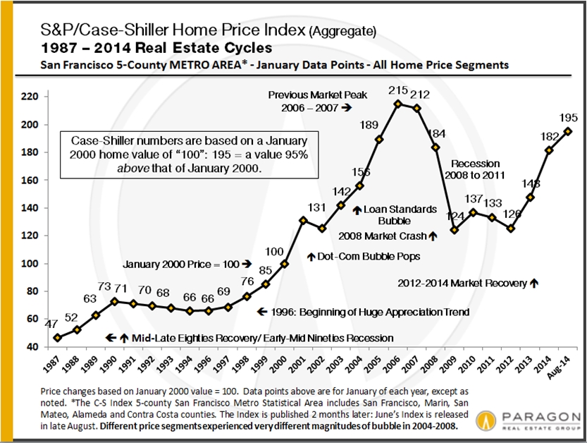
According to the Case-Shiller Home Price Index, Bay Area homes of all price segments are now, regardless of their different ups and downs over the past 15 year, about 96% above their prices in year 2000 (as of late 2014). This may suggest that an equilibrium is being achieved in the market.

Note that the tremendous burst in home price appreciation actually began in 1996, subsequent to the early nineties recession. Prices approximately doubled in the 5 years 1996 to 2000. This earlier period is not included in these charts, nor is the smaller, short-term decline following the dotcom bubble bursting in 2001 broken out.

Appreciation-since-2000_by-Neighborhood

———————————————————————
Housing Cost: Today vs. Previous Peak Values

Comparing current San Francisco home values to previous peak values before the 2008 financial markets crash, we estimate general home-price appreciation in San Francisco of approximately 15% to 20% over the past 7 years. However, mortgage interest rates are now about 35% lower than in 2007 and there has been inflation of approximately 15% over the same period. Thus, we estimate that, adjusting a normal 20% – 25% down-payment plus resulting loan expense to 2007 dollars, the current cost of housing – mortgage and property taxes – is about 12% lower now than it was in 2007. This is a back-of-the-envelope calculation based on a number of basic assumptions – and it would obviously vary widely by neighborhood – but we believe it to be generally valid.

The Bay Area’s current market recovery has lasted about 3 years now. Over the past 35 years of cycles, recoveries have typically lasted in the range of 5 to 7 years, which doesn’t guarantee that this one shall follow past patterns.

———————————————————————

Important notes regarding this report:

The estimates in this analysis should be considered very approximate since there are different ways to evaluate home value movements – such as median price and average dollar per square foot – and they don’t always agree, nor are they perfectly reliable. Besides which, other factors can affect these statistics besides changes in values, such as big changes in the distressed, new-construction or luxury home segments. There are also a wide variety of economic and political factors that can and do impact real estate markets.

Different San Francisco neighborhoods peaked in value at varying times before the bubble popped on 9/15/08: Generally speaking, the least affluent areas peaked in 2006; the mid-price segment in 2007; and the high-end market hit peak prices in late 2007/early 2008. We use the 2-year period of 2010-2011 as the basis for “bottom of the market” values, and we use aggregate 2014 YTD values (as of mid-late November) for “present” values. If one cherry-picked specific months or quarters for the absolute lowest and highest values in each neighborhood, the percentage and dollar swings illustrated would be much more dramatic than with the broader periods used in this report, but, we believe, no more meaningful.

This map of neighborhoods is according to the San Francisco Association of Realtors,

San_Francisco_Neighborhood_Map

SAN FRANCISCO REALTOR DISTRICTS

District 1 (Northwest): Sea Cliff, Lake Street, Richmond (Inner, Central, Outer), Jordan Park/Laurel Heights, Lone Mountain

District 2 (West): Sunset & Parkside (Inner, Central, Outer), Golden Gate Heights

District 3 (Southwest): Lake Shore, Lakeside, Merced Manor, Merced Heights, Ingleside, Ingleside Heights, Oceanview

District 4 (Central SW): St. Francis Wood, Forest Hill, West Portal, Forest Knolls, Diamond Heights, Midtown Terrace, Miraloma Park, Sunnyside, Balboa Terrace, Ingleside Terrace, Mt. Davidson Manor, Sherwood Forest, Monterey Heights, Westwood Highlands

District 5 (Central): Noe Valley, Eureka Valley/Dolores Heights (Castro, Liberty Hill), Cole Valley, Glen Park, Corona Heights, Clarendon Heights, Ashbury Heights, Buena Vista Park, Haight Ashbury, Duboce Triangle, Twin Peaks, Mission Dolores, Parnassus Heights

District 6 (Central North): Hayes Valley, North of Panhandle (NOPA), Alamo Square, Western Addition, Anza Vista, Lower Pacific Heights

District 7 (North): Pacific Heights, Presidio Heights, Cow Hollow, Marina

District 8 (Northeast): Russian Hill, Nob Hill, Telegraph Hill, North Beach, Financial District, North Waterfront, Downtown, Van Ness/ Civic Center, Tenderloin

District 9 (East): SoMa, South Beach, Mission Bay, Potrero Hill, Dogpatch, Bernal Heights, Inner Mission, Yerba Buena

District 10 (Southeast): Bayview, Bayview Heights, Excelsior, Portola, Visitacion Valley, Silver Terrace, Mission Terrace, Crocker Amazon, Outer Mission

Some Realtor districts contain neighborhoods that are relatively homogeneous in general home values, such as districts 5 and 7, and others contain neighborhoods of wildly different values, such as district 8 which includes both Russian Hill and the Tenderloin.

———————————————————————
Statistics are generalities that may fluctuate for a number of reasons, including but not limited to changes in home values. There is no San Francisco “median home” or “average home,” that one can use as the unchanging basis for analysis year after year, only differing collections of unique homes – and how these general statistics apply to any particular property is impossible to say without a custom market analysis. These analyses were performed in good faith with data derived from sources deemed reliable, but they may contain errors and are subject to revision. All numbers should be considered approximate.

San Francisco Autumn Real Estate Market Dynamics

SF Luxury Home Sales Hit New Peak

Neighborhood Snapshots: Noe & Eureka Valleys, South Beach
& Yerba Buena, Richmond District, Bernal Heights & Sunset/Parkside

November 2014 Update

The San Francisco market definitely cooled after the overheated feeding frenzy of the first half of the year. The competition between buyers for new listings declined to more rational levels: Homes that might have received 5 to 10 offers earlier in the year received 1 or 2 or 3. Values in many of the city’s neighborhoods plateaued or even ticked down a bit after spring’s big spike – the exception being districts with the most affordable house prices (under $1.2 million) where prices generally continued to tick up. The number of expired and withdrawn listings jumped 18% August through October when compared to last year, to over 460 listings, as buyers decided many sellers were pushing the envelope on prices too far.

On the other hand, as seen in the charts below, the autumn market has been very strong by any reasonable measure, just not one of utterly crazed competition. The number of house and condo sales was a little higher in October 2014 than October 2013, and that doesn’t include a very large number of high-end, new-development condos that went into contract. Most of the city’s listings have continued to sell quickly for well over the asking price and luxury home sales hit their highest number ever.

The market for multi-unit buildings did decline dramatically, but that was due to Prop G fears. Since the proposition failed on November 4, that effect should quickly dwindle. Meanwhile, buyers have a large inventory of 2-4 unit buildings to choose from.

General Market Dynamics
1

Median Sales Price by Month: Median prices are affected by other factors besides just changes in home values, such as seasonality, inventory available to purchase and significant changes in the luxury market. It often jumps up and down by month and season: It is the longer-term trend which is most meaningful. In this chart above, the spring spike, summer decline and early autumn increase are clear. Among other factors, luxury home sales usually jump in spring and autumn and drop in summer and mid-winter, and this rise and fall affects the overall median price. For the last 3 years, the general trend line has been dramatically up.

Homes Selling Over & Under List Price: As seen in the 2 charts below, an astounding percentage of San Francisco home listings continue to sell over, and sometimes far over asking price. However, an increasing percentage of listings aren’t selling at all: A hot market doesn’t mean buyers will pay any price sellers dream up. This first chart looks at SF houses, condos, co-ops, TICs and 2-4 unit buildings, breaking down sales by those that sell with and without price reductions, and the difference that makes in sales price and average days on market. Pricing correctly right from the start reaps significant rewards for sellers.

2

This chart breaks down SF house and condo listings by the percentage of list price achieved upon sale. Even if the autumn market isn’t as white-hot as last spring’s, these are incredible statistics. It should be noted that some of this phenomenon is certainly due to strategic underpricing of homes by some listing agents, which became increasingly popular in 2014.

3

Months Supply of Inventory (MSI): At just under 2 months of inventory, San Francisco’s MSI is up from spring 2014, but still indicates a very strong seller’s market.

4

———————————————————————

San Francisco Luxury Home Market

Luxury Home Sales Soar Again: October saw a big autumn surge in luxury home sales: It was by far the biggest month ever for SF house sales of $2m+, with 61 sales. Luxury condo sales were also quite high at 55 sales, a figure which doesn’t include market response to the new “ultra-luxury” Lumina project in South Beach, where 80 to 100 very expensive condos went into contract amid almost frenzied bidding – these units won’t close escrow until construction is completed in 2015 or early 2016.

The average days-on-market (DOM) for luxury houses sold in October was 21 days, and for luxury condos, it was 28 days: These are very low DOM figures, indicating quick market response to the listings purchased.

5.

Luxury House Values: House sales of $2,500,000 and above, charted here by average dollar per square foot, cluster in a handful of areas in the city. The Pacific Heights-Marina district has the most sales and the highest median sales price for such sales: Historically, this district has been the city’s nexus for big, luxury houses. However, the greater Noe, Eureka & Cole Valleys district now sees a substantial (and growing) number of sales in this segment, though at a significantly lower price point. This area is becoming popular with the young, high-tech, ultra-wealthy (such as Mark Zuckerberg) and record prices are being achieved. Russian & Telegraph Hills have very few house sales, but very high values, as seen below. And the greater St. Francis Wood-Forest Hill area is by far the best value for big homes (often on big lots) by how much house you get for your money.

Average house size varies from approximately 2700 square feet in Russian & Telegraph Hills to 3260 in Noe, Eureka & Cole Valleys to 4200 in Pacific Heights-Marina. All things being equal (which they rarely are), a smaller home will typically sell at a higher dollar-per-square-foot than a larger one.

6

Luxury Condo & Co-op Values: The Pacific Heights-Marina district currently has the most luxury condo and co-op sales – but not for long: With all the new, high-rise condo construction in the greater South Beach-Yerba Buena district – already featuring the highest average dollar per square foot values in the city – this new residential area will soon dominate sales volume too. The prestigious condo and co-op neighborhoods of Russian, Nob and Telegraph Hill also feature some of the most expensive units in San Francisco. With new, luxury condo construction surging across the city, such sales – at very high dollar per square foot prices – are growing in neighborhoods such as the Mission, Hayes Valley, Duboce Triangle, Mission Dolores and Potrero Hill – and there’s a lot more coming.

Average unit size for luxury condos ranges from about 1650 square feet in South Beach/Yerba Buena to 1900 – 2100 square feet in the older, northern neighborhoods such as Pacific Heights. Older buildings usually feature larger units.

Perhaps as many as 30-40% of luxury units in the city are being purchased as pied e terres and second homes by the very affluent, or even as investments (often by wealthy foreign buyers).

7

———————————————————————

Bay Area Real Estate Prices

These two charts come from our recent report on Bay Area Demographics, covering issues such as ancestry, income, housing and education.

Square Footage for $1,000,000: At average county values, you’ll get double the square footage in Sonoma and Contra Costa as you will in San Mateo and San Francisco, and, of course, in other parts of the country, that can double or triple again.

8

Average Asking Rents: In terms of rental-rate appreciation, the Bay Area has 3 of the 4 hottest rental markets in the country in Oakland, San Jose and San Francisco. High rents, of course, are one of the big factors behind high home prices.

9

———————————————————————

San Francisco Neighborhood Snapshots

A look at long-term home-value trends in selected city districts. Please call or email if you’d like information on another neighborhood. Median and average statistics are generalities which summarize a huge range of underlying, individual sales.

10 11 12 13 14

Bay Area Demographics

18 charted analyses of ancestry, affluence, education, real estate,
politics, poverty and employment for San Francisco, Marin, Napa,
Sonoma, San Mateo, Santa Clara, Alameda & Contra Costa Counties.

4th Quarter 2014, Paragon Special Report

These charts are mostly based on U.S. Census surveys from 2010 to 2013. Each of the 8 counties examined contains areas of widely varying demographics, and the multiple reports analyzed (6+ for each county) contain counts and estimates made at different times. Though these statistics are broad overviews, we still found many fascinating insights – and hope you will as well.

Adjusting your screen-view to zoom 150% will make the charts easier to read.

———————————————————————

Ancestry, Race & Age

For the most part, the ancestry and race categories used below
are as designated in the U.S. Census reports.

Ancestry: This first chart is a collated overview of the 8 counties. The Bay Area is one of the most multi-cultural places on earth, but (not broken out on this chart) this diversity is not evenly spread: Different ethnic and national groups often cluster in specific counties. For example, San Francisco has the largest populations with Chinese or Russian ancestry; Santa Clara has, by far, the greatest number of residents from India, Vietnam or Mexico; Alameda leads in those of Portuguese or Pacific Island heritage. For breakdowns by county, U.S. Census reports can be accessed at .

1

Race: Marin County has by far the largest percentage white (non-Hispanic) population at 73%, followed by Sonoma and Napa. San Francisco has the largest Asian percentage at 34.4%, with Santa Clara just behind at 34.1%. Santa Clara is the only county where white isn’t the largest group – Asian is bigger by a tiny margin. Napa has the largest Hispanic percentage at 33%, with 5 other counties between 23% and 27%. Alameda has the most substantial percentage black population at 12%.

2

Foreign-Born: The foreign-born population in the Bay Area is large (behind only New York, Miami, LA and Chicago) with again, different groups predominating in different counties. About 50% of our foreign-born residents have acquired U.S. citizenship.

3

Children & Residents Living Alone: It has famously been said that San Francisco has more dogs than children, and at 13.4%, SF has the lowest percentage of residents under 18 of any major U.S. city. The other counties run close to the national percentage of 23%. San Francisco also has a much higher proportion of residents living alone than the other 7 counties – which probably correlates with a more urban lifestyle.

It’s interesting to note (not delineated on the chart) that though SF has relatively few children, its population aged 25 to 39 is very high, at just below 30%. Other Bay Area counties run from 16% (Marin) to 23% (Santa Clara). Demographers have noted that younger, post-college adults are moving into urban centers in large numbers, and this is clearly occurring in San Francisco. The city’s young, high-tech, start-up environment is undoubtedly supercharging this phenomenon.

4

———————————————————————

Affluence, Poverty, Education & Politics

Median Household Income: Many factors impact this statistic: household size, level of education, percentages of homeowners vs. renters, median age and of course, employment. Marin and Santa Clara are at the top of the list for highest household income. Obviously, various towns and neighborhoods – such as Pacific Heights, Ross, Atherton, Piedmont, Blackhawk – far exceed the figures in the chart below.

5

Poverty: According to the 2013 Wealth-X report, the Bay Area has the 3rd highest number of ultra-high-net-worth residents in the country, behind NY and LA. According to SFLuxe, the Bay Area is now home to over 70 billionaires – and it seems one can’t turn around in Safeway anymore without bumping into another new billionaire.

But surging affluence isn’t the only story.

The U.S. poverty-level income threshold does not vary by geographic region: For a family of 4, the national threshold is approximately $23,500. According to a Stanford think tank, adjusting for much higher local costs of living (especially housing) raises that threshold to $31,000 – $36,500 in Bay Area counties. In San Francisco, that increases the percentage of residents living in poverty to 23% and in Napa to 26%. Adjusted or not, the percentages add up to many hundreds of thousands of people – and this seems an appropriate place to remind all of us not to forget the neediest this holiday season.

6

Unemployment Rates: A big factor behind Bay Area economic conditions has been the strong growth in employment in recent years – in high-tech certainly, but also in the financial, medical, retail, construction and other industries. Many of these new jobs are very well paid.

7

Education: Some Bay Area counties are among the most educated in the country – not a big surprise considering the presence of 3 of the world’s great universities, and the Bay Area’s role as a hub for various high-education industries. Among U.S. major cities, San Francisco usually ranks near the top of the list just below Washington D.C. and Seattle.

8

Political Party Registration: This chart is self-explanatory. The Bay Area is a very blue region in a very blue state.

9

———————————————————————

Housing, Real Estate, Prices & Rents

Median Home Prices: Apples to apples, San Francisco has the most expensive real estate in the Bay Area, followed by San Mateo and Marin. But all the counties include diverse neighborhoods featuring home prices ranging from relatively low to very high. One thing that stands out is the city’s distinctive condo market: the median price for 2-bedroom condos is just a tad lower than its median price for 3-bedroom houses. The reasons are twofold: firstly, very generally speaking, condos predominate in the more affluent city neighborhoods, while houses predominate in the less affluent. Secondly, thousands of new condos have been built in the last 10 years, or are under construction now, and by and large, they are of luxury or “ultra-luxury” quality and cost.

10

For a Million Dollars: Consider this infographic to be very approximate indeed, but it gives an idea of what one would get in square footage for $1,000,000 at each county’s overall house and condo average dollar-per-square-foot value. For the money, one gets more than twice the space in Contra Costa or Sonoma as in San Francisco or San Mateo. In many parts of the country, one could double or triple the square footage again.

11

Case-Shiller Home-Price Trends: The Case-Shiller SF Metro Area does not cover all 8 of the Bay Area counties, but it generally applies to the overall market. If Case-Shiller went back a bit further, we would see the late seventies/early eighties recession on this chart. From recession – which in the last 30-odd years has typically lasted 4-5 years – comes recovery (typically very robust recovery). Recovery usually takes 5-7 years to become utterly “over-exuberant,” which leads to a correction – and the next recession. We are still less than 3 years into our current recovery – which doesn’t mean that past trends will hold true in the future.

This chart aggregating all the sales of 5 counties is a huge simplification of hundreds of different micro-markets: Different areas and price segments of the Bay Area housing market had 2004 – 2008 bubbles and crashes of vastly different magnitudes. The lowest price segment rose and crashed the most (think “subprime loans”) and, though recovering dramatically, is still well below 2006 peak values. The higher priced housing segment had a much smaller bubble and crash, and has now exceeded its previous peak values of 2007-2008, in many cases by substantial margins. All 3 home price segments – low, middle and high – are now approximately 95% – 97% above their values of year 2000 (denoted as “100” on the chart).

12

Average Asking Rents: In the Bay Area, rising apartment rents and rising home prices have gone hand in hand, a big social, economic and political issue right now. Per the analytics firm Reis, San Jose, Oakland and Francisco are 3 of the 4 hottest rental markets in the country, as measured by rent appreciation.

13

Homeownership: With San Francisco’s homeownership rate of 37%, tenants outnumber homeowners by a large margin – and, not surprisingly, the city has some of the strongest rent and eviction controls in the country. (SF rent-limitation controls do not typically affect vacant or recently built apartments, so they do not reduce the “asking rent” values seen in the earlier chart.)

14

Market Size: Santa Clara and the two East Bay counties each have more than twice as many home sales as any of the other 5 counties. This is mostly due to significantly higher populations, but San Francisco’s relatively low number of home sales is also caused by the fact that almost two thirds of its units are rental housing: Thus, SF has more people but fewer home sales than San Mateo. Very limited supply amid huge demand is a big factor in its rising home prices.

15

Era of Construction: This chart illustrates how empty the Bay Area was 75 years ago, before World War II: Almost 50% of San Francisco’s housing was built prior to 1940, but in 6 of the other counties, the percentage falls to 12% or lower. In Santa Clara and Contra Costa, it drops to 5% – there were a lot of open fields where housing developments exist now.

16

———————————————————————

Population, Density & Size

Population & Population Density: Santa Clara and Alameda have the largest populations of the 8 counties. San Francisco, the second most densely populated city in the country (far behind Manhattan), has a population density 95 times that of Napa County.

17

Size in Square Miles: This chart reminds us what a small place San Francisco really is – and its inability to expand (except upward) plays an interesting role in many of its economic and social dynamics. Sonoma is the largest of the 8 counties and it is 33 times as large as San Francisco County.

18

3rd Quarter 2014 Market Report

San Francisco House & Condo Values

Which Neighborhoods Dominate Home Sales?

Who Is Buying the City’s Luxury Condos and Why?

September saw the largest surge of new listings coming on market in the past 2 years, which led to a big jump in deal-making, but data on transactions negotiated in September won’t be available until most close escrow in October and early November. In the meantime, we’ll look at the last 2 quarters.

Median Sales Prices
& Average Dollar per Square Foot

The following 2 charts look at current and longer-term trends in home values. As is common, median house sales prices dropped a bit in the 3rd quarter – this is due mostly to seasonality issues – though condos have held steady for 3 quarters now at $950,000. Dollar per square foot values have continued to increase to new peaks: This metric is particularly being impacted by new-development condo sales, which are breaking dollar per square foot records virtually everyplace they’re being built.
If you wish to drill down on values in very specific city neighborhoods, we recently updated our interactive map, which can be found here: SF Home Price Map

Median_SFD-Condo_by-Qtr_Short-term

AvgDolSqFt_by-Neighborhood_Comp

Where Home Sales Occur at What Prices

These 2 charts illustrate where the greatest quantity of house and condo sales occur in San Francisco. House sales are dominated by the districts running along the southwest and south borders of the city, from Sunset-Parkside down to Ingleside and across to Excelsior, Portola and Bayview. These areas are also among the most affordable in the city. With 25% of sales, the South Beach-SoMa-Mission Bay district has the biggest concentration of condo sales: Virtually the only place where high-rise, high-density projects can be built in the city, the latest to begin selling is the ultra-luxury, 656-unit Lumina development. Realtor district 5, the greater Noe-Eureka-Cole Valleys area, sees a large number of both house and condo sales: This area has appreciated ferociously since the early 1990’s.

Note that the median sales prices delineated on these charts combine neighborhoods of differing values and are generalities for the larger areas described.

House_Unit-Sales_by-District

Besides the neighborhoods in the chart above, the Lake Street, Sea Cliff and Jordan Park area had 35 house sales in the past year and a median sales price of $3,000,000 over the past six months, and Potrero Hill had 34 house sales and a median price of $1,460,000.

Condo-Unit-Sales_by-District

Who Is Buying San Francisco’s Luxury Condos & Why?

A report just published by 48HillsOnline analyzed the SF Assessor’s Office owner mailing records for 23 condo buildings comprising 5212 units, most built in the last 10 years and/or qualifying for the description “luxury real estate.” It found that 39% of owner mailing addresses were not those of the property, with percentages over 50% for ultra-prestige buildings such as the St. Regis, Four Seasons and Millennium – some of the most expensive real estate west of Manhattan. The article’s basic thesis is that building condos for the rich to use as second or third homes does virtually nothing to alleviate the city’s shortage of housing. Without agreeing with their conclusion, the analysis does confirm an interesting insight, i.e. the city is increasingly becoming a destination for wealth, as well as a location for the creation of new wealth.

As to the article’s anti-development case: First of all, 61% of owners appear to be owner-occupiers – working professionals, empty nesters, famous ballplayers and so on – and are clearly helping to address local home-buyer demand. Of the 39% with different mailing addresses, there may be a number of explanations: 1) units are indeed being used as second homes or pied e terres by the ultra-affluent who like to visit the city (and spend money in the local economy), 2) the units are being used as investments by local or, often, foreign buyers: to buy and hold, as long-term rental properties (which help alleviate the housing shortage), or as short-term Airbnb type rentals (which don’t), and 3) units are being occupied by dependents, such as children attending college. It’s also possible some mailing addresses are for services handling financial matters for owners.

Additionally, it’s true that developers of these condo projects, under city law, must build a certain number of affordable housing units or contribute funds to do so. Last but not least, the sale and ownership of these high-end condos contribute huge sums to the county’s transfer tax and property tax revenues, which help support city services.

Condo-Bldgs_Non-SF-Mailing-Address

Home Listings Selling over Asking Price

Average Days on Market

This next chart illustrates three points: 1) the remarkable heat of the city’s real estate market as buyers bid up home prices, 2) how seasonality impacts demand – with spring and autumn being the big, highest-demand, selling seasons, and 3) because of supply issues, the SF house market is somewhat hotter than the condo market (though it too, by any standard, is very hot).

Remember that because of the time lag between listings coming on market and offers negotiated, and the actual close of escrow – upon which these statistics are based – September’s market is not reflected on these charts.

SP-OP_All-SF-Sales_by-Month

Days on market statistics still indicate a high-demand market and, again, that the house market is a bit hotter than those for condos and TICs. New condo development is helping to meet buyer demand, while new house construction barely exists in San Francisco. TIC sales, whose numbers have been dwindling in recent years, are impacted by a number of legal, political and financing issues.

DOM_by_Quarter

San Francisco Employment

We recently illustrated our report on the main factors behind our market, charting employment, seen below, city population, city rents, interest rates and the S&P 500. Taken together, one clearly perceives the inter-connectedness between them and with SF home price trends as well. The full report, with all the new charts, is here: 10 Factors behind the Market

Employment_SF-by-year

Neighborhood Snapshots

If you’d like information on home-value trends for other property types or other neighborhoods than shown below, please let us know. We cover all of them.

Cole-Ash-Clar_SFD_Avgs_Numbers

Potrero-Dogpatch_Condo_Values-by_Year

District-7_2U_DolSqFt-by-Year

Bay Area Home Price Report

Bay Area Real Estate Values

Bay Area Luxury Home Sales

San Francisco Home Prices by Neighborhood

August 2014 Report by Paragon Real Estate Group

————————————————————

Bay Area Home Prices – Mapped

Our updated map of comparative house values around the Bay Area: The trend virtually everywhere around the Bay has been continued appreciation since the recovery began in earnest in early 2012. Please note that median sales prices and average dollar per square foot values are statistical generalities that may fluctuate for a number of reasons.

8-14_Map_Bay-Area_Median_House-Price

————————————————————

Bay Area Luxury Home Sales

Luxury home sales have soared all around the Bay Area, but are concentrated most in the 3 counties most affected by the high-tech wealth boom – Santa Clara, San Mateo and San Francisco – as well as Marin, which has been a very wealthy county for a long time. In San Francisco, condos and co-ops make up a significant percentage of high-end sales (and generally achieve the highest dollar per square foot values), but in other counties, the luxury segment is comprised almost exclusively of houses, estates and, in the wine country, ranch/vineyard estates.

As a point of context, Santa Clara is the most populous Bay Area county with about 1,875,000 residents; then come Alameda (1.58m), Contra Costa (1.1m), San Francisco (835,000 residents, about 60% of whom are renters), San Mateo (750k), Sonoma (500k), Marin (260k) and Napa (140k). As a percentage of total sales, homes selling for $2,000,000 and above make up about 13% of Marin’s market, 11% of San Francisco’s, 10% of San Mateo’s, 7% of Santa Clara’s, 5% of Napa’s, and under 2% in Sonoma, Contra Costa and Alameda Counties. Solano had no home sales over $2m reported to MLS during this period.

Of course, $2,000,000 will buy you a lot more in some counties and neighborhoods than in others. The devil’s always in the details – and this is only a broad brush overview.

Bay-Area_Lux-Home-Sales_by-County

————————————————————

San Francisco Home Prices by Neighborhood

Below are 2 of 8 updated tables breaking down the city’s 2014 YTD sales by neighborhood, property type, bedroom count, median and average sales prices, and average dollar per square foot value. Each table is in order of median sales price.

All 8 tables can be found online here: San Francisco Home Values.

8-14_3BR-SFD

8-14_2BR-Condo