Are San Francisco Home Values Rotten to the “Core”?

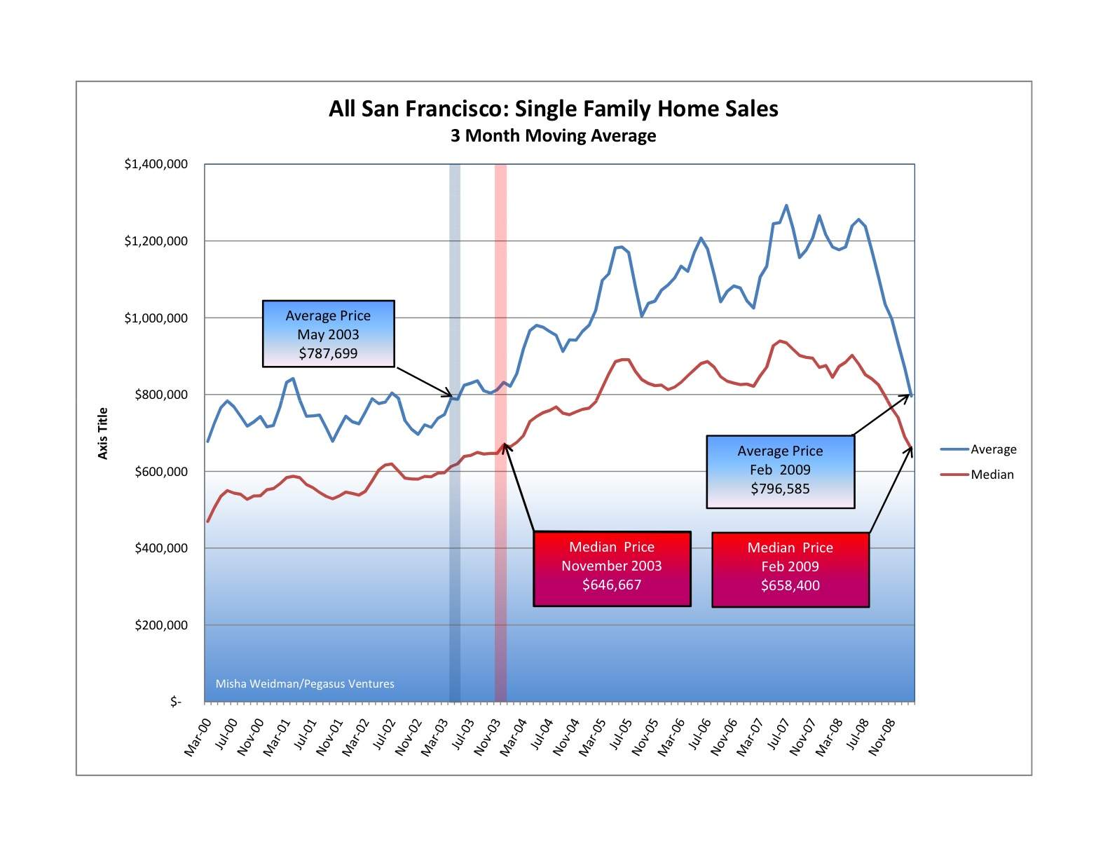
Not long ago I did a guest post at The Front Steps in which I showed that city-wide home prices had fallen back to November 2003 levels. Here’s the chart.

san-francisco-price-trends-2000-presentsmall

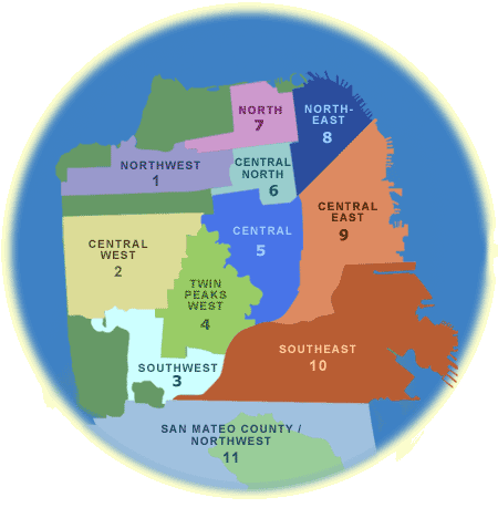
That prompted some discussion about whether the results would be different if you excluded home sales in some of San Francisco’s outlying areas, such as the Bayview and the Westlake districts. These and other neighborhoods are included in MLS (Multiple Listing Service) Districts 3 and 10. Here’s the official MLS district map.

mls-district-map

The thinking, mine included, was that San Francisco’s generally more expensive “core” areas would have held up better than the more modestly priced outer areas, where the economic downturn could be expected to have had a greater and more immediate impact.  Did they? I recently posted this chart at The Front Steps as a partial answer.

core-area-medians-vs-all-districts

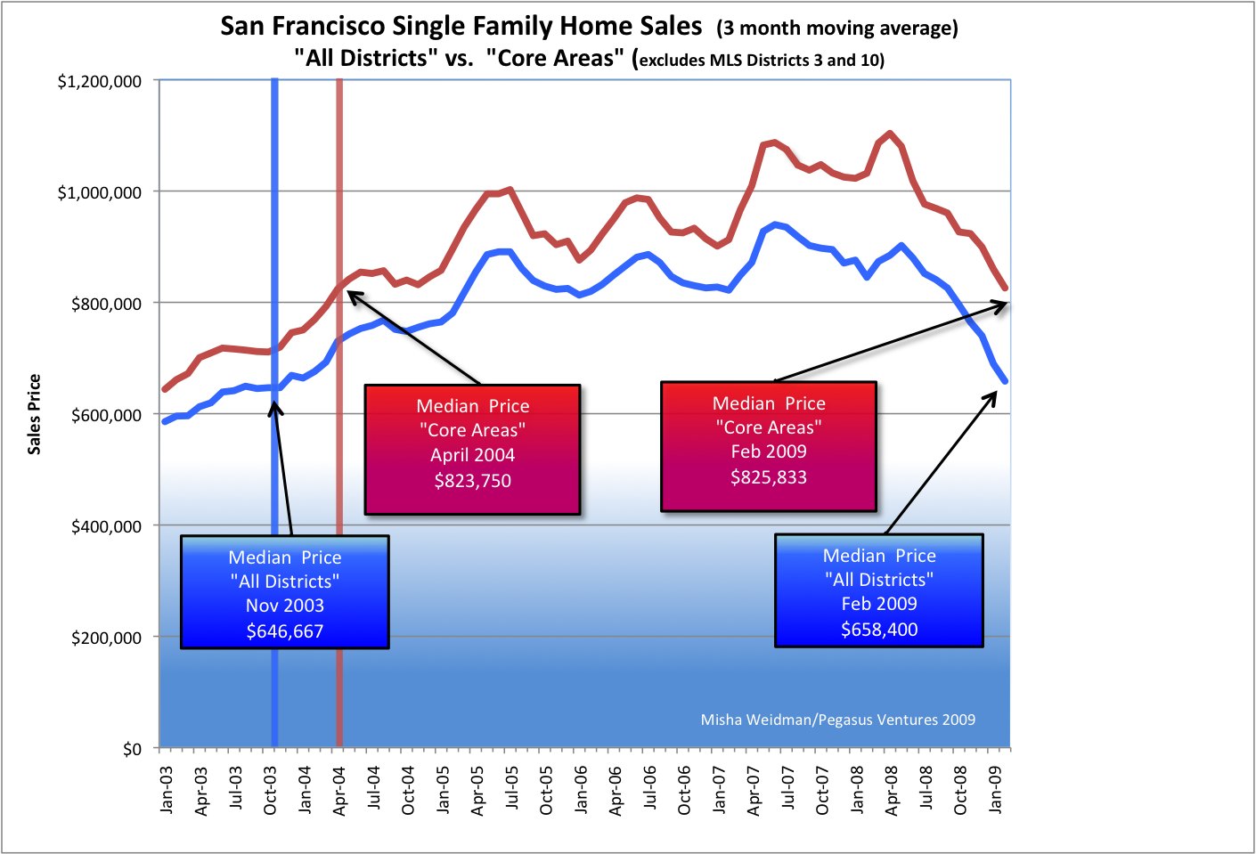
What’s really interesting about this chart is how closely the “Core Areas” and “All Districts” price lines track each other. This isn’t altogether surprising since the “Core Areas” data overlaps with over 75% of the “All Districts” data.   The fact that “Core Area” prices are higher also isn’t surprising.

But have “Core Areas” been holding up better than the city as a whole?  Based on this chart, I thought the answer was “yes”, since it shows an increasing price divergence in favor of “Core Areas” starting around July 2007.

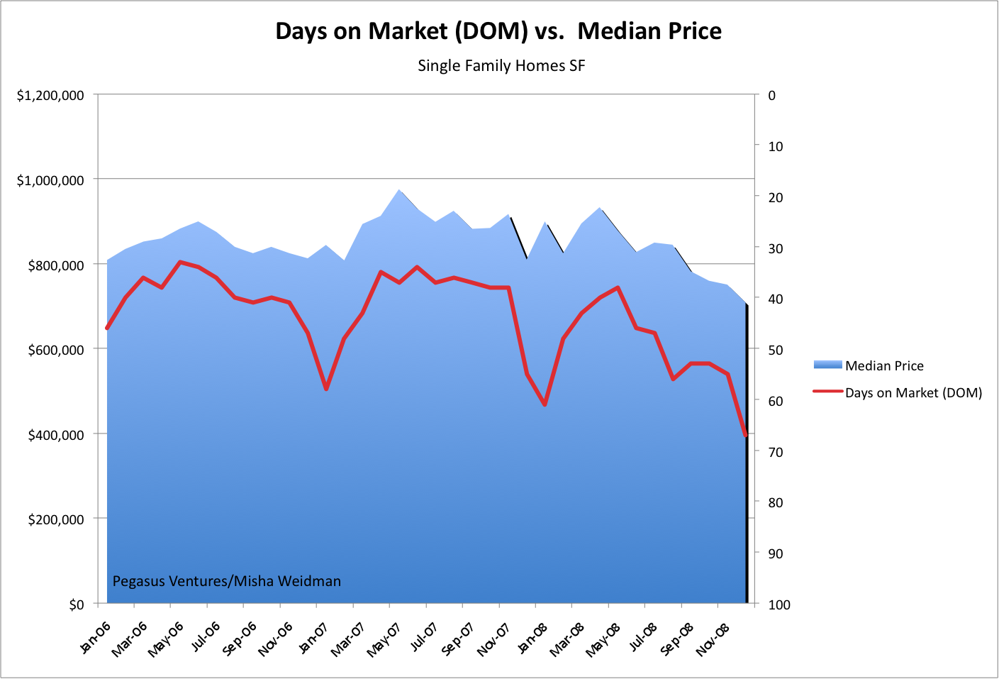
Still, the divergence was relatively subtle, so I decided to take another stab at answering the question. This time, I focused directly on Districts 3 and 10 and compared the results to the city as a whole. I also looked specifically at how far prices had fallen from their respective all-time highs. Here’s the resulting chart — note, this is single family homes only, not condos (click to enlarge) .
district-3-and-10-v-all-dist

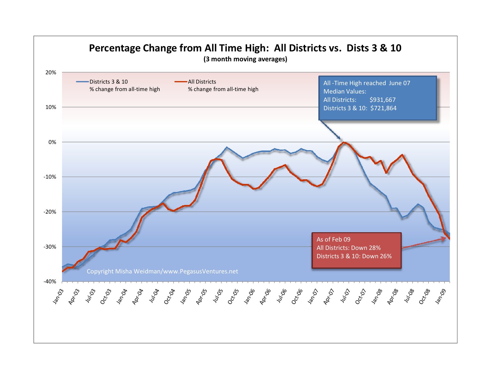
In both cases, all-time highs were reached in June 2007. What this chart clearly confirms is that prices in Districts 3 and 10 really did fall further and faster than prices for the city as a whole. Initially, that is. Starting around July 2008, prices dropped off a cliff city-wide. As of February 2009, Districts 3 and 10 are actually doing slightly better than the city as a whole.

I will spare you the details of my travails with Excel, pivot tables, and generating median values for large data sets. Not fun – and the principal reason why I haven’t posted for a few weeks. However, I do think that this chart allows us to conclude that “Core Areas” haven’t performed substantially better or differently than the city as a whole. Much ado about nothing you say? Perhaps, but at least we’ve now established a baseline — sort of like the S&P 500 — against which to compare specific neighborhoods and areas.  Stay tuned.

“San Francisco Property Sales and Prices Rebound in February”

…or so proclaims my venerable data-crunching guy at the REreport.  All the data is available and updated monthly under my  “Market Trends” tab, organized by MLS District, or city-wide, annual or monthly, single family or condo — it’s all available here.

This chart, from the lead-in page, shows unit sales and median prices for both homes and condos are up from Jan 09, but down year over year.

picture-7

But not so fast.  Much as I’d love to believe we’ve hit bottom, it’s hard to know whether this is anything more than the usual seasonal uptick in sales now that we’re coming out of the winter doldrums.  Here’s the chart for single family homes sales.  See those incredibly regular troughs right around Jan/Feb each year?  I’d say it’s way to early to declare a bottom.

picture-8

Buy land, they ain’t making any more of it.

mars_panorama
Available: Cheap Land on Mars -- Panoramic Views

Ever wonder how much that would cost you in San Francisco? Ever think it might make sense to buy your own little piece of heaven and build the house of your dreams on it rather than pay through the nose for an old Victorian lady wearing a lot of make-up and suffering from 100 year-old plumbing?

First off, you may spend a lot of time looking. Since 2005, there have only been 216 undeveloped land sales in San Francisco. I’ve tabulated the results by ZIP code for the 208 for which there was sufficient information to calculate the price per square foot.
picture-21

With so few data points available, one should be careful drawing conclusions. For example, $673 per square foot for land in Hayes Valley and/or the tenderloin? I don’t think so. With only two data points for that zip, who knows why?

Still, the numbers make an overall kind of sense. Zip 94109 (Nob Hill, Russian Hill) is at the top end at $495 per foot; zip 94124 (Bayview) is at the bottom. Most of the zips line up more or less where you’d expect them to.

A quick recent case study: a 1900 foot “view lot” on Diamond St in Noe Valley, heading up towards Diamond Heights sold in June 08 for $1,052,000  — a cool $100,000 over the asking price.  That’s $550 bucks a foot.  That price included approved construction plans and permits for a 3100 square foot 4BR/4BA home, complete with elevator.  Construction costs can obviously vary widely, but my insurance broker quotes an insurance industry “replacement cost” range of $300 to $500 per square foot for San Francisco/Marin.  That includes architectural fees, etc.

Take the low end of that range and you get a construction cost on that house of $930,000.  So you’re in for $2 million before you spend a dime for financing charges, delays, cost over-runs, law-suits from disgruntled neighbors, seeing your shrink, costs of divorce, etc.

This confirms my view that the only people who can really make money developing residential property in San Francisco are the ones who can do big multi-unit projects and contractors who don’t have to pay retail to build or fix something.  The market’s too efficient to leave any fat for people just looking to build and spin.  Same thing’s true for the mythical “fixer-upper.”

On the other hand, if you’re still one of the happy few who don’t feel beaten down by the daily economic news, perhaps you should go ahead and build that dream-house.  There’s always slim pickings for 3,000 square foot homes in San Francisco, let alone ones equipped with an elevator.  And if you do find one, you’ll be paying north of $2 million anyway.

Just be sure to budget extra for the shrink and the divorce attorney.

More Grim News on Housing

Saturday’s NY Times proclaims “A Gloomy Outlook for Home Sales’ Big Season.” The headliner, by the way, was “Job Losses Hint at Vast Remaking of U.S. Economy.” Is it really any wonder we have difficulty sleeping a’ nights?

Here are some of the cheery highlights:

  • One out of every seven apartments and houses in the US are vacant, a level not seen since the 1960’s. That’s about 19 million units
  • Less than a third of those are actually for rent or for sale, meaning that many more could yet come onto the market.
  • New contracts for previously owned homes fell at their fastest pace for two years.
  • Some areas that have fallen fastest, like inland California, are seeing improved sales.
  • Urban areas that have withstood the recession reasonably well, like San Francisco and New York, are “frozen.”

We pass Elk Grove on our way up to Tahoe.  Beautiful spot east of Sacramento.  You can buy a 3 BR house there for $193,000.  The same house sold for $336,000 four years ago.  The mortgage is a $100 less than it costs to rent a 2BR apartment.  It’s hard not to think of that as positive.  That is, unless you were the one who lost $143,000 in equity.

They’re predicting the housing market will get “worse” before it gets better.  Why “worse”?  Because a lot of people are going to feel — and be — a hell of a lot poorer than they used to.   And the people for whom an increase in housing affordability might make a difference are the ones who are getting hammered the worst.

Here’s a chart showing future’s contracts on home prices.  It shows prices deteriorating further this year, followed by a long, flat recovery starting some time in 2010.

picture-4

Sounds like it’s going to be chilly spring.

SF Home Prices at 2003 Levels

Sorry, folks, but it’s that bad — or good, depending on your perspective.

I tracked average and median prices going back to 2000 for the ten combined MLS districts that comprise the San Francisco Multiple Listing Service — the big database that realtors use to list properties and record sales information .  (The MLS District Map is here, on my Market Trends page.)  Here are the results (click to make the chart bigger):

san-francisco-price-trends-2000-presentsmall

Pretty scary stuff, especially when you look at the suislide (a new word is born?) that started in June of last year and shows no signs of slowing down.

Before you head for the windows, or call your realtor (me!) to start looking for a house to buy, consider this:  as I’ve said before, there’s nothing so local as real estate.  It really does matter what neighborhood you’re talking about. This chart, while it does illustrate something meaningful about the overall SF market, doesn’t tell you anything about values in any particular neighborhood.  It lumps together data from neighborhoods as diverse as Hunter’s Point and Visitacion Valley in District 10, which has been slammed  for well over a year now, with neighborhoods like Noe Valley  in District 5 and St. Francis Wood  in District 4, both of which seem to be holding up pretty well.  Go to my Market Trends page to see the charts for individual districts.  I’ll be creating charts for individual neighborhoods within districts for future blogs.

And if it’s any consolation, SF real estate is holding up a heck of a lot better than the stock market, don’t-cha-know.  Today the S&P 500 closed at 682.55.  The last time it closed under 683 was on May 17, 1996.

January Data Sings the Blues

Here’s the latest sales data broken down by MLS District.  Full reports are available here under the Market Trends Tab and are well worth a look.

picture-2

Median and Average prices are down substantially year over year for single family homes in all districts except District 7 (“North”, which includes top-shelf enclaves like Pacific Heights and the Marina), but with only 2 sales for the month in that area, it’s not a meaningful statistic.  Indeed, as I’ve pointed out in previous blogs, sales drop off so dramatically every year during December/January that I’d be cautious reading too much into the  statistics for those particular months.

However, the three month moving average  for SF as a whole, which smooths out the seasonal fluctation, has clearly been heading south since last summer, as these two charts show (also available, much more prettily, under that Market Trends Tab):

sfhomesales0109

sfcondosales0109

Details on individual MLS districts to follow in another post.

On the Economic Front, A Rare Voice of Optimism

It’s hard to find much cause for hope these days.  The headlines tell us every day about tectonic shifts in our economic landscape.  We read about layoffs spiraling into the millions, major institutions crumbling, government bail-outs of unprecedented proportion.  Just one example of the doom and gloom:  David Brooks on today’s NY Times Op Ed page, describes the situation as a psychological crisis rather than an economic one, a crisis potentially so bad that no amount of money thrown at the problem will fix.
In this media-driven echo chamber, it’s hard to hear many sober, let alone optimistic, voices.  Dr. Jim Smith may be one such.  He was the keynote speaker at a major builders’ trade show in mid-2007 and accurately predicted both the looming recession – though not its depth – and a Democratic win as a result.
His current prognostications are less dire than most.  According to an article in today’s Wall Street Journal, he sees GDP of 4% by year’s end. There’s no more than a one line quote in the WSJ, but I was able to find more details in an economic forecast he wrote at the end of 2008 in his capacity as Chief Economist for the wealth-management (the latest oxymoron?) firm, Parsec Financial. (Smith is also a professor at Western Carolina University’s Institute for the Economy and the Future) and a former co-chair of the European Council of Economists.)
Here are a few highlights.  You can download his full forecast here.
•    The unemployment news is bad and is likely to get worse, but oft-quoted comparisons to earlier periods like after World War II are misguided because the national economy is so different.  The unemployment picture should start turning around in a few months.
•    Like Brooks, he sees a huge crisis of confidence underpinning this melt-down, just as it has underpinned other financial crises.  Here’s the takeway:  Historically, when huge resources are thrown at financial panics, three things have always happened:  The panic stops; stock markets boom; and the real economy soars.
•    Things to look for to signal a turnaround:  an upturn in housing starts, especially single family units.  Next, an increase in new vehicle sales.
•    The consensus view is that there won’t be a turnaround in the economy until the summer or fall 2009.  He thinks that view is too pessimistic.
I sure hope he’s right.

DOM Roll Please

A couple of posts ago, we dispensed with Absorption Rate as a good barometer of the market since there appeared to be no correlation between how much inventory was available in relation to sales rates and where median prices were going.  I asked whether there might be a different metric that would correlate better, like the oft-quoted Days on Market or “DOM.”

In essence, DOM tracks the average number of days that properties have been on the market from the time they became active on the MLS (Multiple Listing Service used by realtors) to the time they actually sell.

Great minds must think alike because it turns out that my friends over at Inside SF Real Estate have been exploring the same thing.  Head over to their recent post for a look at DOM trends over 14 years.  What they haven’t done, however, is track DOM against median prices.  Ha!  I have, and here are the results for the last three years tracked by month (my numbers are pulled directly from the MLS database  — click to make the chart larger).

dom-chart

Now that’s what I call correlation! Note that the right-hand Y axis tracks DOM inversely, with longer periods at the bottom and shorter periods at the top.  So, this chart is basically showing that during periods, even relatively short periods, when the average DOM falls, prices rise, and when properties stay “on the market” for longer, prices fall.  This is just what you’d expect.

Why?  My guess is that DOM captures many of the factors in play in the real estate market at any given time.  For example, if credit is tight and appraisals are rigorous, you’d expect that transactions would take longer to get approved.  Likewise, if lots of people are bidding on the same house, you’d expect that the winning bidder would promise a quick “no contingency” close and that there would be no haggling on the sale price.  When the market slows, you’d expect more cautious buyers, more haggling on price, longer closing periods — all reflected ultimately in the DOM.

As my friends over at InsideSFRealestate pointed out in their post on DOM, realtors can play games with DOM.  For example, if a property doesn’t sell, they’ll take it off the market, and then put it back on as a “new listing” at a lower price and voila, the DOM resets to zero.  Still, that would just tend to increase the “down” side of the line — the correlation would still hold.

The only other point I’d add is to note the seasonal trend in the chart.  It seems that every December/January, DOM increases and prices dip.  Perhaps that’s the best time to buy.