The View from Space — Part 3: Above California

As promised, here are a few tidbits from Leslie Appleton-Young’s presentation to the conference sponsored by UC Berkeley’s Fisher School of Real Estate and Urban Economics.  Ms. A-Y is the California Association of Realtors’ Chief Economist.

Most of the data covers the state as a whole, and even when it’s broken down by county, Ms.  A-Y stressed that there can be huge differences when you get more “granular” with the details.  (I made the same point in my 10/27 post discussing how misleading the much-quoted Case Shiller Index can be.)

Continue reading “The View from Space — Part 3: Above California”

The View from Space — Part 2

More pearls from Ken Rosen and the other big brains who addressed UC Berkeley’s  Annual Real Estate and Economics Symposium on Monday:

•    What to Invest In Now: Rosen and several other commentators say that REITS (publicly traded companies that invest in investment-grade real estate) are cheap relative to their underlying assets.  Some are trading at around 50% of the replacement value of the assets they hold and are paying a dividend of around 10%.  The best sector of the real estate market right now is the apartment rental market.  (Makes sense, since a lot less people can afford to buy homes.) So look for REITS that own big apartment complexes in decent market areas (see below).   Do your homework:  be sure that they have good management teams and don’t have too much short-term debt because refinancing anything is going to be tough for a while. Hedge your bets.  (Easier said than done for us mortals down here on planet earth.)  Rosen has parked his cash in short term Treasuries.  Obviously he’s worried.  We should probably be too.

•    Where to Invest: “Global gateway”, “quality of life,” “new tech.”  These are the buzzwords that describe cities that should weather the recession relatively well.   Seattle, San Francisco, Boston, and Colorado were all mentioned.   An exception is New York, which is ground zero (again) for the meltdown in the financial sector.  Washington DC is poised for a big expansion as government programs expand to address the current crisis.  San Diego is showing signs of improvement.  Places like Detroit “have no reason to exist.”

•    When will things improve? Be careful over the next year.  Watch for lower LIBOR (London Interbank Offered Rates) as an indication of banks’ willingness to lend again.  Also look for a reduction in market volatility.  Here’s a link to today’s Bloomberg for a really instructive piece on the significance of LIBOR.

•    One of the other key speakers at the conference was Leslie Appleton Young, Chief Economist of the the California Association of Realtors (CAR).  Sure, you can dismiss CAR as a spin outfit for the industry, but you can’t argue with the data they collect.  Another post will cover Ms. A-Y’s analysis of California and the Bay Area.

The view from space — Part 1

Ken Rosen is a smart guy.  He’s the co-chair of the Fisher Center of Real Estate and Urban Economics at the Haas School of Business at UC Berkeley and the investment advisor of choice to some of the biggest players in real estate, from banks to insurance companies to REITS.

Once or twice a year I spend the day in a windowless hotel conference room listening to Ken and some of the biggest heads in the real estate biz  expounding on the state of real estate. These guys (and they are mostly guys) look at real estate through the lens of global macro-economics and international finance.  Want to know where interest rates are going?  They study yield curves on T-Bills and monetary policy in the capitals of Europe.  This is “the view from space.”

There’s a lot of information that I can’t actually put to use:  I don’t really need to know whether the smart money is investing in CMBS’s (commercial mortgage backed securities) because folks like you and I can’t buy them anyway.  But I always come away from these conferences with a better sense of the “big picture,”  of where real estate is headed in the broader context of the national and global economy.

Right now, the picture ain’t pretty.  Here are some highlights from Rosen’s economic wrap-up.  More to follow in other posts:

  • Recession or Depression? Rosen puts the chances of a deep recession at 70%, a moderate one at 25%, and a full-blown 1929-style depression at 5%.  This was echoed by many speakers.  The major global governments, including China, are throwing so much money into the system that a depression seems unlikely — but it’s still a possibility.
  • The credit crunch: Inter-bank interest rates are coming down, which means that bank confidence is improving.  Easing credit should follow.
  • San Francisco should weather the storm reasonably well because of its diversified “global gateway” economy and the fact that it hasn’t been overbuilt.  Not so, the East Bay.
  • The dollar should continue to improve because, believe it or not, the US economy is doing well relative to the rest of the world.

What to invest in?  More anon.

Dataquick vs MLS: why the discrepancies?

In my October 27 blog discussing the Case-Shiller Index, I referred to Bay Area County stats from Dataquick that showed San Francisco’s median prices to be down 12.7% from a year previous (YOY) vs.  the 11.36% that I’d quoted in my October 23 blog.

The reason for the discrepancy?  Dataquick compiles its figures from the San Francisco County Recorder’s Office; my numbers come from the MLS.  Transactions like foreclosures or transfers between family members or between legal entities generally don’t involve agents or brokers so they don’t show up in the MLS.  They also tend to be at lower values because they are often at below market rates, so Dataquick’s numbers will always be somewhat lower than the numbers pulled from the MLS.  Thanks to Rick Campbell at the REReport for his quick response.

Update to Halloween Horror: Did it just get scarier….??

The day after I posted my take on the Case-Shiller Index, they came out with July’s report (they’re always trailing three month averages) showing a continuing decline in the San Francisco MSA.  Wait for it:  down 27.3% from July 2007.  Are we worried?  Not that much.  Why not?  Read my October 27 blog:  “San Francisco” means most of the Bay Area when it comes to the Case-Shiller Index.

You want scary?  Median prices are down 45% year over year in Contra Costa County.

Horror Headline (just in time for Halloween): SF home prices down 24.8%!!!

Yup, that’s right folks.  According to the well-known and well-respected Case-Shiller Index published by Standard and Poor’s, San Francisco home prices in July 2008 were down a whopping 24.8% from a year previous.  How can this be, when you read right here that median prices were down YOY (year over year) a “mere”  11.3% in September  (see Oct 23 blog below) and just 5.5% YOY for July 2008 — see my market trends archive.)  More realtor fluffery, you huff, designed to make the credulous public believe that things are not so bad.

Actshooly (actually), the reason’s simple.  As is often the case when widely quoted indexes talk about a city, what they’re really referring to is a Metropolitan Statistical Area (MSA), a much larger geographical area. So “San Francisco” doesn’t mean our little piece of heaven, no.  It means…  all of Alameda, Contra Costa, Marin, and San Mateo COUNTIES as well as San Francisco county.

According to the latest release from Dataquick, median home prices in Contra Costa County were down a whopping 45.6% YOY for September 2008. No great surprise considering that it includes ground-zero overbuilt subdivision train-wreck areas like Pittsburgh and Antioch. Take a look:

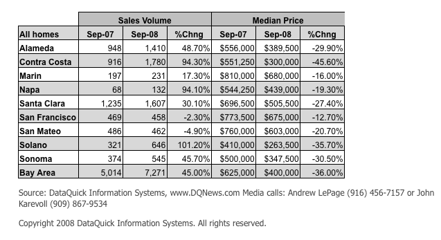
With Alameda County down 30%  and even Santa Clara County down 27.4%, it’s clear how the other counties in the San Francisco MSA are dragging the “San Francisco” index down.  Feel better now?

And a PS.  Dataquick shows San Francisco County as down 12.7% for September versus my 11.3%.  I get my  numbers from a service that pulls them directly from the MLS, then I use their spreadsheets to dig deeper when necessary.  I’m looking into why there’s a discrepancy between my numbers and Dataquick’s.

Cool new blog with an analytical approach

I came across a great post analyzing condo prices in Pacific Heights at TheFrontSteps.com.  Source of the article is a new blog Inside SF Real Estate, very much of the same philosophy as I believe in:  independent analysis, hard fact, no bs.  I’m adding them to my blogroll today.

They also have a great chart and article focusing on Noe Valley condo and home prices (wish I’d done it first 🙁 ).  Go take a look.  And good luck Arrian!

Just How Bad Is It? (Answer: depends)

I’ve been digging a bit deeper into the raw data that’s used to generate the beautiful graphs you can find here and which I used to generate the MLS District graphs in my blog of a few days ago.

So I thought I’d check how September 08’s median home prices (condos will come later) compared to their all-time highs and to the median prices of a year ago, both by MLS District and for all of San Francisco.  I didn’t include District 8 (North-east) because it doesn’t have enough data to be useful, and I also didn’t include the southern-most districts of SF (3 and 10) because to be honest I don’t follow them closely. Here’s the result:

So clearly prices are down from their all-time highs across the board.  (Most districts were still hitting highs or near-highs well into 2007, by the way, and District 5, which includes Noe Valley had its top 3 highs in 2008!) )  But where the drops are really big (Districts 6 and 7 for example), that could simply be due to the fact that the all-time high was aberrational.

The percentage change from a year ago are interesting because you can see how some districts seem to be doing quite well.  Half up, half down.  Once again, though, with sales volumes down across the board, there are less data points and that can skew the numbers.  But it certainly seems like the tonier districts (1, 5 and 7) are holding up better than the others.  (Take a look at my graph from a coupla days ago to see how the districts compare over time.)

Bottom line(s)?

San Francisco single family homes are down over 11% from a year ago.

The more expensive neighborhoods seem to be doing ok.