The 2011 San Francisco Residential Wrap-Up: Things Are (Are Not) Looking Up


Where do you think the market went in 2011?  Come on.  Take a guess.  If you believe my own SF Association of Realtors “stronger affordability conditions, a lower cost of owning versus renting, and declining foreclosures, continue to steer the San Francisco housing market in a positive direction.” [January 2012 Market Focus Report].

“Continue.” Now that’s reassuring.  Continue reading “The 2011 San Francisco Residential Wrap-Up: Things Are (Are Not) Looking Up”

Who to Believe? Case Shiller or Ken Rosen

Case Shiller may be talking about double dip but Ken Rosen sees a somewhat brighter future for San Francisco’s residential real estate market.

Here’s the doom and gloom at the national level from the recently released Case Shiller Report for January 2011:

These data confirm what we have seen with recent housing starts and sales reports. The housing market recession is not yet over, and none of the statistics are indicating any form of sustained recovery. At most, we have seen all statistics bounce along their troughs; at worst, the feared double-dip recession may be materializing. Continue reading “Who to Believe? Case Shiller or Ken Rosen”

A Faltering Housing Market?

George may have left office a year ago, but there appears to be a growing consensus that the likely shape of the recovery will be a “W.”  How appropriate, if you believe that we are reaping the bitter fruit of his administration’s policies.

A front page article in the Business Section of last Wednesday’s New York Times, grimly entitled An Upturn in Housing May be Reversing,” pulls together recent and contradictory data from various sources, including Case-Shiller, Moody’s, and The National Association of Realtors.  The conclusions are sobering.

There is a growing consensus that the positive national sales data that we’ve seen over the last few months is faltering.  Much of the recent activity, for example, was stimulated by the anticipated expiration of the “First Time Home-buyer Tax Credit,” originally set to expire in November, and now extended through April of next year.  Essentially, this means we’ve “borrowed” from future sales.

Also, despite some positive economic news and decent sales volumes, there’s been little improvement in sales prices because inventory levels – read “foreclosed properties” – remain so high.   Mary Maitland, VP of the S & P Index that publishes the Case-Shiller Index foresees a “W” pattern for the housing market, with prices this winter testing the lows we saw earlier in the spring.  Am I allowed to say “I told you so?”

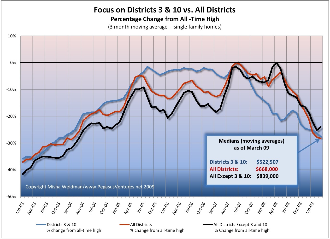
The NY Times article has a cool interactive chart for specific MSA areas including “San Francisco” — remember this covers 5 of the 9 Bay Area Counties.

Districts 3 and 10, R.I.P.

The Excelsior, Bayview, Hunter’s Point, Oceanview, Ingleside:  these are some of the neighborhoods included in the San Francisco Association of Realtors’  MLS (Multiple Listing Service) Districts 3 and 10.  It’s been suggested here and elsewhere  that perhaps these non-“core” San Francisco neighborhoods have been pulling down San Francisco’s home prices disproportionately.  The theory, plausible enough, is that these more modestly-priced neighborhoods would be feeling the effects of the economic slowdown more than the tonier “core” neighborhoods, whose denizens’ bank accounts might provide a little more padding against hard times.
I recently published a chart that compared the percentage change of Districts 3 and 10 from their all-time highs to that of the city as a whole.  Some readers of theFrontSteps expressed an interest in seeing what the chart would look like if you excluded those districts from the data set for the city as a whole.  (Districts 3 and 10 make up over 20% of the city’s single family home sales for the 5 year period covered by the chart.)  I aim to please, so I ran the numbers again and here are the results.
focus-on-dists-3-and-10-vs-all-dists

The chart confirms, once and for all, that however you want to cut it – with or without Districts 3 and 10 – home values for the the “core” San Francisco Districts have fallen almost as far as those for the outer Districts.  They just took a little longer to start falling, that’s all.

Bottom line:  We don’t have Districts 3 and 10 to kick around any more.  I’m going to start rolling out comparisons of specific districts and neighborhoods to the city as a whole (ie.  “All Districts”), starting with some that have supposedly weathered the market reasonably well.  I think you’ll find the results surprising.  I know I did.

The View from Space — Part 3: Above California

As promised, here are a few tidbits from Leslie Appleton-Young’s presentation to the conference sponsored by UC Berkeley’s Fisher School of Real Estate and Urban Economics.  Ms. A-Y is the California Association of Realtors’ Chief Economist.

Most of the data covers the state as a whole, and even when it’s broken down by county, Ms.  A-Y stressed that there can be huge differences when you get more “granular” with the details.  (I made the same point in my 10/27 post discussing how misleading the much-quoted Case Shiller Index can be.)

Continue reading “The View from Space — Part 3: Above California”