Interested in what’s happening with new developments in San Francisco? Click the link below to view the interactive map…
http://www.parascopesf.com/development-map/
Source : Parascopesf.com

Interested in what’s happening with new developments in San Francisco? Click the link below to view the interactive map…
http://www.parascopesf.com/development-map/
Source : Parascopesf.com
The S&P Case-Shiller Home Price Index for July 2014 was released today, and indicated a small – less than 1% – dip in high-price-tier houses. (The Case-Shiller aggregate Index for all Bay Area home price tiers dropped even less, about 4 tenths of a percent.)
For the past 3 years, home prices have surged in the spring and then plateaued during the summer. It is too early to speculate whether home prices are trending down a bit after the spring market frenzy, which is certainly possible. For any definitive sense of home price trends, we will have to wait until the autumn-selling season numbers are in. Autumn this year began with a big surge in the number of new listings in September.
Remember that the C-S Index covers not just San Francisco, but 4 other Bay Area counties and is a 3-month rolling average. San Francisco makes up a very small part of all the house sales being surveyed by the Index and C-S home prices reflect offers negotiated in previous months – thus the June 2014 peak reflects the heat of the market in the heart of the spring 2014 selling season.
The last 13 months, July to July:
The small dip in July 2014 from the spring peak can be seen. Small fluctuations up and down are not particularly meaningful until substantiated by longer term data.

Since the recovery began in earnest in early 2012.
One can see the two previous summer price plateaus (and, now perhaps the beginning of a third) after spring surges:

Longer-term overview of real estate cycles:

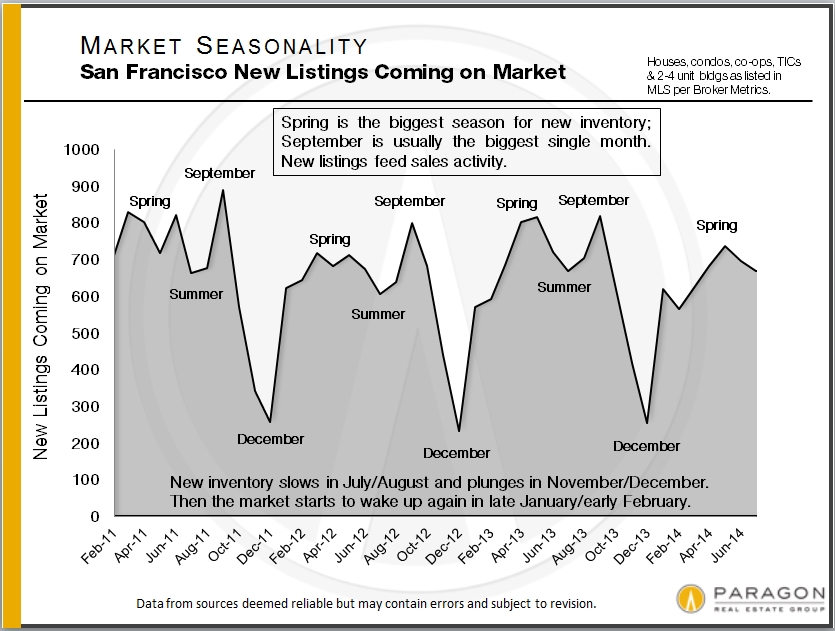
Coming out of the summer slowdown, the last big sales season of the year runs from early September to mid-November (when the market usually retreats into semi-hibernation until mid-January). September is typically the single month with the highest number of new listings and this year, it started out with a bang: 300 new listings hit the market in the first week after Labor Day. As a point of comparison, May, the biggest new-listing month YTD, had a total of 720.
A list of San Francisco’s most recent listings can be found here, easily sortable by neighborhood, property type and price: New Home Listings
This year’s summer slowdown was bigger than usual: Compared to 2013, the number of listings coming on market dropped 12% and the number of sales fell 16% – these are large drops. Median sales prices also declined significantly from the spring peak, but summer price drops are normal due to seasonal factors. We’ve found it difficult and risky to make confident assessments of market trends during the summer or winter holiday slowdowns: One really has to see what happens in spring and autumn when sellers and buyers jump back in.
San Francisco, California & United States Markets

This chart compares Months Supply of Inventory (MSI) – a measurement of buyer demand against the supply of homes for sale; median Days on Market (DOM) – how quickly new listings go into contract; and median home sales prices, for the city, state and country. Typically, an MSI under 3 to 4 months is considered a seller’s market; at an average of 1.5 months of inventory over the summer, San Francisco would typically be considered an extreme seller’s market (which puts upward pressure on prices). San Francisco’s median days-on-market figure is also extraordinarily low, and of course, our home prices are significantly higher than most places on the planet.
Not shown on the chart, but another dramatic indicator of market conditions: Over the last 3 months the average SF home sale closed for 7% over the original asking price. (It hit 10% in May at the height of the spring frenzy.)
10 Factors behind the San Francisco Real Estate Market
——————————————————-
San Francisco Home Sales by Property Type & Price Range


Unlike the vast majority of other counties, condos and condo-like homes such as co-ops and TICs now predominate in the SF homes market, a trend that will only accelerate as dozens of (expensive) new-condo projects come on line in coming years. The difference in median sales prices between houses and condos has also narrowed to less than 12% – when condos used to be the significantly cheaper alternative. Condos also play a huge role in luxury home sales, often selling for the highest dollar per square foot figures in the city. TIC sales, almost an exclusively SF phenomenon, have been dwindling, but now sometimes command prices in excess of $1,500,000.
The relatively small quantity – and declining percentage of sales – of house listings in San Francisco has put significant competitive pressure on house prices. This effect has been cascading through the city’s neighborhoods, from most desirable to historically less desirable, as families search for affordable options in a rapidly appreciating market. Very, very few new houses are being built in the city and those that are, are typically very costly.
——————————————————-
Seasonality & the SF Real Estate Market


In August we completed an analysis of how seasonality affects inventory, buyer demand and median sales prices. These 2 charts illustrate its effect on listings accepting offers and prices. Please note that other factors besides changes in values can affect median price fluctuations. For the complete report: Seasonality & Real Estate
——————————————————-
San Francisco Neighborhood Home Prices

We recently issued our semi-annual breakdown of San Francisco home sales by neighborhood, property type and bedroom count. This table is for 3-bedroom houses. For our complete analysis (8 tables): SF Neighborhood Values
For our updated map of home values around the Bay Area: Bay Area Map
——————————————————-
Selected Neighborhood Snapshots
Long-term Trends in San Francisco Home Values


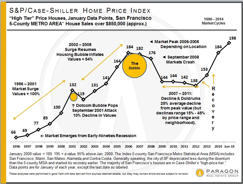
The Case-Shiller Index for the San Francisco Metro Area covers the house markets of 5 Bay Area counties, divided into 3 price tiers, each constituting one third of unit sales. Most of the San Francisco’s and Marin’s house sales are in the “high price tier”, so that is where we focus most of our attention.” The Index is published 2 months after the month in question and reflects a 3-month rolling average, so it will always reflect the market of some months ago. June’s Index was released on the last Tuesday of August.
The 5 counties in our Case-Shiller Metro Statistical Area are San Francisco, Marin, San Mateo, Alameda and Contra Costa. Needless to say, there are many different real estate markets found in such a broad region, and it’s probably fair to say that the city of San Francisco’s market has generally out-performed the general metro-area market.
The first two charts illustrate the price recovery of the Bay Area high-price-tier home market over the past year and since 2012 began, when the market recovery really started in earnest. In both 2012 and 2013, home prices surged in the spring and then plateaued in the summer-autumn. The surge in prices that occurred in spring of 2013 was particularly dramatic, reflecting a frenzied market of huge buyer demand, historically low interest rates, increasing consumer confidence and extremely low inventory. In San Francisco itself, it was further exacerbated by an expanding population and the high-tech-fueled explosion of new wealth. The market then calmed down somewhat in the second half of 2013, but then heated up yet again in early 2014. In fact, the spring 2014 market was, if anything, even more ferocious than last year’s. Typically, the market cools off for the summer months and that is what we are starting to see in the Case-Shiller numbers (which, again, are some months behind the current market). The next big indication of market trends will come after the autumn selling season begins in mid-September.
For more regarding how seasonality affects real estate: Seasonality & the Real Estate Market
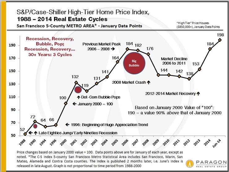
Case-Shiller Index numbers all reflect home prices as compared to the home price of January 2000, which has been designated with a value of 100. Thus, a reading of 198 signifies home prices 98% above those of January 2000.
Short-Term Trends: 12 Months & Since Market Recovery Began in 2012

Longer-Term Trends & Cycles
The third and fourths charts below reflect what has occurred in the longer term (for the high-price tier that applies best to San Francisco and Marin counties), showing the cycle of recession, recovery, bubble, decline/recession since 1996, and since 1988. Note that, past cycle changes will always look smaller than more recent cycles because the prices are so much higher now; if the chart reflected only percentage changes between points, the difference in the scale of cycles would not look so dramatic.

Different Bubbles, Crashes & Recoveries
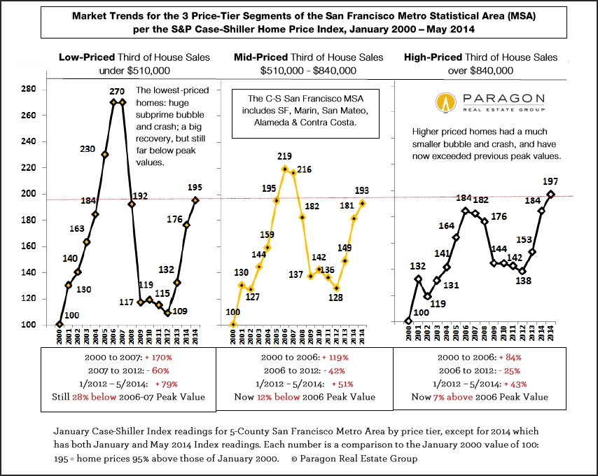
This next chart compares the 3 different price tiers since 2000. The low-price-tier’s bubble was much more inflated, fantastically inflated, by the subprime lending fiasco – an absurd 170% appreciation over 6 years – which led to a much greater crash (foreclosure crisis) than the other two price tiers. All 3 tiers have been undergoing dramatic recoveries, but because the bubbles of the low and middle tiers were greater, their recoveries leave them well below their artificially inflated peak values of 2006. It may be a long time before the low-price-tier of houses regains its previous peak values. The high-price-tier, with a much smaller bubble, and little affected by distressed property sales, has now exceeded its previous peak values of 2007. Most neighborhoods in the city of San Francisco itself have surpassed previous peak values by substantial margins.
It’s interesting to note that despite the different scales of their bubbles, crashes and recoveries, all three price tiers now have similar overall appreciation rates when compared to year 2000. As of May 2014, as seen below, appreciation for all three tiers since 2000 ranged from 93% to 97%. In June (not shown below), this range narrowed further to 96% to 98%. This suggests an equilibrium is being achieved across the general real estate market.
Different counties, cities and neighborhoods in the Bay Area are dominated by different price tiers. Bay Area counties such as Alameda, Contra Costa, Napa, Sonoma and Solano have large percentages of their markets dominated by low-price tier homes (though all tiers are represented to greater or lesser degrees). San Francisco, Marin, San Mateo and Santa Clara counties are generally mid and high-price tier markets, and sometimes very high priced indeed. Generally speaking, the higher the price, the smaller the bubble and crash, and the greater the recovery as compared to previous peak values.
Remember that if a price drops by 50%, then it must go up by 100% to make up the loss: loss percentages and gain percentages are not created equal.
The two “2014″ readings for each tier in the chart below, refer to January 2014 and May 2014.
San Francisco County
And then looking just at the city of San Francisco itself, which has, generally speaking, among the highest home prices in the 5-county metro area (and the country): many of its neighborhoods are now blowing past previous peak values. Note that this chart has more recent price appreciation data than available in the Case-Shiller Indices. This chart shows both house and condo values, while the C-S charts used above are for house sales only. Median prices are affected by other factors besides changes in values, including seasonality, new constructions, inventory available to purchase, and significant changes in the distressed and luxury home segments. Short-term fluctuations are less meaningful than longer term trends.

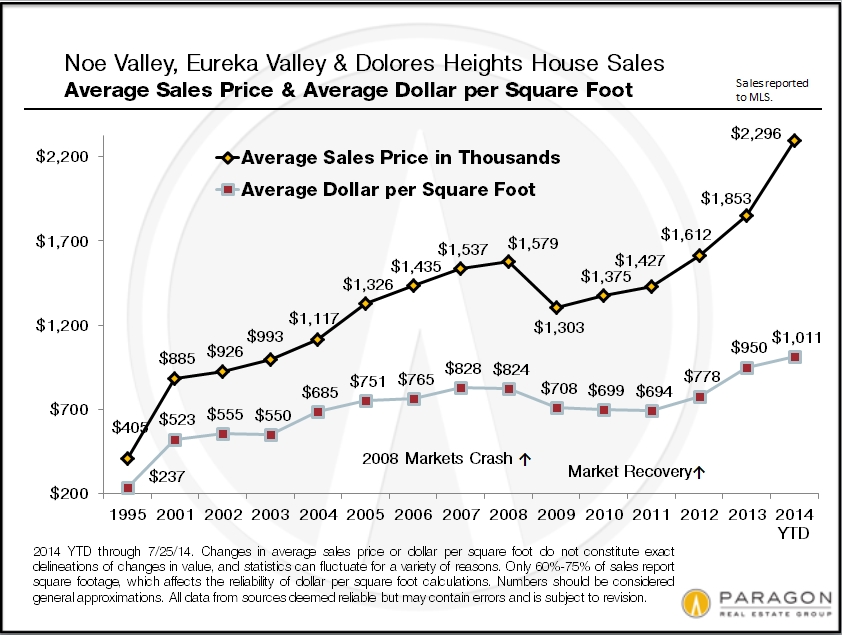
And this chart for the Noe and Eureka Valleys neighborhoods of San Francisco shows the explosive recovery seen in many of the city’s neighborhoods, pushing home values far above those of 2007. San Francisco, San Mateo and Santa Clara counties are most effected by the high-tech wealth effect on home prices. Noe and Eureka Valleys are particularly prized by this buyer segment and the effect on prices has been astonishing.
Seasonality in the San Francisco Homes Market
August 2014 Report by Paragon Real Estate Group
Seasonality typically affects inventory levels, buyer demand and median home prices, often in significant ways – as is illustrated in the following charts. However, it is not the only factor affecting market conditions and trends – general economic conditions, new construction projects coming on market, sudden changes in interest rates, stock market IPOs, natural and political events, and other factors can and do impact the market as well. It should also be noted that new listings and new sales occur every month of the year – and sometimes, depending on prevailing market conditions and the specific property, buying or selling during the slower periods can be the smart strategy.
The devil’s always in the details, and the details of the market change constantly. Still, there is a typical ebb and flow to the level of activity in the market that correlate with seasonality, and that is what this report explores from a variety of angles.
——————————————–
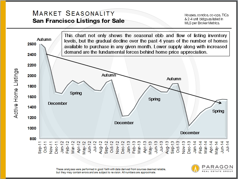
Without inventory, there is no market. These first 3 charts show the classic effects of seasonality on supply and demand.
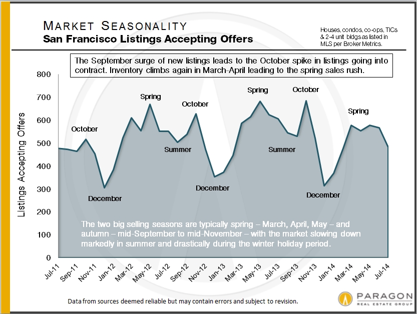
As seen in this next chart, the higher-price end of the market is usually more affected by seasonality that the general market. Among other effects, this will usually raise the median sales price during the peak spring and autumn selling periods, and lower them in the slower periods of summer and mid-winter (as delineated in the final chart). Note: In the chart, the changes up and down in sales are plotted based upon the sales of January 2013 equaling a base line of 100. This is a very approximate illustration, because of other factors that affect the analysis, though we do believe it reflects the market reality.
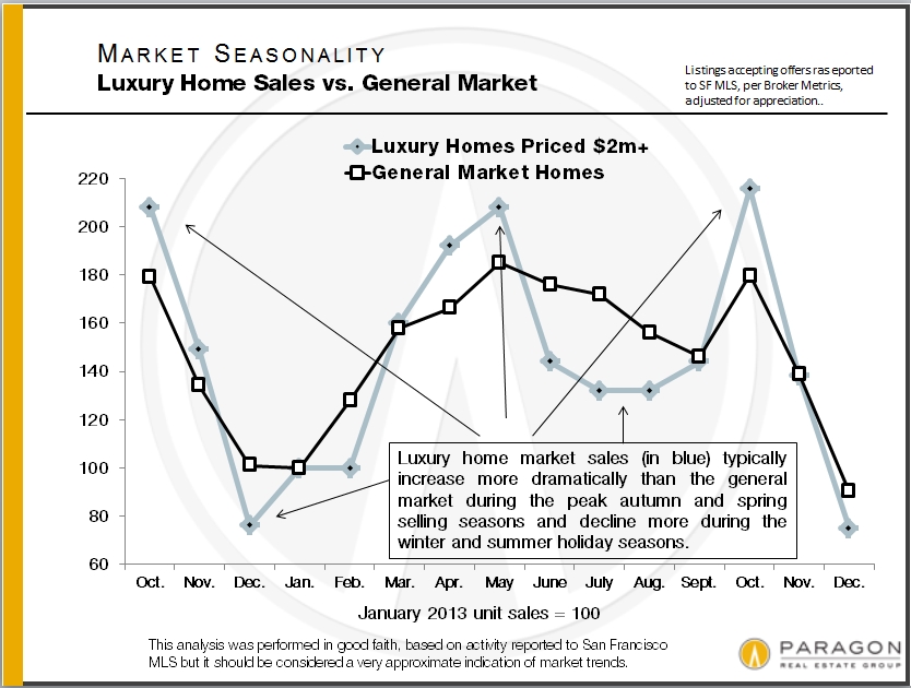
This final chart illustrates both the rapidly appreciating real estate market since 2012 and the shorter term ups and downs that seasonality can play in median home prices. Of course, in an appreciating or depreciating market, there are usually other factors impacting median sales prices as well – as always, what is most meaningful is the longer term trend in home prices, not short-term fluctuations.

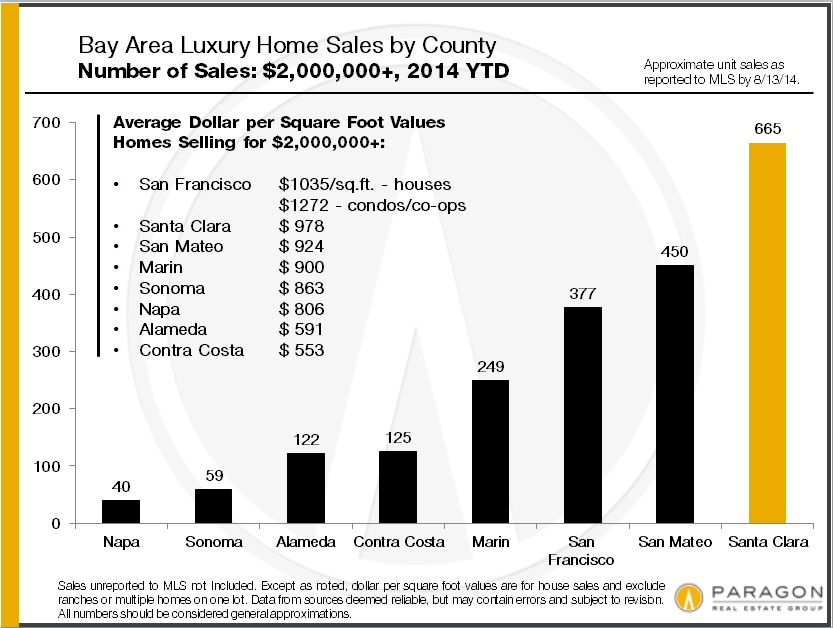
Bay Area Real Estate Values
Bay Area Luxury Home Sales
San Francisco Home Prices by Neighborhood
August 2014 Report by Paragon Real Estate Group
————————————————————
Bay Area Home Prices – Mapped
Our updated map of comparative house values around the Bay Area: The trend virtually everywhere around the Bay has been continued appreciation since the recovery began in earnest in early 2012. Please note that median sales prices and average dollar per square foot values are statistical generalities that may fluctuate for a number of reasons.

————————————————————
Bay Area Luxury Home Sales
Luxury home sales have soared all around the Bay Area, but are concentrated most in the 3 counties most affected by the high-tech wealth boom – Santa Clara, San Mateo and San Francisco – as well as Marin, which has been a very wealthy county for a long time. In San Francisco, condos and co-ops make up a significant percentage of high-end sales (and generally achieve the highest dollar per square foot values), but in other counties, the luxury segment is comprised almost exclusively of houses, estates and, in the wine country, ranch/vineyard estates.
As a point of context, Santa Clara is the most populous Bay Area county with about 1,875,000 residents; then come Alameda (1.58m), Contra Costa (1.1m), San Francisco (835,000 residents, about 60% of whom are renters), San Mateo (750k), Sonoma (500k), Marin (260k) and Napa (140k). As a percentage of total sales, homes selling for $2,000,000 and above make up about 13% of Marin’s market, 11% of San Francisco’s, 10% of San Mateo’s, 7% of Santa Clara’s, 5% of Napa’s, and under 2% in Sonoma, Contra Costa and Alameda Counties. Solano had no home sales over $2m reported to MLS during this period.
Of course, $2,000,000 will buy you a lot more in some counties and neighborhoods than in others. The devil’s always in the details – and this is only a broad brush overview.
————————————————————
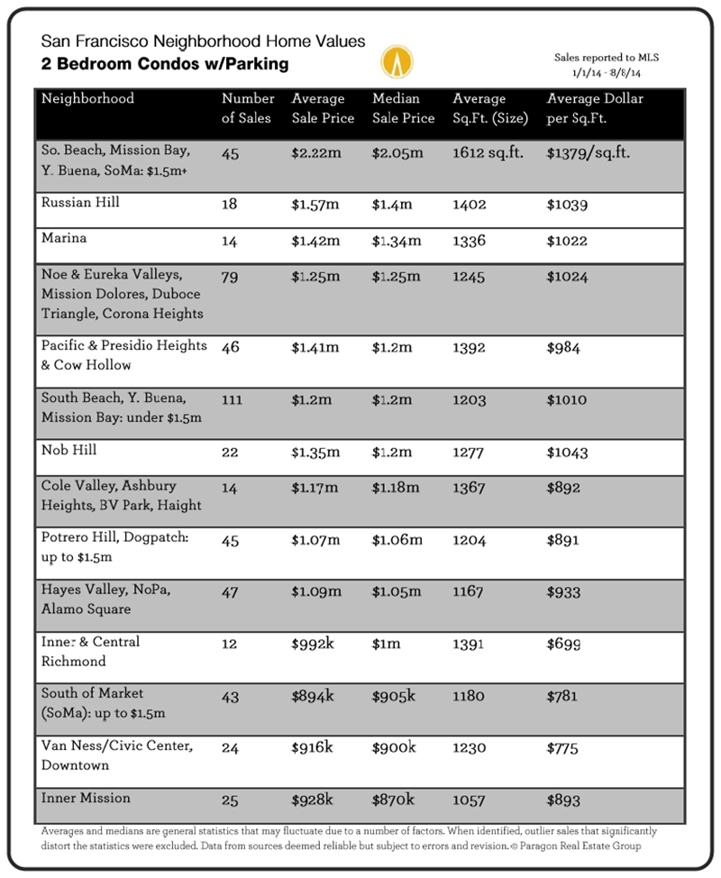
San Francisco Home Prices by Neighborhood
Below are 2 of 8 updated tables breaking down the city’s 2014 YTD sales by neighborhood, property type, bedroom count, median and average sales prices, and average dollar per square foot value. Each table is in order of median sales price.
All 8 tables can be found online here: San Francisco Home Values.

Where to Buy in San Francisco for under $1,000,000
Shifts in the San Francisco Luxury Home Market
The Biggest San Francisco Home Sales of the Year
The Paragon August 2014 Market Report
For your convenience, a map of San Francisco neighborhoods is included at the bottom of the newsletter. Adjusting your screen-view to zoom 125% or 150% will make the charts easier to read.
Buying a Home for under $1 Million
There has been a lot of chatter in the media recently about the median home price in San Francisco hitting $1,000,000. Here’s a look at the neighborhoods where one is most likely to find something under that price.
If one wishes to buy a house for less than a million dollars, choices are definitely shrinking with the recent, huge surge of appreciation – approximately 50% over the past 2.5 years. Neighborhoods like Bernal Heights, Miraloma Park and the Richmond district are quickly dropping off the list of options. The largest selection of affordable houses is now in the neighborhoods running along the western and southern borders of the city.

Looking for a condo or TIC under $1 million opens up a completely different and much wider array of neighborhood options in San Francisco. Needless to say, what one can buy at a particular price point may vary tremendously between neighborhoods.

———————————————————————
Shifts in the San Francisco Luxury Home Market
20 years ago, “San Francisco luxury home” referred to real estate in the northern band of old-prestige neighborhoods running from Sea Cliff/ Lake Street/ Jordan Park through the Pacific Heights/ Marina district, to Russian, Nob & Telegraph Hills (plus a few smaller enclaves like St. Francis Wood and Ashbury Heights). Those neighborhoods are still known for large, beautiful, expensive homes and, indeed, still dominate the ultra high-end. But other districts have developed footprints in the luxury market due to changing tastes and demographics, to the high-tech boom creating new centers of gravity for wealth (and changing commuting patterns), and to the formation of entirely new SF neighborhoods.
The general Noe, Eureka and Cole Valleys district (much of which was originally blue-collar neighborhoods) is now one of the most sought after areas of the city, and its prices have blown through the roof – more houses over $2 million now sell here than in all the prestige northern neighborhoods combined. In the South Beach, Yerba Buena and Mission Bay area, some of the most expensive condo buildings in the country have risen from formerly B-class commercial-industrial wastelands. And most recently, new $1000+ per square foot condo buildings are beginning to pop up in places like the Mission, Hayes Valley and the Market Street corridor, catering to new, young, high-tech buyers.
These two charts show the shifts that have occurred just in the past 7 years.


———————————————————————
Sales Prices Over & Under List Price
Believe it or not, this next chart, which shows an incredible percentage of San Francisco home sales selling for more, and often much more, than asking price, actually indicates a small cooling from May’s market. In May, 7% of homes sold went through price reductions before sale; in July, price reductions went up to 11%. In May, the percentage of homes selling for 20% or more over list price was 29%; in July, that dropped to 24%. In May, 8% sold more than 1% under list price; in July, it was 12%. Most of July’s sales went into contract in June and if the market is cooling further, which is not unusual in mid-summer, it won’t show up in the statistics until later.

———————————————————————
Biggest Home Sales of 2014 YTD, by Neighborhood
These two charts of the most expensive house and condo sales so far this year are not comprehensive, but simply snapshots of highest home prices achieved in a selection of neighborhoods around the city. One can’t help loving the idea that the biggest SF home sale reported to MLS so far in 2014, at $11 million, was marketed as having “tremendous potential.”


——————————————————————–
We recently wrote an article on the underlying conditions that, we believe, have given rise to our current real estate market, which can be found here: 10 Factors Behind the SF Market. Our mid-year report on the Bay Area apartment building market is here: Paragon Apartment Market Report. And our recent update on the S&P Case-Shiller Home Price Index is here: SF Metro Area Case-Shiller Report.
Median Home Sales Price by Month
As is quite common, the overall median sales price dropped in July after the spring spike. Such short-term fluctuations don’t have much significance until substantiated over the longer term.

———————————————————————
Mortgage Interest Rates
Interest rates, whose movements are famously difficult to predict, have for the time being remained very low – an important dynamic in the real estate market as people compare the costs of renting and buying.

———————————————————————
San Francisco Neighborhood Map
For your convenience, below is a map of the city’s neighborhoods.

SAN FRANCISCO REALTOR DISTRICTS
District 1 (Northwest): Sea Cliff, Lake Street, Richmond (Inner, Central, Outer), Jordan Park/Laurel Heights, Lone Mountain
District 2 (West): Sunset & Parkside (Inner, Central, Outer), Golden Gate Heights
District 3 (Southwest): Lake Shore, Lakeside, Merced Manor, Merced Heights, Ingleside, Ingleside Heights, Oceanview
District 4 (Central SW): St. Francis Wood, Forest Hill, West Portal, Forest Knolls, Diamond Heights, Midtown Terrace, Miraloma Park, Sunnyside, Balboa Terrace, Ingleside Terrace, Mt. Davidson Manor, Sherwood Forest, Monterey Heights, Westwood Highlands
District 5 (Central): Noe Valley, Eureka Valley/Dolores Heights (Castro, Liberty Hill), Cole Valley, Glen Park, Corona Heights, Clarendon Heights, Ashbury Heights, Buena Vista Park, Haight Ashbury, Duboce Triangle, Twin Peaks, Mission Dolores, Parnassus Heights
District 6 (Central North): Hayes Valley, North of Panhandle (NOPA), Alamo Square, Western Addition, Anza Vista, Lower Pacific Heights
District 7 (North): Pacific Heights, Presidio Heights, Cow Hollow, Marina
District 8 (Northeast): Russian Hill, Nob Hill, Telegraph Hill, North Beach, Financial District, North Waterfront, Downtown, Van Ness/ Civic Center, Tenderloin
District 9 (East): SoMa, South Beach, Mission Bay, Potrero Hill, Dogpatch, Bernal Heights, Inner Mission, Yerba Buena
District 10 (Southeast): Bayview, Bayview Heights, Excelsior, Portola, Visitacion Valley, Silver Terrace, Mission Terrace, Crocker Amazon, Outer Mission
Some Realtor districts contain neighborhoods that are relatively homogeneous in general home values, such as districts 5 and 7, and others contain neighborhoods of wildly different values, such as district 8 which, for example, includes both Russian Hill and the Tenderloin.
The Case-Shiller Index report for May 2014 for the 5-county San Francisco Metro Statistical Area was released yesterday, showing another small bump in home prices from April to May. The aggregate or total index is now up approximately 55% since the market recovery began in early 2012. The 5 counties covered by the index are San Francisco, Marin, San Mateo, Alameda and Contra Costa.
Our full report can be found here: http://www.paragon-re.com/Case_Shiller_Reflects_Accelerating_Home_Prices.
However, Case-Shiller also breaks out home price changes by price tier – low, middle and high – and each tier has experienced dramatically different trend lines since 2000. The low price tier – homes found mostly in Alameda and Contra Costa counties (though also other Bay Area counties not in the SF MSA, such as Solano, Sonoma and Napa) experienced a crazy bubble much larger than the other price tiers and subsequently experienced a much bigger crash due to foreclosures and short sales. The middle and high price tiers, which predominate in San Francisco, Marin and San Mateo, experienced much smaller bubbles and crashes. This is dramatically illustrated in the first graph below.
In all the Case-Shiller Indices the numbers refer to a January 2000 home value of 100. Thus a reading of 195 signifies a value 95% above that of January 2000.

All tiers have seen big recoveries since 2012 began, but only the high-price tier has now exceeded previous peak values attained in 2006-2007. Because of the absurd size of the low-price tier bubble, its home prices are still far below previous peak values and it’s probably unreasonable to expect them to be surpassed anytime soon.
However, all the price tiers show very similar overall appreciation rates since 2000, running from 93% to 97% over the 14 ½ years, which suggest an equilibrium is being achieved across the general market.
This chart below tracks home price appreciation for higher-priced homes since 2012. As with all statistics, monthly statistics are much less meaningful than longer term trends.

San Francisco itself, whose median house price is now over $1.1 million, has performed significantly better than even the general high-price tier, as can be seen in the median price chart for the Noe & Eureka Valleys neighborhoods of the city.
This chart is just a sample of how some San Francisco neighborhoods – especially its most expensive ones – have far exceeded general Bay Area appreciation trends, as far a previous peak values are concerned. Many of San Mateo’s cities have experienced a similar dynamic, as they both share the dominant effect of the high-tech wealth effect on home prices.
