
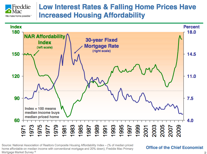
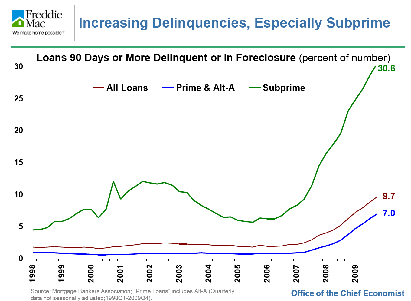
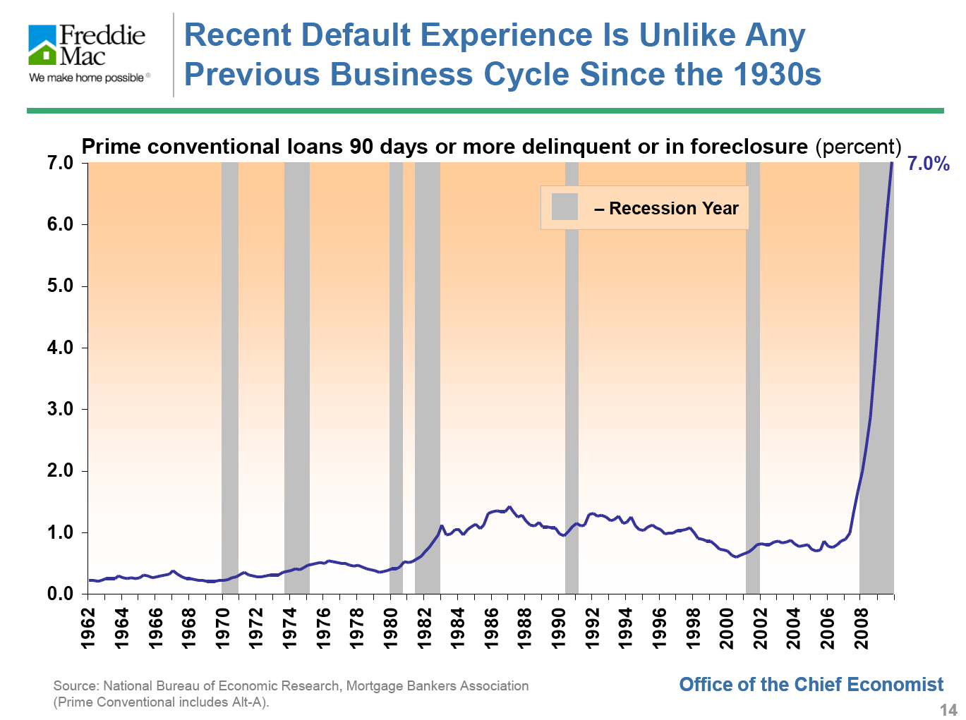
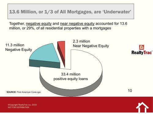
A couple of months ago (gasp!) I promised to post my favorite charts from the UC Berkeley Fisher School of Real Estate and Urban Economics’ symposium on the state of the market. I then got swamped working on my own development project up in Windsor, north of Santa Rosa, and all my blogging came to a halt. Without further ado, here are a few of my favorite charts from the conference. In most cases, I’ll let them speak for themselves.


Related articles by Zemanta
- Here’s Why Jumbo Mortgage Delinquencies Are 50% Above Average And Rising (businessinsider.com)