Update on What $2.1 Million Buys in Noe Valley — (now it’s under $2 million)

Back in February I posted about two $2.1 million homes offered for sale in my ‘hood. 731 Douglass had 3,000 square feet of good, livable space and the sorts of finishes and flourishes  you’d expect.  But it had no back yard and was located on the fairly busy corner of 24th Street and Douglass, with a Muni stop and Noe Valley Courts’ sand-pit within spitting distance of the front windows.

731-douglass-now
731 Douglass

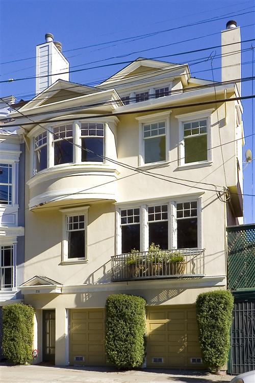
Meanwhile 110 Hoffman, offered at just $2,000 less than Douglass, had a little less space and a vertical, less user-friendly lay-out.  But, location it had in spades, on one of Noe’s best and quietest streets.  Plus it had a spacious back yard with a lovely mature tree.

110 Hoffman
110 Hoffman

My good friend and blogging critic, Mike Dashe  — the American part of the Franco-American wine-making duo who own Dashe Cellars — recently took me to task for not doing what any good story-teller does: tell ’em how it ends.  So here’s the final chapter folks.

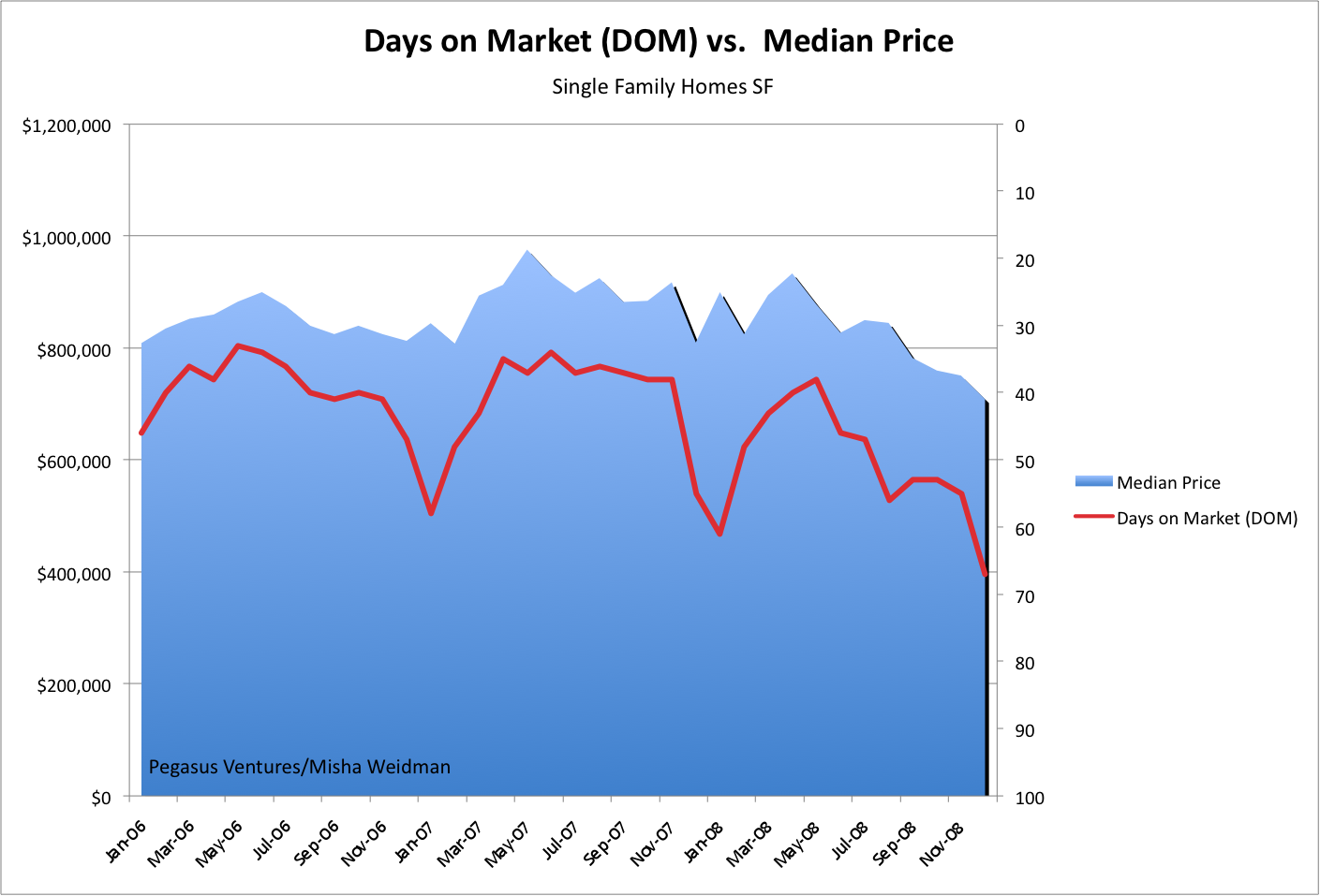
731 Douglass came in first, selling for a respectable $1.85 million, or 85% of the listing price after just 48 days.  Good show!  Though it’s worth noting that this was a cool $100,000 LESS than it sold for back in March 2005, when it was on the market for just 18 days.  (There’s more proof of the correlation between price and DOM — days on market — see my previous post.)

110 Hoffman had a more torturous ride to the finish-line.  Originally listed at $2.395 million, it suffered two price drops and was ultimately withdrawn from the market 102 days later when it failed to sell at $2.148. Fast-forward five months to July and it’s back on the market at $1.995.  And, after falling in and out of contract, and back in —  it sells for….

$1,995,000.  Full list price and all within 10 days if the MLS Database can be believed.

That’s a cool $100k more than 731 Douglass.

What went on here?  I honestly don’t think this was a case of location trumping space.  Instead, it’s about timing.  731 Douglass went on the market in January and sold in March.  Prices generally fall somewhat during winter months.  But much more importantly, does anyone remember how the financial world was coming to an end right at that time? The stock market was dropping like a stone and no one knew where it would end.  (In fact, the S&P 500 hit bottom on March 9.)

I remember when I had the misfortune of putting the first property I ever owned on the market not long after 9/11/01.  I’m convinced that it sold for around $300k less than it would have at any other time.

Seen in this light, it sure seems like the owners (and the agent) of 110 Hoffman made the right decision to bide their time.  A few months later, the sun breaks out literally and metaphorically and things are moving again. Here’s a case where the tortoise beat the hare.

And speaking of odd-looking creatures, let’s get back to Dashe Cellars and their beautiful wines (you gotta try their single vineyard Zins.)  Mike, would you care to explain what’s with the monkey and the, ahem, “whale?”

Picture 5

DOM Roll Please

A couple of posts ago, we dispensed with Absorption Rate as a good barometer of the market since there appeared to be no correlation between how much inventory was available in relation to sales rates and where median prices were going.  I asked whether there might be a different metric that would correlate better, like the oft-quoted Days on Market or “DOM.”

In essence, DOM tracks the average number of days that properties have been on the market from the time they became active on the MLS (Multiple Listing Service used by realtors) to the time they actually sell.

Great minds must think alike because it turns out that my friends over at Inside SF Real Estate have been exploring the same thing.  Head over to their recent post for a look at DOM trends over 14 years.  What they haven’t done, however, is track DOM against median prices.  Ha!  I have, and here are the results for the last three years tracked by month (my numbers are pulled directly from the MLS database  — click to make the chart larger).

dom-chart

Now that’s what I call correlation! Note that the right-hand Y axis tracks DOM inversely, with longer periods at the bottom and shorter periods at the top.  So, this chart is basically showing that during periods, even relatively short periods, when the average DOM falls, prices rise, and when properties stay “on the market” for longer, prices fall.  This is just what you’d expect.

Why?  My guess is that DOM captures many of the factors in play in the real estate market at any given time.  For example, if credit is tight and appraisals are rigorous, you’d expect that transactions would take longer to get approved.  Likewise, if lots of people are bidding on the same house, you’d expect that the winning bidder would promise a quick “no contingency” close and that there would be no haggling on the sale price.  When the market slows, you’d expect more cautious buyers, more haggling on price, longer closing periods — all reflected ultimately in the DOM.

As my friends over at InsideSFRealestate pointed out in their post on DOM, realtors can play games with DOM.  For example, if a property doesn’t sell, they’ll take it off the market, and then put it back on as a “new listing” at a lower price and voila, the DOM resets to zero.  Still, that would just tend to increase the “down” side of the line — the correlation would still hold.

The only other point I’d add is to note the seasonal trend in the chart.  It seems that every December/January, DOM increases and prices dip.  Perhaps that’s the best time to buy.

Absorption R.I.P.

After talking to people about my last post on Absorption Rates and the lack of a correlation between slower absorption and lower median prices (or faster absorption and higher prices), I got the impression that there was some curiosity — skepticism?  — about the underlying numbers.  So I thought a post mortem of sorts was in order.  Here’s a chart that simply tracks total listings and total sales over a little more than the two years covered by the Absorption Rate chart.
on-market-vs-sold

Total listings is defined as new listings plus anything that’s under contract but still  “contingent” in the parlance of realtors.  Total sales is exactly that.  The chart reflects the raw monthly numbers with no averaging.  This really highlights the seasonal fluctations:  ie. the very evident drop-off in activity at the end/beginning of each year.

Other than the seasonal dips, maybe you can conclude that both listings and sales are trending downward, but I sure don’t see any evidence of a major change of direction in either.

A couple of closing thoughts.  My absorption rate conclusions were based on an analysis of single family homes only.  It’s possible that the conclusion would be different if I’d included condos and TIC’s as well.  ie.  Looking at the broader market might change the results.

On the other hand, it’s possible that correlations between absorption and price would appear if we looked at finer segments of the market.  For example, we might find that absorption rates are longer at the high end of the market and that in fact prices have come down as we’d expect for that portion of the market.

Alas, the MLS database that’s the repository for sales information for brokers/realtors simply doesn’t allow you to do this sort of data-mining easily, so we’ll never know.

I stand by my previous conclusions:  First, San Francisco just isn’t that overbuilt a market. Second, if you take out the seasonal fluctuations, the absorption rate doesn’t seem to have moved that much anyway.  Finally, and perhaps most importantly, absorption rate doesn’t tell you how much activity (offers)  each available listing is generating — in the end, just one property gets sold.

The question is whether there are other metrics that do a better job of tracking whether the market’s “hot.”  Stay tuned.