
I’m back! (More on this later….)
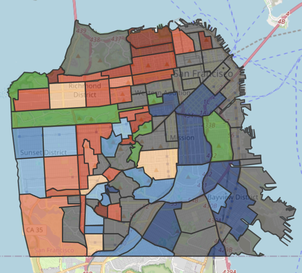
I’m so excited to present this heat map of San Francisco neighborhoods, which I believe may be the first of its kind. I’ve been thinking about this idea for a while: thank you Claude, and a shout-out to my son, too, who helped me bring the coding part of this project to fruition.
Be sure to click on the “fullscreen” button on the map below to expand it. We will get into the qualifications shortly, Continue reading “Winners and Losers: A Heat Map of San Francisco’s Neighborhoods”