The August Case-Shiller Index report released today showed a small home price decline for the 5 counties of the SF Metro Area. Autumn’s numbers will give us a clearer indication as to whether this is the beginning of a flattening or declining price trend or simply the not untypical indication of a summer adjustment from the spring frenzy. PDFs are attached.
Mortgage Interest Rates Just Hit a 16-month Low
3rd Quarter 2014 Market Report
San Francisco House & Condo Values
Which Neighborhoods Dominate Home Sales?
Who Is Buying the City’s Luxury Condos and Why?
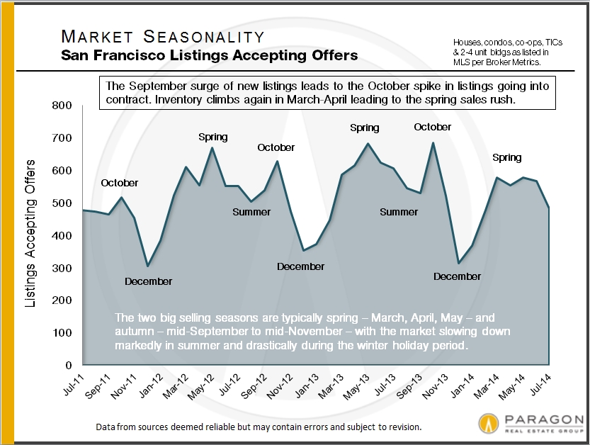
September saw the largest surge of new listings coming on market in the past 2 years, which led to a big jump in deal-making, but data on transactions negotiated in September won’t be available until most close escrow in October and early November. In the meantime, we’ll look at the last 2 quarters.
Median Sales Prices
& Average Dollar per Square Foot
The following 2 charts look at current and longer-term trends in home values. As is common, median house sales prices dropped a bit in the 3rd quarter – this is due mostly to seasonality issues – though condos have held steady for 3 quarters now at $950,000. Dollar per square foot values have continued to increase to new peaks: This metric is particularly being impacted by new-development condo sales, which are breaking dollar per square foot records virtually everyplace they’re being built.
If you wish to drill down on values in very specific city neighborhoods, we recently updated our interactive map, which can be found here: SF Home Price Map
Where Home Sales Occur at What Prices
These 2 charts illustrate where the greatest quantity of house and condo sales occur in San Francisco. House sales are dominated by the districts running along the southwest and south borders of the city, from Sunset-Parkside down to Ingleside and across to Excelsior, Portola and Bayview. These areas are also among the most affordable in the city. With 25% of sales, the South Beach-SoMa-Mission Bay district has the biggest concentration of condo sales: Virtually the only place where high-rise, high-density projects can be built in the city, the latest to begin selling is the ultra-luxury, 656-unit Lumina development. Realtor district 5, the greater Noe-Eureka-Cole Valleys area, sees a large number of both house and condo sales: This area has appreciated ferociously since the early 1990’s.
Note that the median sales prices delineated on these charts combine neighborhoods of differing values and are generalities for the larger areas described.
Besides the neighborhoods in the chart above, the Lake Street, Sea Cliff and Jordan Park area had 35 house sales in the past year and a median sales price of $3,000,000 over the past six months, and Potrero Hill had 34 house sales and a median price of $1,460,000.
Who Is Buying San Francisco’s Luxury Condos & Why?
A report just published by 48HillsOnline analyzed the SF Assessor’s Office owner mailing records for 23 condo buildings comprising 5212 units, most built in the last 10 years and/or qualifying for the description “luxury real estate.” It found that 39% of owner mailing addresses were not those of the property, with percentages over 50% for ultra-prestige buildings such as the St. Regis, Four Seasons and Millennium – some of the most expensive real estate west of Manhattan. The article’s basic thesis is that building condos for the rich to use as second or third homes does virtually nothing to alleviate the city’s shortage of housing. Without agreeing with their conclusion, the analysis does confirm an interesting insight, i.e. the city is increasingly becoming a destination for wealth, as well as a location for the creation of new wealth.
As to the article’s anti-development case: First of all, 61% of owners appear to be owner-occupiers – working professionals, empty nesters, famous ballplayers and so on – and are clearly helping to address local home-buyer demand. Of the 39% with different mailing addresses, there may be a number of explanations: 1) units are indeed being used as second homes or pied e terres by the ultra-affluent who like to visit the city (and spend money in the local economy), 2) the units are being used as investments by local or, often, foreign buyers: to buy and hold, as long-term rental properties (which help alleviate the housing shortage), or as short-term Airbnb type rentals (which don’t), and 3) units are being occupied by dependents, such as children attending college. It’s also possible some mailing addresses are for services handling financial matters for owners.
Additionally, it’s true that developers of these condo projects, under city law, must build a certain number of affordable housing units or contribute funds to do so. Last but not least, the sale and ownership of these high-end condos contribute huge sums to the county’s transfer tax and property tax revenues, which help support city services.
Home Listings Selling over Asking Price
Average Days on Market
This next chart illustrates three points: 1) the remarkable heat of the city’s real estate market as buyers bid up home prices, 2) how seasonality impacts demand – with spring and autumn being the big, highest-demand, selling seasons, and 3) because of supply issues, the SF house market is somewhat hotter than the condo market (though it too, by any standard, is very hot).
Remember that because of the time lag between listings coming on market and offers negotiated, and the actual close of escrow – upon which these statistics are based – September’s market is not reflected on these charts.
Days on market statistics still indicate a high-demand market and, again, that the house market is a bit hotter than those for condos and TICs. New condo development is helping to meet buyer demand, while new house construction barely exists in San Francisco. TIC sales, whose numbers have been dwindling in recent years, are impacted by a number of legal, political and financing issues.
San Francisco Employment
We recently illustrated our report on the main factors behind our market, charting employment, seen below, city population, city rents, interest rates and the S&P 500. Taken together, one clearly perceives the inter-connectedness between them and with SF home price trends as well. The full report, with all the new charts, is here: 10 Factors behind the Market
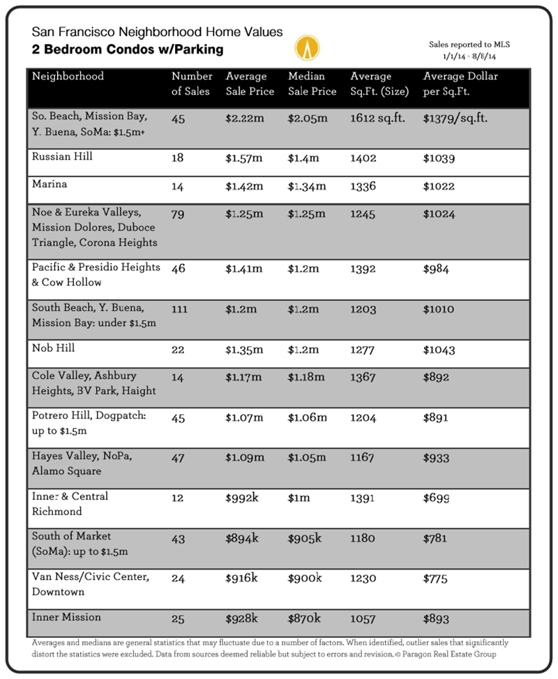
Neighborhood Snapshots
If you’d like information on home-value trends for other property types or other neighborhoods than shown below, please let us know. We cover all of them.
Case-Shiller sees small drop in Bay Area home prices in July – 3 charts included
The S&P Case-Shiller Home Price Index for July 2014 was released today, and indicated a small – less than 1% – dip in high-price-tier houses. (The Case-Shiller aggregate Index for all Bay Area home price tiers dropped even less, about 4 tenths of a percent.)
For the past 3 years, home prices have surged in the spring and then plateaued during the summer. It is too early to speculate whether home prices are trending down a bit after the spring market frenzy, which is certainly possible. For any definitive sense of home price trends, we will have to wait until the autumn-selling season numbers are in. Autumn this year began with a big surge in the number of new listings in September.
Remember that the C-S Index covers not just San Francisco, but 4 other Bay Area counties and is a 3-month rolling average. San Francisco makes up a very small part of all the house sales being surveyed by the Index and C-S home prices reflect offers negotiated in previous months – thus the June 2014 peak reflects the heat of the market in the heart of the spring 2014 selling season.
The last 13 months, July to July:
The small dip in July 2014 from the spring peak can be seen. Small fluctuations up and down are not particularly meaningful until substantiated by longer term data.

Since the recovery began in earnest in early 2012.
One can see the two previous summer price plateaus (and, now perhaps the beginning of a third) after spring surges:

Longer-term overview of real estate cycles:

Updated S&P Case-Shiller Home Price Index for San Francisco Metro Area
The Case-Shiller Index for the San Francisco Metro Area covers the house markets of 5 Bay Area counties, divided into 3 price tiers, each constituting one third of unit sales. Most of the San Francisco’s and Marin’s house sales are in the “high price tier”, so that is where we focus most of our attention.” The Index is published 2 months after the month in question and reflects a 3-month rolling average, so it will always reflect the market of some months ago. June’s Index was released on the last Tuesday of August.
The 5 counties in our Case-Shiller Metro Statistical Area are San Francisco, Marin, San Mateo, Alameda and Contra Costa. Needless to say, there are many different real estate markets found in such a broad region, and it’s probably fair to say that the city of San Francisco’s market has generally out-performed the general metro-area market.
The first two charts illustrate the price recovery of the Bay Area high-price-tier home market over the past year and since 2012 began, when the market recovery really started in earnest. In both 2012 and 2013, home prices surged in the spring and then plateaued in the summer-autumn. The surge in prices that occurred in spring of 2013 was particularly dramatic, reflecting a frenzied market of huge buyer demand, historically low interest rates, increasing consumer confidence and extremely low inventory. In San Francisco itself, it was further exacerbated by an expanding population and the high-tech-fueled explosion of new wealth. The market then calmed down somewhat in the second half of 2013, but then heated up yet again in early 2014. In fact, the spring 2014 market was, if anything, even more ferocious than last year’s. Typically, the market cools off for the summer months and that is what we are starting to see in the Case-Shiller numbers (which, again, are some months behind the current market). The next big indication of market trends will come after the autumn selling season begins in mid-September.
For more regarding how seasonality affects real estate: Seasonality & the Real Estate Market
Case-Shiller Index numbers all reflect home prices as compared to the home price of January 2000, which has been designated with a value of 100. Thus, a reading of 198 signifies home prices 98% above those of January 2000.
Short-Term Trends: 12 Months & Since Market Recovery Began in 2012
Longer-Term Trends & Cycles
The third and fourths charts below reflect what has occurred in the longer term (for the high-price tier that applies best to San Francisco and Marin counties), showing the cycle of recession, recovery, bubble, decline/recession since 1996, and since 1988. Note that, past cycle changes will always look smaller than more recent cycles because the prices are so much higher now; if the chart reflected only percentage changes between points, the difference in the scale of cycles would not look so dramatic.
Different Bubbles, Crashes & Recoveries
This next chart compares the 3 different price tiers since 2000. The low-price-tier’s bubble was much more inflated, fantastically inflated, by the subprime lending fiasco – an absurd 170% appreciation over 6 years – which led to a much greater crash (foreclosure crisis) than the other two price tiers. All 3 tiers have been undergoing dramatic recoveries, but because the bubbles of the low and middle tiers were greater, their recoveries leave them well below their artificially inflated peak values of 2006. It may be a long time before the low-price-tier of houses regains its previous peak values. The high-price-tier, with a much smaller bubble, and little affected by distressed property sales, has now exceeded its previous peak values of 2007. Most neighborhoods in the city of San Francisco itself have surpassed previous peak values by substantial margins.
It’s interesting to note that despite the different scales of their bubbles, crashes and recoveries, all three price tiers now have similar overall appreciation rates when compared to year 2000. As of May 2014, as seen below, appreciation for all three tiers since 2000 ranged from 93% to 97%. In June (not shown below), this range narrowed further to 96% to 98%. This suggests an equilibrium is being achieved across the general real estate market.
Different counties, cities and neighborhoods in the Bay Area are dominated by different price tiers. Bay Area counties such as Alameda, Contra Costa, Napa, Sonoma and Solano have large percentages of their markets dominated by low-price tier homes (though all tiers are represented to greater or lesser degrees). San Francisco, Marin, San Mateo and Santa Clara counties are generally mid and high-price tier markets, and sometimes very high priced indeed. Generally speaking, the higher the price, the smaller the bubble and crash, and the greater the recovery as compared to previous peak values.
Remember that if a price drops by 50%, then it must go up by 100% to make up the loss: loss percentages and gain percentages are not created equal.
The two “2014″ readings for each tier in the chart below, refer to January 2014 and May 2014.
San Francisco County
And then looking just at the city of San Francisco itself, which has, generally speaking, among the highest home prices in the 5-county metro area (and the country): many of its neighborhoods are now blowing past previous peak values. Note that this chart has more recent price appreciation data than available in the Case-Shiller Indices. This chart shows both house and condo values, while the C-S charts used above are for house sales only. Median prices are affected by other factors besides changes in values, including seasonality, new constructions, inventory available to purchase, and significant changes in the distressed and luxury home segments. Short-term fluctuations are less meaningful than longer term trends.
And this chart for the Noe and Eureka Valleys neighborhoods of San Francisco shows the explosive recovery seen in many of the city’s neighborhoods, pushing home values far above those of 2007. San Francisco, San Mateo and Santa Clara counties are most effected by the high-tech wealth effect on home prices. Noe and Eureka Valleys are particularly prized by this buyer segment and the effect on prices has been astonishing.
Seasonality in the San Francisco Homes Market
August 2014 Report by Paragon Real Estate Group
Seasonality typically affects inventory levels, buyer demand and median home prices, often in significant ways – as is illustrated in the following charts. However, it is not the only factor affecting market conditions and trends – general economic conditions, new construction projects coming on market, sudden changes in interest rates, stock market IPOs, natural and political events, and other factors can and do impact the market as well. It should also be noted that new listings and new sales occur every month of the year – and sometimes, depending on prevailing market conditions and the specific property, buying or selling during the slower periods can be the smart strategy.
The devil’s always in the details, and the details of the market change constantly. Still, there is a typical ebb and flow to the level of activity in the market that correlate with seasonality, and that is what this report explores from a variety of angles.
——————————————–
Without inventory, there is no market. These first 3 charts show the classic effects of seasonality on supply and demand.
As seen in this next chart, the higher-price end of the market is usually more affected by seasonality that the general market. Among other effects, this will usually raise the median sales price during the peak spring and autumn selling periods, and lower them in the slower periods of summer and mid-winter (as delineated in the final chart). Note: In the chart, the changes up and down in sales are plotted based upon the sales of January 2013 equaling a base line of 100. This is a very approximate illustration, because of other factors that affect the analysis, though we do believe it reflects the market reality.
This final chart illustrates both the rapidly appreciating real estate market since 2012 and the shorter term ups and downs that seasonality can play in median home prices. Of course, in an appreciating or depreciating market, there are usually other factors impacting median sales prices as well – as always, what is most meaningful is the longer term trend in home prices, not short-term fluctuations.
Bay Area Home Price Report
Bay Area Real Estate Values
Bay Area Luxury Home Sales
San Francisco Home Prices by Neighborhood
August 2014 Report by Paragon Real Estate Group
————————————————————
Bay Area Home Prices – Mapped
Our updated map of comparative house values around the Bay Area: The trend virtually everywhere around the Bay has been continued appreciation since the recovery began in earnest in early 2012. Please note that median sales prices and average dollar per square foot values are statistical generalities that may fluctuate for a number of reasons.
————————————————————
Bay Area Luxury Home Sales
Luxury home sales have soared all around the Bay Area, but are concentrated most in the 3 counties most affected by the high-tech wealth boom – Santa Clara, San Mateo and San Francisco – as well as Marin, which has been a very wealthy county for a long time. In San Francisco, condos and co-ops make up a significant percentage of high-end sales (and generally achieve the highest dollar per square foot values), but in other counties, the luxury segment is comprised almost exclusively of houses, estates and, in the wine country, ranch/vineyard estates.
As a point of context, Santa Clara is the most populous Bay Area county with about 1,875,000 residents; then come Alameda (1.58m), Contra Costa (1.1m), San Francisco (835,000 residents, about 60% of whom are renters), San Mateo (750k), Sonoma (500k), Marin (260k) and Napa (140k). As a percentage of total sales, homes selling for $2,000,000 and above make up about 13% of Marin’s market, 11% of San Francisco’s, 10% of San Mateo’s, 7% of Santa Clara’s, 5% of Napa’s, and under 2% in Sonoma, Contra Costa and Alameda Counties. Solano had no home sales over $2m reported to MLS during this period.
Of course, $2,000,000 will buy you a lot more in some counties and neighborhoods than in others. The devil’s always in the details – and this is only a broad brush overview.
————————————————————
San Francisco Home Prices by Neighborhood
Below are 2 of 8 updated tables breaking down the city’s 2014 YTD sales by neighborhood, property type, bedroom count, median and average sales prices, and average dollar per square foot value. Each table is in order of median sales price.
All 8 tables can be found online here: San Francisco Home Values.
New Case-Shiller report: new jump in Bay Area home prices
The new S&P Case-Shiller Home Price Index for April 2014 came out today and it showed another bump in home prices for the 5-county San Francisco Metro Statistical Area. For homes in the upper tier of home values – as most of San Francisco’s are – prices are up approximately 17% in the past 12 months and up 41% since the recovery began in early 2012.
Based upon what we are seeing on the ground in the market, we expect another bump in the May Index, which will come out at the end of July.


