Now hold on there, matie! Basic economic theory says more supply than demand, prices will fall, right? Well take a look at this graph. It shows the absorption rate of single family home listings from January 2006 through December 2008 plotted against median prices (click to make it bigger):
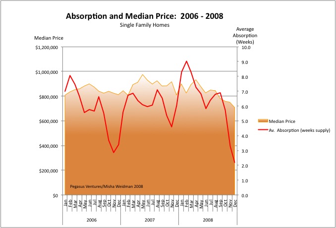
“Absorption” is basically the number of weeks it would take to sell all the homes available on the market based on the number of homes that are selling at that time. (I’ve tweaked the formula to diminish the spikes caused by the huge seasonal dropoff in new listings each December/January.) There are many ways to calculate absorption, but the basic idea is simply to capture how quickly demand is eating supply. Less time to absorb the supply should reflect a “hotter” market where sellers can demand top dollar. A higher absorption rate, on the other hand, means that there’s relatively more listings on the market than demand for them. That would tend to suggest a buyer’s market and softer prices.
In the chart above, we’d expect to see median prices rising when the Absorption Rate line falls and median prices falling as the Absorption Rate line rises. ie. an inverse correlation.
Well, I’ve looked at this chart long and hard and I just don’t see those lines moving that way at all. In fact I’ve looked at similar data as far back as 2002 and the only thing that’s clear is that people forget about buying or selling a home at the end of the year. Look at 2006: the market got tighter but prices stayed pretty flat. In 2007, stuff was being absorbed more slowly (the red line goes up), but prices went up anyway. In 2008, you’d think that with only two weeks of supply available, home prices would be skyrocketing. Obviously that aint happenin’.
I’m not an economist or a statistician, but I did get my dear wife, who eats statistics for breakfast, to check my methodology. I think these results are quite counter-intuitive. Here are the explanations I can think of. Please chime in with your own:
- If you cut off the peaks and troughs, the Absorption Rate mostly stays within a band of around 4 to 7 weeks. That suggests that supply/demand in San Francisco is actually pretty stable. And that in turn suggests that something else must be driving prices. Note, for example, that my chart doesn’t reflect the number of offers that are made on any particular house. There might be 10 offers on a house, but at the end of the day just one house gets sold. Anyone who was playing during the frenzies of 2005 – 2007 doesn’t need to be told how multiple offers affect price, but that sort of demand isn’t reflected in an absoprtion rate.
- Relatively speaking, San Francisco is not a stressed market. Supply/demand is not hugely out of whack. Foreclosures are not piling up (yet). Under these circumstances, prices are “sticky.” They don’t react quickly to changes in demand. If people don’t get the price they want, what do they do? They don’t sell unless they really have to. And SF home-owners tend to be people who don’t have to sell. More on this in another post.
- The price increases of the last few years and their recent tumble may are probably most directly attributable to one thing, pure and simple: easy money. That aint gonna show up on this graph either.
Conclusion: “Absorption” isn’t a good measure of supply/demand.
So is there any other metric that correlates more closely with changes in price? How about the famous “DOM” — Days on Market. This is how long a property takes to go from being listed to being sold. The theory goes that when properties sell quickly the market is “hot.” Why do properties sell quickly? Probably because … there’s more demand than supply. ie. More people making offers, more people getting the loans they need, more people willing to waive inspection contingencies and buy “as is” just to get the deal done. So maybe DOM actually does capture those muliple offers where the Absorption Rate just doesn’t.
So will DOM tell us how “hot” the market is and where prices are headed? Or is DOM dumb. Stay tuned….


