

Your correspondent has been hard at work wrestling with a database with nearly 40,000 sales going back to pre-pandemic January 2019. Full disclosure: Claude has been my constant side-kick to analyze and deep-dive the data in ways I would never have been able to do before. Conclusions and writing remain my own.
As promised in my last newsletter, here’s a heatmap — actually two — comparing price changes in the condo market between the 6-month period right before the COVID pandemic lockdown in March 2020, and the 6-month period ending in mid-July 2026. (Note these are best viewed on your computer screen, not a mobile device; click on the “full screen button” for the best experience.)
Why these two periods? Because I wanted to see to what extent the city’s condo market has recovered from the exodus that followed the COVID pandemic. It’s well documented that the exodus hit the condominium market hard and the Downtown/SoMa area particularly hard. And there’s been lots of talk of “recovery.” So where are we today?
The first chart above compares median sales price for the two periods; the second compares median sales price per square foot. At a glance, the Sales Price Heatmap simply reveals much more color variation, with a mix of up (red) and down (blue) subdistricts. This is especially so in the Downtown/SoMa area that’s outlined in navy blue.
If you look at the Price Per SF Heatmap, the Downtown/SoMa area is uniformly blue — ie, down on a price per sf basis. Areas outside of Downtown/SoMa also have some notable differences. Northern downtown waterfront neighborhoods shift from largely deep red (significantly up) in the Sales Price Heatmap to pale red and mostly pale blue (slightly up or down) in the Price Per SF Heatmap.
Why do the two heatmaps disagree — and why does it matter?
“Median sales price” is probably the most oft-quoted metric for how a market is doing. If you looked simply at the Sales Price Heatmap you might conclude that parts of Downtown/SoMa have recovered since COVID — the Financial District up 80%, Yerba Buena and South Beach modestly positive. Areas directly north of there also up significantly: Telegraph Hill, for example, up 52.6%.
But you’d be wrong, and I’m going to get geeky here: the hidden culprit here is that there’s been a change in product mix from one period to another. The reason why the Financial District/Barbary Coast’s median condo price rose 80% was because the typical unit that sold changed. It went from 883 square feet to 1,336. The median price per square foot actually fell 7%.
And with only 9 sales in the 2020 period and 11 in the 2026 period, the thinness of the sales numbers makes it even easier to end up with eye-popping numbers like an 80% increase.
To be clear, thin data is never a good foundation for good statistics and it’s a challenge I struggle with when trying to strike a balance between granularity and reliability. Hence the number of gray neighborhoods in these heatmaps: plenty of neighborhoods in SF just don’t have a lot of condo sales, period. And if I’d set the minimum above 5 sales, the map would have gotten grayer still.
What the Price Per SF Heatmap Says about Downtown/SoMa Condos
First, let’s be clear: everything here is the long-run picture since COVID, not what’s happened lately. I’ll get to recent months in my next post — teaser: things are looking up.
The entire Downtown/SoMa area is down. Every single subdistrict. Not down on average, not down in most places — all eight of them, from South Beach at the shallow end (−1.2%) to Van Ness/Civic Center at the deep end (−23.5%). There’s no ambiguity to interpret here and no bright spot to point at.
And here’s the bottom line for Downtown/SoMa as a whole: it’s down 15.3% since October 2019 — roughly its pre-pandemic peak — when the trailing six-month median hit $1,189 per square foot. Today it’s $1,007.
What the Price Per SF Heatmap Says about “Neighborhood Condos”
What about the residential neighborhoods outside the Downtown/SoMa area? Looking at the heatmap, many of the northern neighborhoods typically identified as “luxury” (think Pacific and Presidio Heights, the Marina, Cow Hollow, etc.) are showing positive (red). Other residential neighborhoods are either mixed or down. For example, the quadrant north of Downtown/SoMa (Russian, Nob, Telegraph Hill, North Beach, Waterfront) is showing a mix of slightly up and slightly down. The neighborhoods immediately south and southwest of Downtown/SoMa (including Inner Mission, Hayes Valley, Potrero Hill) are almost uniformly down (blue).
So does the heatmap show another example of the K economy at work?
On its face it looks like the heatmap is showing a K economy in action, but is it really? In 20 words: No, but there is a K economy for condos as well; it just does not show up on a heatmap. And I’m going to spare you having to reading 500 words of explanation why and put it as succinctly as I can: when you strip out the thin data, the change in mix data, and the weird data (Noe Valley up, Eureka Valley/Dolores Heights right beside it down), there just isn’t any clearly observable pattern that shows condos appreciating significantly more in luxury neighborhoods than outside out them.
And this makes sense: In Pac Heights, for example, sure you have your mansions on Broadway and Jackson, but the neighborhood has a huge mix of property types, from grand Art Deco buildings, some of which comprise condo/coops and others of which hold rental units, to smaller multi-family buildings, mid-rise apartment buildings and your merely expensive single family homes. The mix is borne out in the numbers too: Pacific Heights condo sales in the 6 months ending in July 2026 ran from $525,000 to $8,000,000, $460 to $3,033 a square foot, and a third of them sold below the citywide median condo price. Only 30 of its 107 sales made the top decile.
To be sure, Pacific Heights does have the largest number of luxury condominium sales, but what defines them is not geography but price. If you define “luxury condominium” as the top 10% most expensive sales, the neighborhood with the next highest number of sales is…South Beach — ie., in the Downtown/SoMa corridor (chart below).
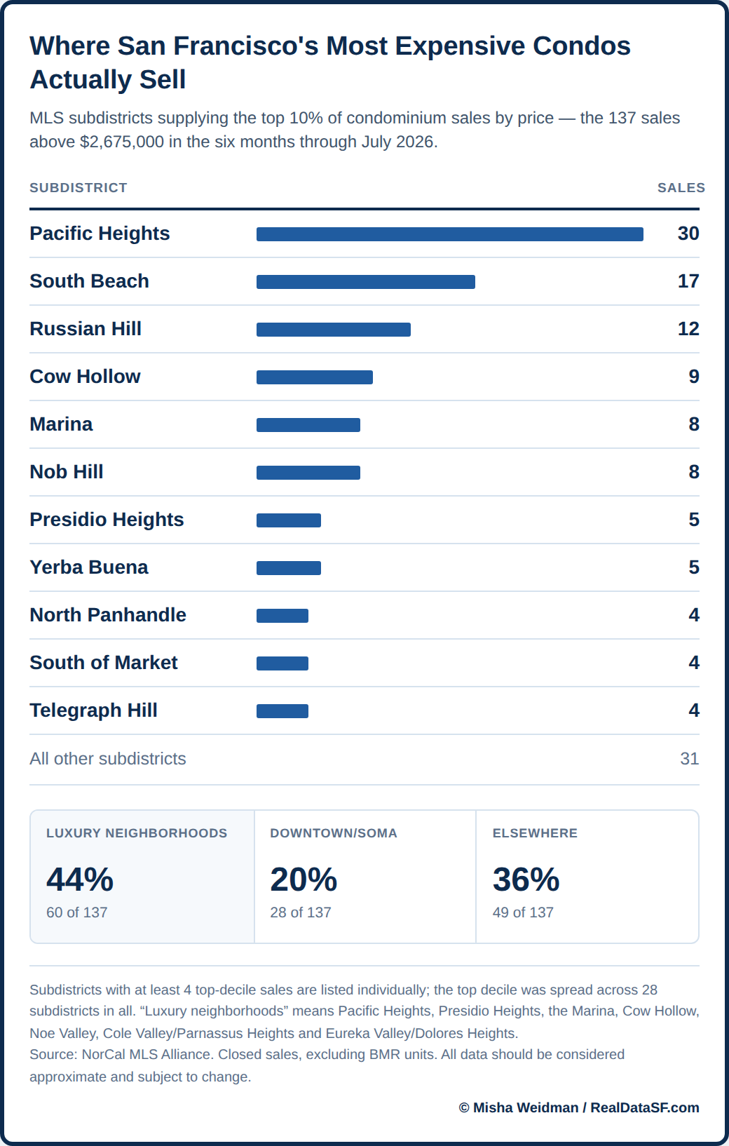
Again, we can argue about which neighborhoods are “luxury” and which aren’t, but however you cut it, the above chart shows that 56% of them sold outside of what I’ll call SF’s “core” luxury areas. (Note for the pickiest of readers: the analysis comes out the same or slightly stronger when I ran this analysis on price per square foot basis.)
The K Economy Re-Emerges
Now here’s the kicker, once you define a luxury condo by price rather than by geography, a K-economy picture actually does emerge. The chart below separates condo sales into their price percentiles for each 6 month period we are covering. Look at how well the top of the market did compared to the bottom!
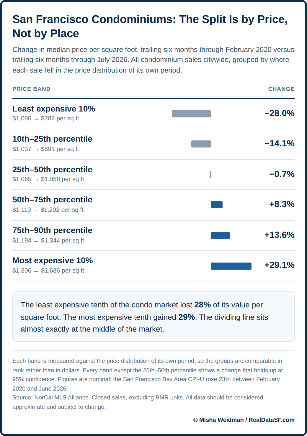
The most expensive and least expensive decile almost exactly mirror each in gains and losses respectively. The rest of the spread hinges around the 25th-50th percentile, with the bands above it increasing in price and those below it decreasing in price. One important note: I said “price” not “value.” These numbers don’t reflect inflation during the same period (noted on the chart), but real estate prices are usually quoted nominally anyway.
This has perhaps been my data-geekiest post ever, and I want to thank those readers who stayed with me to the end! To be honest, I thought heatmaps would visually clarify the story — and in a way that hadn’t been done before. It largely worked for single family homes, because single family homes are reasonably homogeneous within their respective neighborhoods. It turns out that condominiums are not, and that complicates the picture considerably.
As always, your questions, comments and suggestions are much appreciated! And if you have any idea for a blog post, get in touch and let me know!