That’s Bernal with an “A”.

bernal09

I’ve been making the case recently that SF’s enormous run-up in prices has caused formerly overlooked or “B” neighborhoods to suddenly become the latest battlegrounds in the bidding wars. The reasons’s simple: with more and more people priced out of their first choice neighborhoods, they are increasingly moving on to their second and even third or fourth choices.

Bernal Heights has always had its charms — fine weather, great views, and pretty good freeway access, depending on where you are. But, with its wicked-narrow streets and generally modest housing stock, it’s often been seen as the poor cousin to Noe Valley or even Potrero Hill.

Not any more, apparently. According to this recent article at SFGATE, Bernal Heights was just picked as THE hottest neighborhood in THE COUNTRY, according to Redfin, the national real estate brokerage company. They based their findings on such metrics as how often their users saved Bernal Heights homes to their “favorites” list, how often the area was searched, etc. That sort of attention has resulted in a median sales price increase of 38.2%, according to Redfin. Our own numbers come in at a more believable 20.3% change for the average home price.

Bernal Heights

Still, there’s no doubt that Bernal Heights has finally “arrived” as a neighborhood.

So from now on, spell Bernal with an “A.”

Real Data SF January 2014 Newsletter: The 2013 Real Estate Wrap-Up

1

Photo courtesy of  loicphoto.com

San Francisco Bubbles

Happy New Year one and all!  While much of the rest of the country was just beginning to come out of its long recessionary swoon, our little piece of heaven enjoyed its second full year of a booming sellers’ market, fueled in no small part by what appears to be a decisive shift in venture capital to our local zip codes.  Those much-despised Goo-hoo buses are no accident.  Take a look at this instructive chart from an August 2013 piece in The Atlantic entitled “Why San Francisco May Be the New Silicon Valley”:

2

The Atlantic, August 5, 2013

Add to those sparkling … er, bubbles… SF’s home-grown biotech and medical innovation companies, a resurgent financial sector, and several years of pent-up demand, and it’s no surprise that the Urban Land Institute placed San Francisco at the top of its list for places to invest for the second year in a row.  (You can download the full ULI report here.)

Taking Stock

Let’s begin with some perspective.  What does the San Francisco real estate market really look like?  Our venerable market guru put together this chart from a number of sources.

3

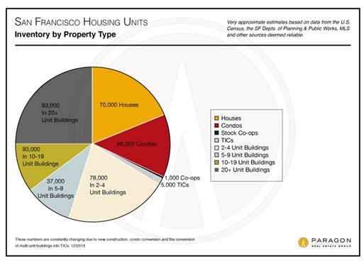
The numbers are approximate, but the chart shows that there are only about 125,000 housing units that are owned rather than rented.  That’s less than a third of SF’s total stock of around 425,000 units. Is it any wonder that renters are such a powerful force in San Francisco?

What People Bought

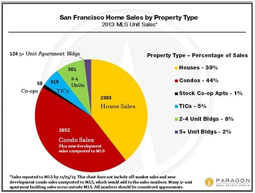
Now let’s look at what people bought last year.  The chart below shows that around 5,000 homes and condos traded hands, with condos leading the way by a few hundred units.  (These numbers don’t include “off-market” sales and sales of condos in new buildings, which sometimes are not reported through the MLS.Only 320 TICs changed hands.

4

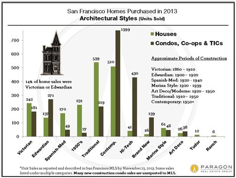
As you’d expect in San Francisco, the vast majority of homes sold were built pre-1950, if not pre-1940.  For condos it’s the reverse.  What’s telling in both cases, however, is how little “brand new” construction there is, especially for single-family homes.There were just 16 sales of “brand new” homes reported through the MLS last year. It’s no wonder, then, that these homes fetch a premium.

5

You can find much more detail about what people bought in 2013, from average house size by neighborhood to the views they saw out their window, here at my blog.

Where?

Where did the sales occur?  Around 20% of all home sales were in District 10, a large geographic area of economically modest neighborhoods that fared the worst during the housing crunch.  By contrast only around 5% of home sales occurred in the toney northern districts that include the Heights and the Hills.    As a result, median home values for the city as a whole are likely to be skewed to the lower end of the scale.

6

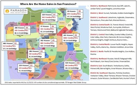
For the rest of the city, the map shows sales pretty much occurring where you’d expect them to:  lots of condos downtown and South of Market; lots of single family homes in areas like District 4 with its “Terrace” neighborhoods (Ingleside, Balboa) dating back to the 1920’s; a mix in District 5, which includes the always popular Noe and Eureka Valleys and the Castro.

How Much?

City-wide, 2013 saw home and condo prices definitively exceed the pre-bust highs they’d reached in late 2007/2008.  There was a rapid run-up in the spring and summer, with a slow-down later in the year.  Some of the slowdown is undoubtedly seasonal; from what I’ve seen so far this year, there are a lot of people still chasing a very limited supply.

7

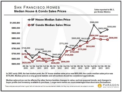
What these city-wide numbers don’t capture, however, is the huge rebound at the top end of the market.  If you define “luxury homes” as those selling for $2 million or more, that segment took off like a rocket at the start of 2012. I’d argue that this is where you see the effect of all those start-up upstarts that are now living and working in SF.

8

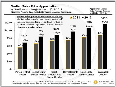
And I believe that the top end is pulling the rest of the market up with it.  As more and more people are being priced out of their first choice, other neighborhoods formerly perceived as less desirable are crashing through their previous price ceilings. One example:  Glen Park, a perennial second fiddle to Noe Valley, is suddenly studded with $2 million homes. Here’s a look at how a few neighborhoods have done.

9

For a comprehensive analysis of other neighborhoods and segments, take a look at the full 2013 wrap-up posted on my blog, where you’ll find no less than 17 charts.

The Crystal Ball

The economic news certainly seems more positive than it was a year ago.  Even if (I should say “when”) the Fed stops printing money and interest rates go up, people smarter than I am have said that it will likely have a minimal impact on the stock market.  The new high-rises that we see being built all over the city aren’t going to be online anytime soon and not everyone wants to live in a dowtown condo anyway.

The bottom line is that it’s hard to see any serious risk of a downturn in real estate values in the coming year.  What may happen, though, is that we will reach something of a plateau where prices stabilize for a while.  Have we reached that point yet?  Probably not. I’d say this sellers’ market  has a ways to run, albeit at a less frenzied pace.

As always, your comments and suggestions are much appreciated.  Please forward this email to anyone you think would enjoy reading it!

Twitter’s Tweet not so Sweet

Technology_Boom_Breeds_Hostility_-_Slide_Show_-_NYTimes-com
Today’s NY Times front page article on the effect that San Francisco’s tech boom is having on economic diversity in SF is tough reading for those of us who earn a living in real estate. Who wants to read that a 98 year old woman is being evicted from her rent-controlled apartment or that a founder of Galeria de La Raza and his partner, who is battling cancer, are being evicted from an apartment that they’ve occupied for decades?

Continue reading “Twitter’s Tweet not so Sweet”

Real Data SF October Newsletter: Own or Rent?

1

Own or Rent? Your Home as an Investment

This month I want to bring together two recent analyses we’ve done on home ownership. The first looks at whether homes are good long-term investments. During the heart of the economic winter, in April 2010, I argued in this post that there are better investments than buying a home. Rather, the almost universal urge to own a home is about satisfying our hard-wired need for “shelter” – a cave that’s secure from marauding creatures (and humans), where we can paint our dreams on the walls without worrying about the landlord.

I still think that’s true, despite the housing recovery and the positive effect that it’s had on long-term home price appreciation. Here’s a chart direct from Freddie Mac that shows long-term national home price appreciation.

Note that this summarizes nominal and real (inflation adjusted) annual rates of growth (and decline) in the national housing market. This next chart shows what’s going on closer to home in the Bay Area market, using Case-Shiller’s high tier home value index, which tracks homes valued in the top third – currently around $800,000. There aren’t too many neighborhoods in SF where you’ll find a home selling for less than that.

The takeaway here is that nominal home prices have increased 244% since 1988 — or about 5% annually — while inflation has gone up by 97% — or a little less than 3% annually. In essence this simply confirms the common wisdom that holding real estate over the long term is a good inflation hedge because property values go up more than the rate of inflation.

But this analysis assumes that you’re buying a house for cash – which few of us are able to do. Rather, we use debt, thus “leveraging” our investment. So if we put 20% down on a home worth $1 million, any increase in the home value results in a five-fold increase in our equity. The magic of leverage!

Looked at this way, homes start looking pretty good as an investment. Based on a long-term home price growth rate of 3%, our actual equity investment would be increasing by 15% annually assuming we’ve put 20% down.

And this doesn’t include the additional equity building up in our home as we pay down the debt, not to mention all the psychological benefits of being able to draw pictures of mastodons on your home’s walls. For a complete discussion of homes as an investment, take a look at our Chief Economic Guru’s article, posted here.

The inevitable corollary to this analysis is whether it’s better (read cheaper) to rent or buy your home. There are a lot of rent vs buy calculators out there. It’s important to be clear about what each of them is comparing. This one, by the New York Times is one of my favorites. (Be sure you go into the advanced settings to input things like your tax rate and expected annual home appreciation.) It essentially compares your total after tax cash outlay on renting vs. buying and determines when you “break even.” That is, when the total cash outlay on buying is less than that on paying rent every month.

This one, available at Paragon’s website, focuses on investment returns though you can also use it to calculate a cash outlay break even point. (Note – Mac-users may have difficulty with the Java applet the site uses.)

Say you decide to rent. You dump the money you could use for a down-payment on a house into the stock market or bonds instead and get a return on that investment. Now compare that to how that same amount of money would grow if you invested it in a house. We used the Paragon calculator to do a rent vs buy comparison on a typical 3 bedroom home in SF. We assumed the home would rent at $4,500 per month and would sell at $1,050,000. We also assumed a 20% down-payment, a loan at 4.5% and 4% annual price appreciation (1% less than the long-term rate we discussed above). Here’s a screenshot of the result:

Conclusion: Viewed an investment, you’d be better off buying a house after 1.5 years than sticking your cash for the down payment in an investment yielding 2.5%.

Now, my main quibble with this analysis is that 2.5% seems too low a return on an investment alternative to home ownership. But even if you increase the return to, say, 7% — more in line with a safe stock portfolio – a home is still a better investment after 1.9 years. Such is the magic of leverage!

As always, comments, criticisms, and kudos always appreciated!

Misha