
It’s hard to find much cause for hope these days. The headlines tell us every day about tectonic shifts in our economic landscape. We read about layoffs spiraling into the millions, major institutions crumbling, government bail-outs of unprecedented proportion. Just one example of the doom and gloom: David Brooks on today’s NY Times Op Ed page, describes the situation as a psychological crisis rather than an economic one, a crisis potentially so bad that no amount of money thrown at the problem will fix.
In this media-driven echo chamber, it’s hard to hear many sober, let alone optimistic, voices. Dr. Jim Smith may be one such. He was the keynote speaker at a major builders’ trade show in mid-2007 and accurately predicted both the looming recession – though not its depth – and a Democratic win as a result.
His current prognostications are less dire than most. According to an article in today’s Wall Street Journal, he sees GDP of 4% by year’s end. There’s no more than a one line quote in the WSJ, but I was able to find more details in an economic forecast he wrote at the end of 2008 in his capacity as Chief Economist for the wealth-management (the latest oxymoron?) firm, Parsec Financial. (Smith is also a professor at Western Carolina University’s Institute for the Economy and the Future) and a former co-chair of the European Council of Economists.)
Here are a few highlights. You can download his full forecast here.
• The unemployment news is bad and is likely to get worse, but oft-quoted comparisons to earlier periods like after World War II are misguided because the national economy is so different. The unemployment picture should start turning around in a few months.
• Like Brooks, he sees a huge crisis of confidence underpinning this melt-down, just as it has underpinned other financial crises. Here’s the takeway: Historically, when huge resources are thrown at financial panics, three things have always happened: The panic stops; stock markets boom; and the real economy soars.
• Things to look for to signal a turnaround: an upturn in housing starts, especially single family units. Next, an increase in new vehicle sales.
• The consensus view is that there won’t be a turnaround in the economy until the summer or fall 2009. He thinks that view is too pessimistic.
I sure hope he’s right.
Revised Absorption Chart, but the results are the same, only worse
Thanks, Jean-Claude for making me take a second look at my methodology on my Absorption Chart. I had anticipated your point about the lag between listing dates and sales but had unfortunately gotten the formula backwards in my chart — basically dividing inventory by lagging sales, rather than forward sales: moral of the story: don’t do this stuff at 1 in the morning.) So I redid the chart with the correct formula inserted. (Excel groupies its =4*(AVERAGE(listings month 1, 2, 3)/AVERAGE(sales months 2, 3, and 4)). The data points at the end of the chart are averaged over shorter periods due to the lack of forward data.
One can quibble about whether a 30 day lag on listings to sales is sufficient, but the average days on market for 2006, 2007, and 2008 were 29, 41, and 51 respectively.
Here’s the revised chart. The median price line and the Absorption Rates line up beautifully, don’t they? Until you remember that there’s supposed to be an inverse correlation between them. True, there appears to be an inverse correlation over the last few months of 2008, but that could simply be due to the lack of forward data. It certainly doesn’t negate the lack of correlation over the previous nearly 3-year period.

Stay tuned for a chart showing median price plotted against Days on Market
Supply/Demand: Does it predict price? Maybe not.
Now hold on there, matie! Basic economic theory says more supply than demand, prices will fall, right? Well take a look at this graph. It shows the absorption rate of single family home listings from January 2006 through December 2008 plotted against median prices (click to make it bigger):
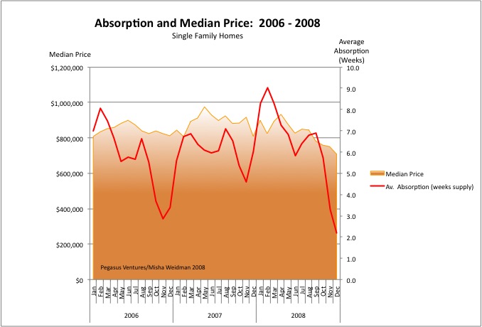
“Absorption” is basically the number of weeks it would take to sell all the homes available on the market based on the number of homes that are selling at that time. (I’ve tweaked the formula to diminish the spikes caused by the huge seasonal dropoff in new listings each December/January.) There are many ways to calculate absorption, but the basic idea is simply to capture how quickly demand is eating supply. Less time to absorb the supply should reflect a “hotter” market where sellers can demand top dollar. A higher absorption rate, on the other hand, means that there’s relatively more listings on the market than demand for them. That would tend to suggest a buyer’s market and softer prices.
In the chart above, we’d expect to see median prices rising when the Absorption Rate line falls and median prices falling as the Absorption Rate line rises. ie. an inverse correlation.
Well, I’ve looked at this chart long and hard and I just don’t see those lines moving that way at all. In fact I’ve looked at similar data as far back as 2002 and the only thing that’s clear is that people forget about buying or selling a home at the end of the year. Look at 2006: the market got tighter but prices stayed pretty flat. In 2007, stuff was being absorbed more slowly (the red line goes up), but prices went up anyway. In 2008, you’d think that with only two weeks of supply available, home prices would be skyrocketing. Obviously that aint happenin’.
I’m not an economist or a statistician, but I did get my dear wife, who eats statistics for breakfast, to check my methodology. I think these results are quite counter-intuitive. Here are the explanations I can think of. Please chime in with your own:
- If you cut off the peaks and troughs, the Absorption Rate mostly stays within a band of around 4 to 7 weeks. That suggests that supply/demand in San Francisco is actually pretty stable. And that in turn suggests that something else must be driving prices. Note, for example, that my chart doesn’t reflect the number of offers that are made on any particular house. There might be 10 offers on a house, but at the end of the day just one house gets sold. Anyone who was playing during the frenzies of 2005 – 2007 doesn’t need to be told how multiple offers affect price, but that sort of demand isn’t reflected in an absoprtion rate.
- Relatively speaking, San Francisco is not a stressed market. Supply/demand is not hugely out of whack. Foreclosures are not piling up (yet). Under these circumstances, prices are “sticky.” They don’t react quickly to changes in demand. If people don’t get the price they want, what do they do? They don’t sell unless they really have to. And SF home-owners tend to be people who don’t have to sell. More on this in another post.
- The price increases of the last few years and their recent tumble may are probably most directly attributable to one thing, pure and simple: easy money. That aint gonna show up on this graph either.
Conclusion: “Absorption” isn’t a good measure of supply/demand.
So is there any other metric that correlates more closely with changes in price? How about the famous “DOM” — Days on Market. This is how long a property takes to go from being listed to being sold. The theory goes that when properties sell quickly the market is “hot.” Why do properties sell quickly? Probably because … there’s more demand than supply. ie. More people making offers, more people getting the loans they need, more people willing to waive inspection contingencies and buy “as is” just to get the deal done. So maybe DOM actually does capture those muliple offers where the Absorption Rate just doesn’t.
So will DOM tell us how “hot” the market is and where prices are headed? Or is DOM dumb. Stay tuned….
The View from Space — Part 3: Above California
As promised, here are a few tidbits from Leslie Appleton-Young’s presentation to the conference sponsored by UC Berkeley’s Fisher School of Real Estate and Urban Economics. Ms. A-Y is the California Association of Realtors’ Chief Economist.
Most of the data covers the state as a whole, and even when it’s broken down by county, Ms. A-Y stressed that there can be huge differences when you get more “granular” with the details. (I made the same point in my 10/27 post discussing how misleading the much-quoted Case Shiller Index can be.)
Continue reading “The View from Space — Part 3: Above California”
The View from Space — Part 2

More pearls from Ken Rosen and the other big brains who addressed UC Berkeley’s Annual Real Estate and Economics Symposium on Monday:
• What to Invest In Now: Rosen and several other commentators say that REITS (publicly traded companies that invest in investment-grade real estate) are cheap relative to their underlying assets. Some are trading at around 50% of the replacement value of the assets they hold and are paying a dividend of around 10%. The best sector of the real estate market right now is the apartment rental market. (Makes sense, since a lot less people can afford to buy homes.) So look for REITS that own big apartment complexes in decent market areas (see below). Do your homework: be sure that they have good management teams and don’t have too much short-term debt because refinancing anything is going to be tough for a while. Hedge your bets. (Easier said than done for us mortals down here on planet earth.) Rosen has parked his cash in short term Treasuries. Obviously he’s worried. We should probably be too.
• Where to Invest: “Global gateway”, “quality of life,” “new tech.” These are the buzzwords that describe cities that should weather the recession relatively well. Seattle, San Francisco, Boston, and Colorado were all mentioned. An exception is New York, which is ground zero (again) for the meltdown in the financial sector. Washington DC is poised for a big expansion as government programs expand to address the current crisis. San Diego is showing signs of improvement. Places like Detroit “have no reason to exist.”
• When will things improve? Be careful over the next year. Watch for lower LIBOR (London Interbank Offered Rates) as an indication of banks’ willingness to lend again. Also look for a reduction in market volatility. Here’s a link to today’s Bloomberg for a really instructive piece on the significance of LIBOR.
• One of the other key speakers at the conference was Leslie Appleton Young, Chief Economist of the the California Association of Realtors (CAR). Sure, you can dismiss CAR as a spin outfit for the industry, but you can’t argue with the data they collect. Another post will cover Ms. A-Y’s analysis of California and the Bay Area.
The view from space — Part 1
Ken Rosen is a smart guy. He’s the co-chair of the Fisher Center of Real Estate and Urban Economics at the Haas School of Business at UC Berkeley and the investment advisor of choice to some of the biggest players in real estate, from banks to insurance companies to REITS.
Once or twice a year I spend the day in a windowless hotel conference room listening to Ken and some of the biggest heads in the real estate biz expounding on the state of real estate. These guys (and they are mostly guys) look at real estate through the lens of global macro-economics and international finance. Want to know where interest rates are going? They study yield curves on T-Bills and monetary policy in the capitals of Europe. This is “the view from space.”

There’s a lot of information that I can’t actually put to use: I don’t really need to know whether the smart money is investing in CMBS’s (commercial mortgage backed securities) because folks like you and I can’t buy them anyway. But I always come away from these conferences with a better sense of the “big picture,” of where real estate is headed in the broader context of the national and global economy.
Right now, the picture ain’t pretty. Here are some highlights from Rosen’s economic wrap-up. More to follow in other posts:
- Recession or Depression? Rosen puts the chances of a deep recession at 70%, a moderate one at 25%, and a full-blown 1929-style depression at 5%. This was echoed by many speakers. The major global governments, including China, are throwing so much money into the system that a depression seems unlikely — but it’s still a possibility.
- The credit crunch: Inter-bank interest rates are coming down, which means that bank confidence is improving. Easing credit should follow.
- San Francisco should weather the storm reasonably well because of its diversified “global gateway” economy and the fact that it hasn’t been overbuilt. Not so, the East Bay.
- The dollar should continue to improve because, believe it or not, the US economy is doing well relative to the rest of the world.
What to invest in? More anon.