Enough about Owning — How about San Francisco Rentals?

I came across a site recently that not only provides a database of available rental units for many US cities, but also has nice, easy-to-read charts on rental trends for specific areas.  Unfortunately, you can’t get very precise in terms of zip code or neighborhood, but it certainly give you a good sense of rental trends.  And trends, as we all know, are what it’s all about!

Welcome to RentBits.com:

I’ve added them to my blog-roll.

Measuring by the Foot: Does it Make a Difference?

Several readers and clients have asked me recently about price per square foot metrics.  Certainly, if you’re trying to figure out how much a home is worth, it helps to get a sense of value by knowing what houses (or condos) are going for in the area on a per square foot basis and multiplying that by the size of the house in square feet.  Elementary my dear Watson.

However, others have been curious about whether there might be a discontinuity between the median price of homes and the median price per square foot, and what that might mean, especially in the context of how much each has fallen from its all-time high.  So I decided to take a look.

The first thing I did was check how often price per square foot was not reported in the MLS (Multiple Listing Sales database) that brokers and other real estate tracking companies use to compile their sales data.  Frequently agents don’t report this because they don’t have any reliable data on how big the house is that was sold or they’re afraid of being sued if they’re wrong.  (I recently learned that when you buy a house in France, the seller must tell you how big it is, and if it’s smaller than stated, the Buyer has the right to adjust the price downwards. I wonder what happens if the house is bigger than expected.)

It turns out that in my database, which goes back to October 2002, price per square foot is reported about 80% of the time on single family home sales.  That’s sufficient to be reliable, so here are the results (click to enlarge).

Median Prices Homes vs Per SF

I would say that overall, and as you’d expect, price per home and per square foot have tracked pretty closely.  It is interesting that during the terrible market freeze of early 2009, the median home price dropped noticeably more steeply than the price per square foot.  There are several possible explanations.  One is that smaller homes were selling better than bigger ones.  Since home price can be reduced to the formula: Area (in square feet)  x Price per SF, if home prices are dropping out of step with a drop in price per square foot, then the Area multiplier must be getting smaller faster.  Furthermore, since smaller homes tend to be cheaper homes, this would give some support to the argument that the higher end of the market has been suffering more than the lower end.  Even if that’s true, it seems to have been a short-lived phenomenon given that both metrics are back in sync as of August.

But the truth is that a lot of factors determine the selling price of a house, not just its size.  Location, views, “curb appeal,” to name just a few.  So I don’t really know how much you can glean just from looking at the areas of disjunction.  For my part, I think this confirms that I’m on solid ground if I use median home prices to look at the state of the market over time.  On the other hand, it also suggests that price per SF could work just as well, and it would be more helpful for people looking to do a value calculation for a particular home.  So I might start using price per sf more frequently.  Please chime in with your thoughts and suggestions.

Waiting for The Other Sheep To Drop

sheep_off_cliff

I really couldn’t find a suitable graphic for a falling shoe….

Thanks to my reader JC for pointing out the San Francisco Chronicle’s September 21 article on the $30 billion or so in “option ARMS”  that are going to reset, starting in 2010.  These are not the subprime ARMS that caused the derivative markets to unravel, the ones that closet reactionaries are still all too eager to blame on the avaricious poor (now is that an oxymoron?) who signed up for them.

No, these are the the loans that the relatively well-heeled and savvy took out to buy their higher end homes.  They appreciated the “options” an option ARM offered.  Like being able to pay just the interest for the stated fixed period of the loan — often 5 years — rather than paying down the principal as well.  Or even paying less than the interest due and rolling the balance into the principal, just like those negative amortization loans that got us into so much trouble in the 1980s.  (We really never learn, do we.)

According to the article, fully 1 in 5 of every home loan made in the San Francisco Metropolitan Statistical Area from 2004 to 2008 was an option ARM.  Since most of these were 5 year option ARMS, the leading edge of these loans is about to hit market.  Here’s why it matters:

After five years, or once the loan balance reaches a certain threshold above the original balance, the mortgages “recast” and borrowers must make full principal and interest payments spread over the loan’s remaining life…. [N]ew payments average 63 percent higher than the minimum payments, but could be more than double in some cases.

Cynthia Kroll, a very smart professor at the Fisher Center for Real Estate and Urban Economics at UC Berkeley, summed it up succinctly:  “This will be another factor keeping home prices from recovering,” she said.

Could be a long, cold winter.

Focus on Noe Valley

It’s been a few months since I took a look at my own stompin’ ground, Noe Valley, and how prices have been doing compared to the city as a whole.  We dispensed with the notion that Noe Valley was somehow “immune” some time ago.  Sadly — at least for home-owners — and happily for buyers, Noe hasn’t bounced back over the last few months, even though city-wide median prices have improved.

Noe Valley Vs. SF All Districts Percent change August 09

Bear in mind that “Noe Valley” means a very small area.  What’s more, there were only 7 sales in August, down from 14 in May and June, and 22 in July.   Sure, there’s been a bit of an improvement over the previous month, but there’s still an 11% difference between how far prices have fallen for the city as a whole (19%) versus Noe Valley (30%).

Arrian Binnings over at Inside SF Real Estate also did a recent update on Noe Valley, looking at median prices in a different way.  (I’ve forgiven him for appropriating my term, “getting granular” to discuss what I now have to refer to as “focusing” on a particular area. Sniff.)  Here’s one of his charts.

insidesfrealestate_01-sep-01-18-55

Not much comfort there either.

People will continue to point out that this doesn’t mean that your beloved home has fallen in value as far as the data suggests  — and that’s probably true, unless you bought a median-priced home at the top of the market.  Still, Noe Valley seems unseasonably cold right now, and it’s not just the fog whipping down off Diamond Heights.

Beautiful Wreck: 587 Jersey, Noe Valley

Walking my dog, yesterday afternoon and I was brought up short by this beautiful wreck around the corner from where we live.

P1010087

Light and shadow from the rafters seemed to make the windows glow like cardboard cut-outs.

P1010088

Here’s the scoop:  Listed in mid-May for $799,000, sold on June 25 for $700,000.  1360 square feet of original detail.  $515 bucks a foot.

I quote from the listing:  “All inside doors, most hardware, some light fixtures appear original and possibly pre-1900.”

Not any more, it seems….

Update on What $2.1 Million Buys in Noe Valley — (now it’s under $2 million)

Back in February I posted about two $2.1 million homes offered for sale in my ‘hood. 731 Douglass had 3,000 square feet of good, livable space and the sorts of finishes and flourishes  you’d expect.  But it had no back yard and was located on the fairly busy corner of 24th Street and Douglass, with a Muni stop and Noe Valley Courts’ sand-pit within spitting distance of the front windows.

731-douglass-now
731 Douglass

Meanwhile 110 Hoffman, offered at just $2,000 less than Douglass, had a little less space and a vertical, less user-friendly lay-out.  But, location it had in spades, on one of Noe’s best and quietest streets.  Plus it had a spacious back yard with a lovely mature tree.

110 Hoffman
110 Hoffman

My good friend and blogging critic, Mike Dashe  — the American part of the Franco-American wine-making duo who own Dashe Cellars — recently took me to task for not doing what any good story-teller does: tell ’em how it ends.  So here’s the final chapter folks.

731 Douglass came in first, selling for a respectable $1.85 million, or 85% of the listing price after just 48 days.  Good show!  Though it’s worth noting that this was a cool $100,000 LESS than it sold for back in March 2005, when it was on the market for just 18 days.  (There’s more proof of the correlation between price and DOM — days on market — see my previous post.)

110 Hoffman had a more torturous ride to the finish-line.  Originally listed at $2.395 million, it suffered two price drops and was ultimately withdrawn from the market 102 days later when it failed to sell at $2.148. Fast-forward five months to July and it’s back on the market at $1.995.  And, after falling in and out of contract, and back in —  it sells for….

$1,995,000.  Full list price and all within 10 days if the MLS Database can be believed.

That’s a cool $100k more than 731 Douglass.

What went on here?  I honestly don’t think this was a case of location trumping space.  Instead, it’s about timing.  731 Douglass went on the market in January and sold in March.  Prices generally fall somewhat during winter months.  But much more importantly, does anyone remember how the financial world was coming to an end right at that time? The stock market was dropping like a stone and no one knew where it would end.  (In fact, the S&P 500 hit bottom on March 9.)

I remember when I had the misfortune of putting the first property I ever owned on the market not long after 9/11/01.  I’m convinced that it sold for around $300k less than it would have at any other time.

Seen in this light, it sure seems like the owners (and the agent) of 110 Hoffman made the right decision to bide their time.  A few months later, the sun breaks out literally and metaphorically and things are moving again. Here’s a case where the tortoise beat the hare.

And speaking of odd-looking creatures, let’s get back to Dashe Cellars and their beautiful wines (you gotta try their single vineyard Zins.)  Mike, would you care to explain what’s with the monkey and the, ahem, “whale?”

Picture 5

San Francisco’s Luxury Home Market

chateau-chenonceau

Every time there’s a housing slump, there’s discussion about whether the top end or the bottom end is fairing better or worse.  Here’s a June 2009 article from The Examiner, declaring that luxury home prices in SF are picking up.  And here’s a report published by First Republic Bank, which puts out a so-called “prestige home index,” for various cities in California, stating that luxury home prices in San Francisco continue to fall.  Here’s the accompanying chart from First Republic.

prestige-sf

And around the beginning of the year, the folks at Paragon Real Estate published an interesting report, How_Much_Have_San_Francisco_Home_Values_Declined_Feb_09,  that broke down price declines based on price range.

But what really constitutes “the luxury market” in a town where you can’t buy a shack for less than half a mill and where the average price for a home was over $1 million in July?

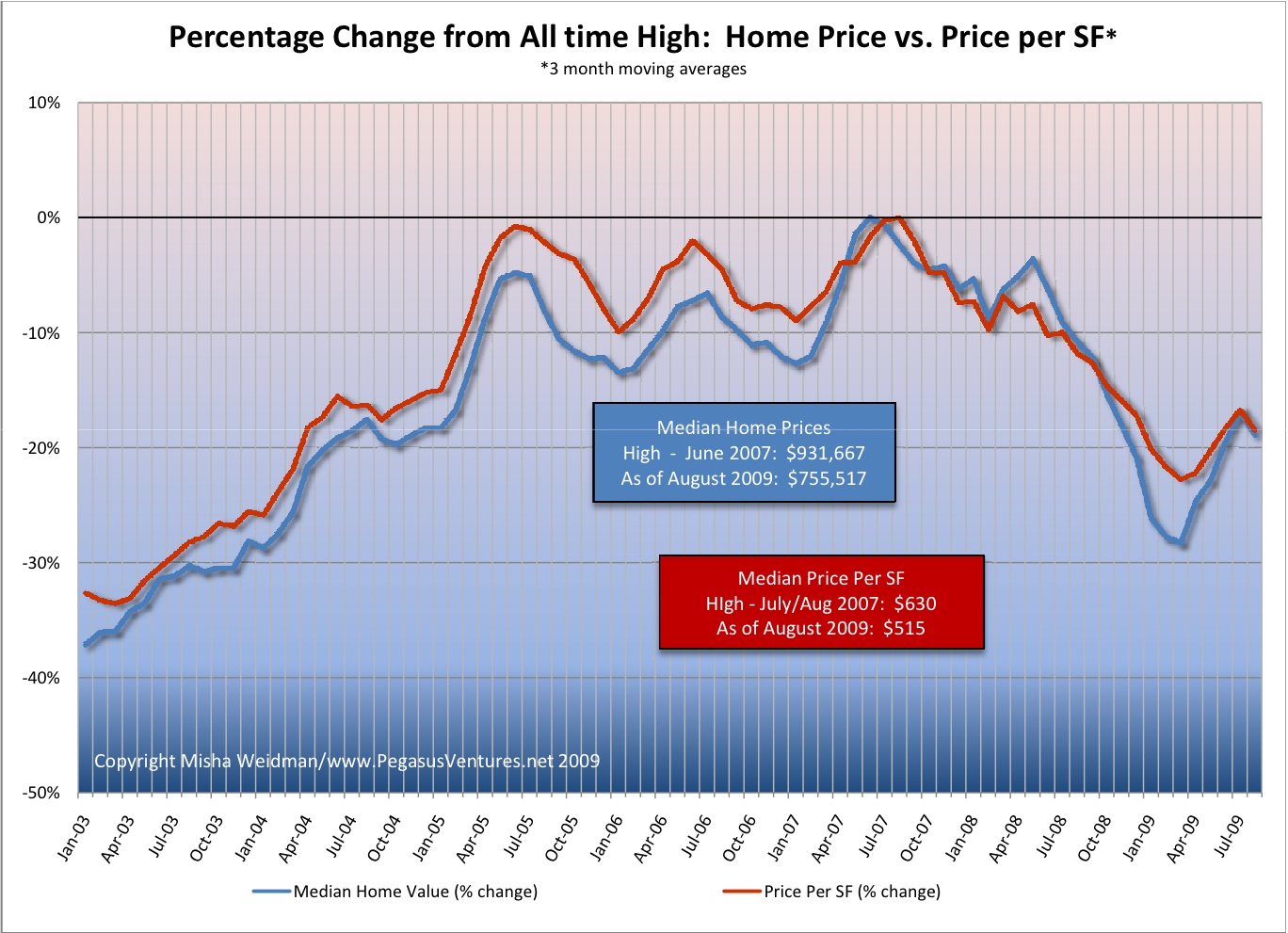
To begin to answer these questions, I first looked at the distribution of sales prices over the last few years. I wanted to create a “snapshot” of the overall market, while including enough data to make the results meaningful.  Here’s a chart that shows how sales were distributed in each price category.

Luxury Market price ranges

Clearly, and not surprisingly, the vast majority of properties sold in the $501,000 to $1.5 million range.  In fact, out of 5,532 home sales over a two-and-a-half year period, only 489, or 8.8% sold for over $2 million.  Over $5 million?  Just 64 sales.

Again, not surprising.  $5 million is a lot of mullah in anybody’s language, though this is a pretty toney town and looking at the mansions up at Pac Heights and Seacliffe (I added the “e”, thank you very much), I expected that there would be more sales in the stratospheric range.

But there aren’t, so whadyagoingtodo?  First, you’re going to be very careful about jumping to any conclusions, because there just isn’t a lot of data.  What’s more, properties at these price levels really do tend to be “unique” – that’s part of their value — and they don’t turn over frequently. This increases the difficulty of reaching meaningful conclusions about price fluctuations in this high-flying, thinly traded market.

Now that we’re done with the disclaimers, let’s see what I came up with.  I picked a minimum sales price of $5 million as fitting the definition of “luxury” rather than just very expensive.

First, I looked at sales volume, another of those metrics frequently discussed in the context of price fluctuations.  The assumption is that when there are a lot of sales prices tend to go up; fewer sales, prices go down.

Luxury Market - Sales v Price

Clearly, sales volume is down for 2009 on an annualized basis, but prices have nevertheless increased from 2008.  Not much of a correlation there.

Next I looked at the average number of days on the market (“DOM”) for these properties to sell.  In a previous post, I’ve argued that this metric really does seem to have a strong inverse correlation with price:  if it’s taking longer for houses to sell, prices tend to go down; if houses are selling quickly, prices tend to go up. The following chart shows DOM plotted on the right-hand axis with the time-scale reversed so that longer time periods are at the bottom and shorter periods are at the top.  I’ve also shown the number of units sold per year.

Luxury Market - Sales v DOM

Here things seem to line up pretty well.  In 2009 so far, there’s been a shortening of DOM and prices have recovered somewhat from 2008.  But again, we’re working with very small numbers of sales, so I’d be careful drawing any definitive conclusions.  In fact, if you just focus on the median sales price, it seems to me that prices have remained pretty much within the same band of value since 2004, except for a spike in 2007 when the overall market was at its hottest.

So, gentle reader, next time you’re shopping for that $5 million house, don’t expect to pick it up at fire sale prices.

As for the rest of us, the truth is that pretty much anyone who can afford a house in San Francisco is already living in luxury.

Heat Map of San Francisco Foreclosures

There’s been a fair bit of discussion on various real estate blogs about the state of foreclosures in San Francisco.  Here’s a picture of SF, courtesy of Hotpads, on our little patch of heaven.

Picture 2

Core SF neighborhoods seem to be doing OK, though worse than “average” — not defined by Hotpads as best as I could tell.  Outer neighborhoods are not doing so well.

The big surprise is the amount of red over in Marin, including toney areas like Sausalito and Mill Valley.  Frankly, I’m skeptical; it just doesn’t add up.  There’s not a lot of information on the free part of their website on their methodology though I believe they’re using data from Realtytrac, which has its own fee-based foreclosure radar website.  If I come up with better information I’ll update this posting.