Cole and Noe Valley Go Head to Head

It seems only fitting that since my last few posts have focused on Cole Valley and Noe Valley, we should take a look at them head to head. Since Cole Valley has relatively few monthly sales, I’ve compared median values on an annual basis. Here are the results (click):

cole-valley-vs-noe-valley-annual-chart

Say what you want about the two valleys, you’re going to pay more if you live in Cole. About $200,000 more, to be precise. Before you conclude that the premium all but vanished in 2009, remember that there have only been five Cole Valley home sales so far this year. Way too few to conclude anything other than that nothing’s selling or that homeowners are so addicted to the breads and pastries at La Boulange that they can’t leave.

Focus on Cole Valley

Noe Valley has its 24th Street shops and cutesy cafés. Cole Valley has, well, its Cole Street shops and cutesy cafés. The two neighborhoods have been engaged in a friendly battle for the hearts of San Francisco homeowners for as long as I can remember.

After doing a guest post on Noe Valley price trends at theFrontSteps a few weeks ago, Alex, tFS’s friendly editor, suggested that I do a side-by-side comparison of sales trends in Cole Valley and Noe Valley.

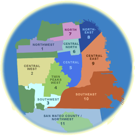
Great idea, I thought! Trouble is, Cole Valley sits within a tiny subdistrict of the MLS  (see the pink area below?) and as a result, there very few transactions from month to month.

district-5-omnimap

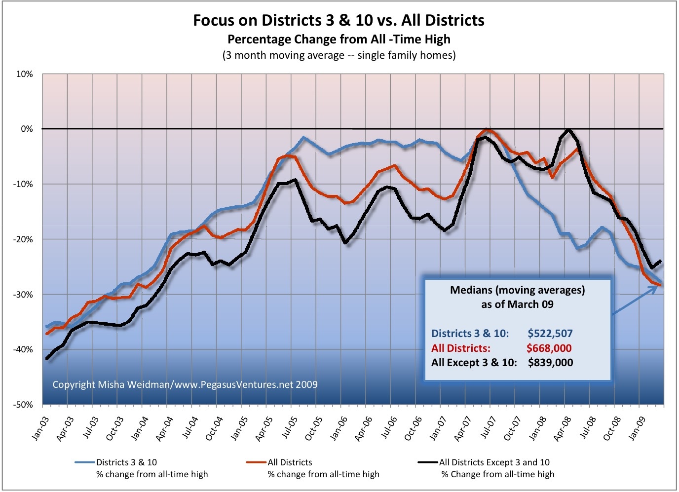
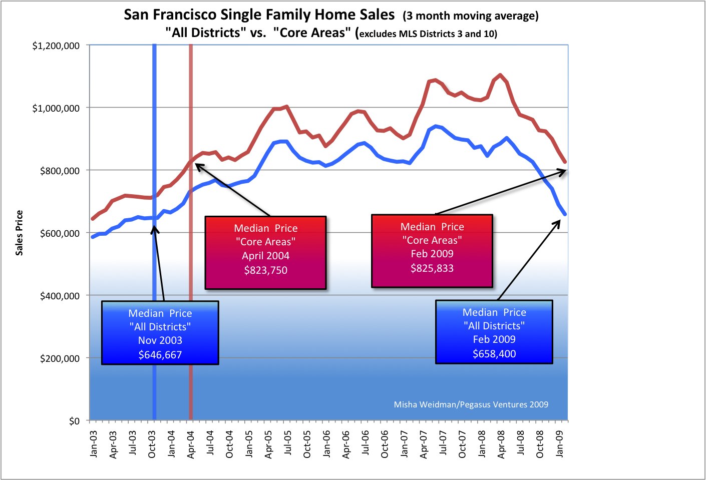
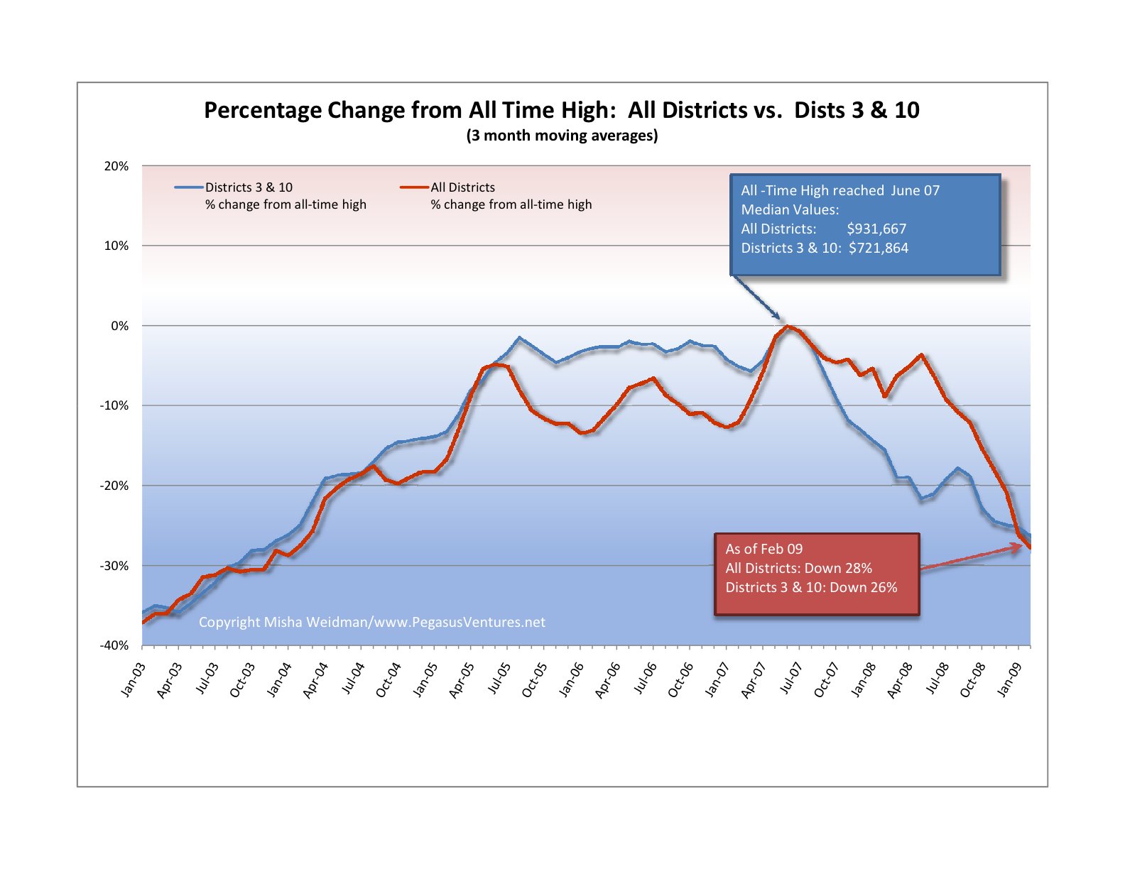
That makes data crunching hard.  Maybe even meaningless. Check out the white bars in this chart (click). They represent the number of single-family home sales per month back to January 2003.  (Number of sales is tracked on the right side of the chart; percentage change from “high” is tracked on the left side.)

cole-valley-monthly-sales-chart

You can see that there are many months where only one or two houses sold. There are some months where there were no sales at all. It’s tough to extrapolate monthly sales trends under those circumstances and dangerous to assume that an “all-time high” is meaningful when it’s based on only one or two data points.

So instead of running percentage changes off of median monthly values, as I had done for Noe Valley, I ran the percentage changes off the “95th Percentile” value of all sales occurring between January 2003 and April 2009. The 95th Percentile value represents a “high”, while excluding the potentially aberrational top 5% of sales.  Aren’t you glad you asked? (Special thanks to my wife, Nina, who looks over my shoulder at a lot of my statistical analyses — she’s the one with the one with the PhD in data-crunching.)

After looking at this chart, I sort of threw up my hands.  With only 179 sales in over 6 years, it’s not sensible in my view to draw conclusions about monthly trends in Cole Valley, let alone to compare them to Noe Valley, where the “core” area alone — Subdistrict 5C — had over 900 sales during the same period.

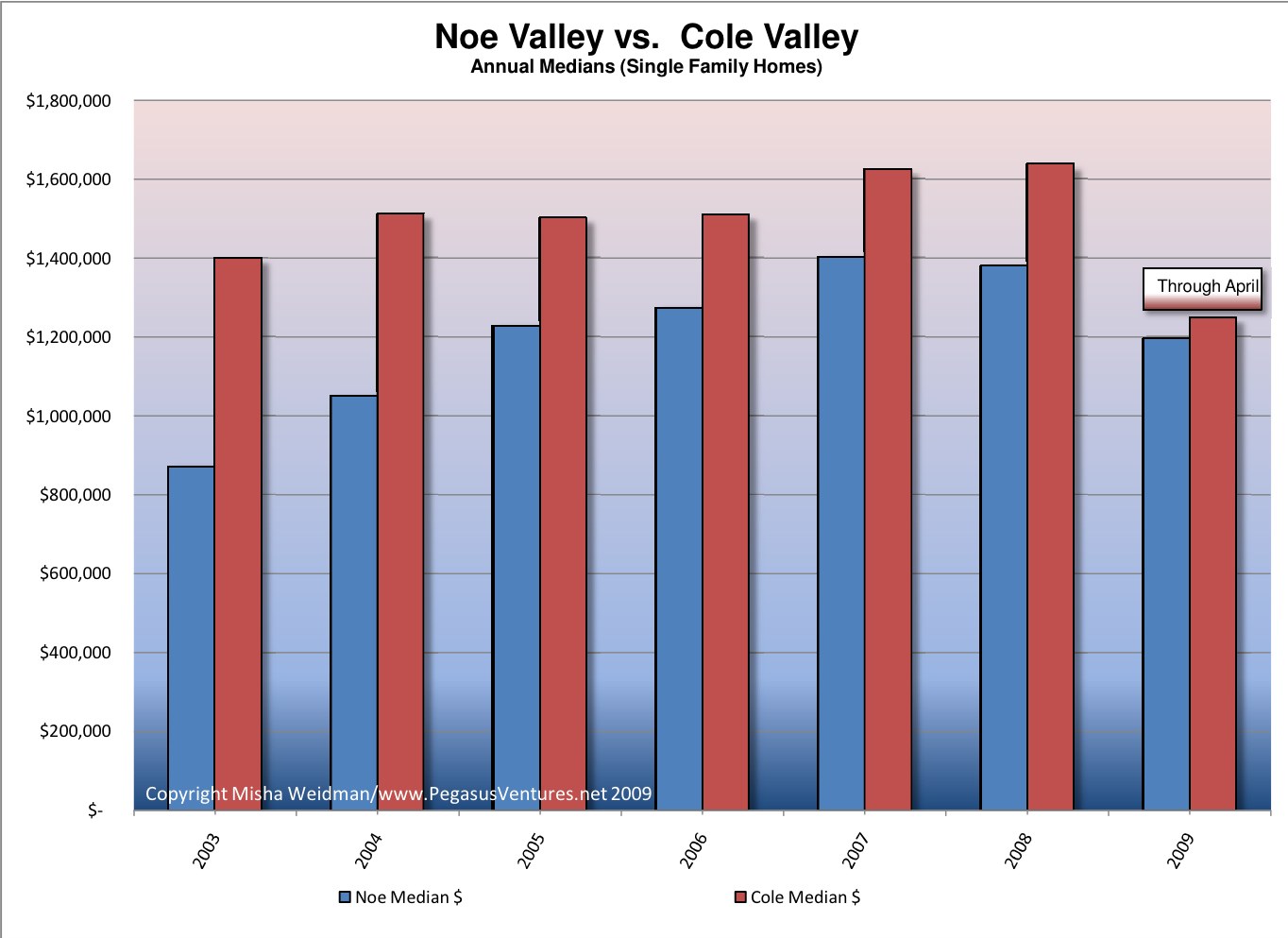
So I re-ran the numbers and calculated medians based on annual sales.  The second chart (click) shows the results.

cole-valley-annual-sales-chart1

I think this is much easier to understand.  Again, with so few sales, one should be careful about drawing any conclusions, and with only 5 sales in 2009 so far, I think it’s too early to conclude that the apparent drop in median prices for 2009 will continue to be accurate.  Rather, I’d say that Cole Valley seems to have been holding up pretty well.

Stay tuned.  I can’t help myself.  Coming up, Cole Valley and Noe Valley go head to head.

Noe Valley Postscript: Median Price Chart

I’ve been having an interesting discussion with a regular reader of theFrontsteps, where I first posted my chart on Noe Valley Percentage Change from All-Time High.  He disputes the fact that Noe Valley has fallen by 30% from its all-time high (reached in March of 2008) because he claims — I think — that March was aberrational.  I’ve looked again at the data for that month and I disagree.  What’s more I think that if you look simply at median prices (moving averages), they show a pretty extended upward trend from the beginning of 2006 through March 2008, with the exception of a dip during the Fall of 2007.  Here’s the chart (click to enlarge).  Enough said.  I’m moving on to another subdistrict.

noe-valley-median-prices

Noe Valley Goes Down

Author: Jack French -- Used under Creative Commons Permission 2.0
Photo: Jack French -- Used under Creative Commons Permission 2.0

Noe Valley’s been my home since 1991 so I’ll admit that I track it with more attention than other neighborhoods.  For quite a few years now it’s also had a reputation for maintaining home values even as the rest of the city stumbles.  The question is whether that’s still true.
Back when I bought my two-unit home at a probate sale with one other bidder in attendance, the “hood” was closer to its working class roots.  Lots of single-story cottages in the 1200 square foot range and lots of duplexes.  It had a thriving lesbian community and was popular with singles who couldn’t afford to rent in the Marina.  It was San Francisco’s stealth neighborhood, just out of yuppy radar range.
By the mid-90’s it was growing increasingly popular with young families who were drawn to its slightly sleepy streets, decent weather, cute parks.  The shops along 24th Street had everything you could possibly need, but without the attitude of Fillmore Street or the grunge of the Haight.  All this, and decent Muni service downtown to boot.
When the dot-commers discovered that it also had great access to 280 and points south, prices took off.  Two-unit buildings started converting to single family homes (that’s what we did).  Little cottages would suddenly grow an extra floor, or a built-out basement, or both. Suddenly, we started seeing 2,500 foot homes and even the occasional trip-K (3,000 sf).
Prices inflated along with the floor-plans.  The million dollar mark was crossed some time around 2000.  The dot-com bust barely caused a blip.  By 2005 we were seeing feeding frenzies over houses approaching $1,000 per foot.   Even after the market started cooling off in 2007, Noe Valley prices seemed to defy gravity.
There’s nothing more local than real estate.  Could it be that Noe Valley was situated in some sort of socio-economic sweet-spot?  Many thought so, including me.  And until recently it was true.  But no longer.  Take a look (click to enlarge):

noe-valley-vs-sf-all-districts-percent-change

The data reflects sales of single family homes for MLS subdistrict 5C only.  Though the subdistrict includes areas as far up as Diamond Heights Boulevard and as far out as Guerrero Street, it captures the neighborhood pretty precisely. Here’s the MLS district map.

picture-1

For the data-geeks among you – and I say that with the deepest affection – I should point out that the volatility of the line for Noe Valley prices is related to the much smaller volume of monthly transactions relative to the All-Districts data, and this is particularly evident around January of each year, when transaction volume really falls off.  Also, the three-month moving average is not weighted to reflect the number of transactions in any given month – it’s a simple average, as is the moving average for All-Districts.
These caveats aside, the trend seems pretty clear.  Noe Valley home prices continued to climb for nearly a year after the city’s as a whole had reached their peak.  But, starting in March 2008, they’ve dropped like a stone.  As of March, they’re actually doing slightly worse, on a percentage basis, than the city as a whole.
I’m not exactly thrilled about the thought that my house is worth about 30% less than it was a year or so ago (and, being both an optimist and a home-owner, I don’t really believe that’s true ☺).  Nor would it surprise me if Noe Valley recovered more quickly than some other neighborhoods.  But, at least for now, its gravity-defying days seem to be over.

Districts 3 and 10, R.I.P.

The Excelsior, Bayview, Hunter’s Point, Oceanview, Ingleside:  these are some of the neighborhoods included in the San Francisco Association of Realtors’  MLS (Multiple Listing Service) Districts 3 and 10.  It’s been suggested here and elsewhere  that perhaps these non-“core” San Francisco neighborhoods have been pulling down San Francisco’s home prices disproportionately.  The theory, plausible enough, is that these more modestly-priced neighborhoods would be feeling the effects of the economic slowdown more than the tonier “core” neighborhoods, whose denizens’ bank accounts might provide a little more padding against hard times.
I recently published a chart that compared the percentage change of Districts 3 and 10 from their all-time highs to that of the city as a whole.  Some readers of theFrontSteps expressed an interest in seeing what the chart would look like if you excluded those districts from the data set for the city as a whole.  (Districts 3 and 10 make up over 20% of the city’s single family home sales for the 5 year period covered by the chart.)  I aim to please, so I ran the numbers again and here are the results.
focus-on-dists-3-and-10-vs-all-dists

The chart confirms, once and for all, that however you want to cut it – with or without Districts 3 and 10 – home values for the the “core” San Francisco Districts have fallen almost as far as those for the outer Districts.  They just took a little longer to start falling, that’s all.

Bottom line:  We don’t have Districts 3 and 10 to kick around any more.  I’m going to start rolling out comparisons of specific districts and neighborhoods to the city as a whole (ie.  “All Districts”), starting with some that have supposedly weathered the market reasonably well.  I think you’ll find the results surprising.  I know I did.

Are San Francisco Home Values Rotten to the “Core”?

Not long ago I did a guest post at The Front Steps in which I showed that city-wide home prices had fallen back to November 2003 levels. Here’s the chart.

san-francisco-price-trends-2000-presentsmall

That prompted some discussion about whether the results would be different if you excluded home sales in some of San Francisco’s outlying areas, such as the Bayview and the Westlake districts. These and other neighborhoods are included in MLS (Multiple Listing Service) Districts 3 and 10. Here’s the official MLS district map.

mls-district-map

The thinking, mine included, was that San Francisco’s generally more expensive “core” areas would have held up better than the more modestly priced outer areas, where the economic downturn could be expected to have had a greater and more immediate impact.  Did they? I recently posted this chart at The Front Steps as a partial answer.

core-area-medians-vs-all-districts

What’s really interesting about this chart is how closely the “Core Areas” and “All Districts” price lines track each other. This isn’t altogether surprising since the “Core Areas” data overlaps with over 75% of the “All Districts” data.   The fact that “Core Area” prices are higher also isn’t surprising.

But have “Core Areas” been holding up better than the city as a whole?  Based on this chart, I thought the answer was “yes”, since it shows an increasing price divergence in favor of “Core Areas” starting around July 2007.

Still, the divergence was relatively subtle, so I decided to take another stab at answering the question. This time, I focused directly on Districts 3 and 10 and compared the results to the city as a whole. I also looked specifically at how far prices had fallen from their respective all-time highs. Here’s the resulting chart — note, this is single family homes only, not condos (click to enlarge) .
district-3-and-10-v-all-dist

In both cases, all-time highs were reached in June 2007. What this chart clearly confirms is that prices in Districts 3 and 10 really did fall further and faster than prices for the city as a whole. Initially, that is. Starting around July 2008, prices dropped off a cliff city-wide. As of February 2009, Districts 3 and 10 are actually doing slightly better than the city as a whole.

I will spare you the details of my travails with Excel, pivot tables, and generating median values for large data sets. Not fun – and the principal reason why I haven’t posted for a few weeks. However, I do think that this chart allows us to conclude that “Core Areas” haven’t performed substantially better or differently than the city as a whole. Much ado about nothing you say? Perhaps, but at least we’ve now established a baseline — sort of like the S&P 500 — against which to compare specific neighborhoods and areas.  Stay tuned.

“San Francisco Property Sales and Prices Rebound in February”

…or so proclaims my venerable data-crunching guy at the REreport.  All the data is available and updated monthly under my  “Market Trends” tab, organized by MLS District, or city-wide, annual or monthly, single family or condo — it’s all available here.

This chart, from the lead-in page, shows unit sales and median prices for both homes and condos are up from Jan 09, but down year over year.

picture-7

But not so fast.  Much as I’d love to believe we’ve hit bottom, it’s hard to know whether this is anything more than the usual seasonal uptick in sales now that we’re coming out of the winter doldrums.  Here’s the chart for single family homes sales.  See those incredibly regular troughs right around Jan/Feb each year?  I’d say it’s way to early to declare a bottom.

picture-8

SF Home Prices at 2003 Levels

Sorry, folks, but it’s that bad — or good, depending on your perspective.

I tracked average and median prices going back to 2000 for the ten combined MLS districts that comprise the San Francisco Multiple Listing Service — the big database that realtors use to list properties and record sales information .  (The MLS District Map is here, on my Market Trends page.)  Here are the results (click to make the chart bigger):

san-francisco-price-trends-2000-presentsmall

Pretty scary stuff, especially when you look at the suislide (a new word is born?) that started in June of last year and shows no signs of slowing down.

Before you head for the windows, or call your realtor (me!) to start looking for a house to buy, consider this:  as I’ve said before, there’s nothing so local as real estate.  It really does matter what neighborhood you’re talking about. This chart, while it does illustrate something meaningful about the overall SF market, doesn’t tell you anything about values in any particular neighborhood.  It lumps together data from neighborhoods as diverse as Hunter’s Point and Visitacion Valley in District 10, which has been slammed  for well over a year now, with neighborhoods like Noe Valley  in District 5 and St. Francis Wood  in District 4, both of which seem to be holding up pretty well.  Go to my Market Trends page to see the charts for individual districts.  I’ll be creating charts for individual neighborhoods within districts for future blogs.

And if it’s any consolation, SF real estate is holding up a heck of a lot better than the stock market, don’t-cha-know.  Today the S&P 500 closed at 682.55.  The last time it closed under 683 was on May 17, 1996.