Homes vs. Condominiums: How much extra do you pay?

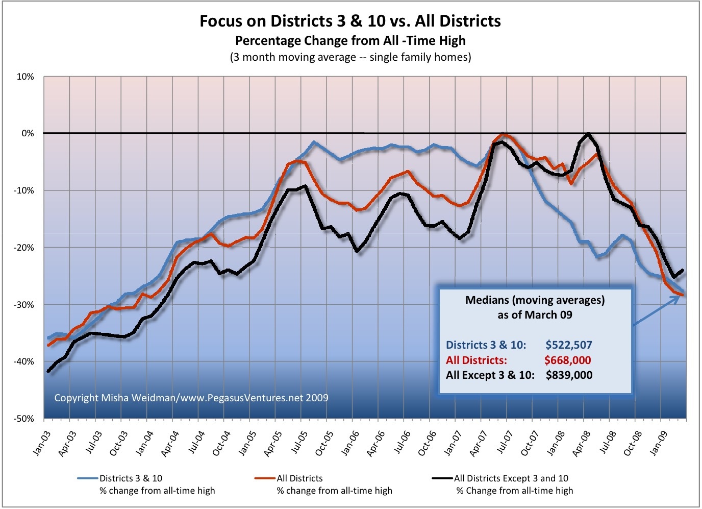
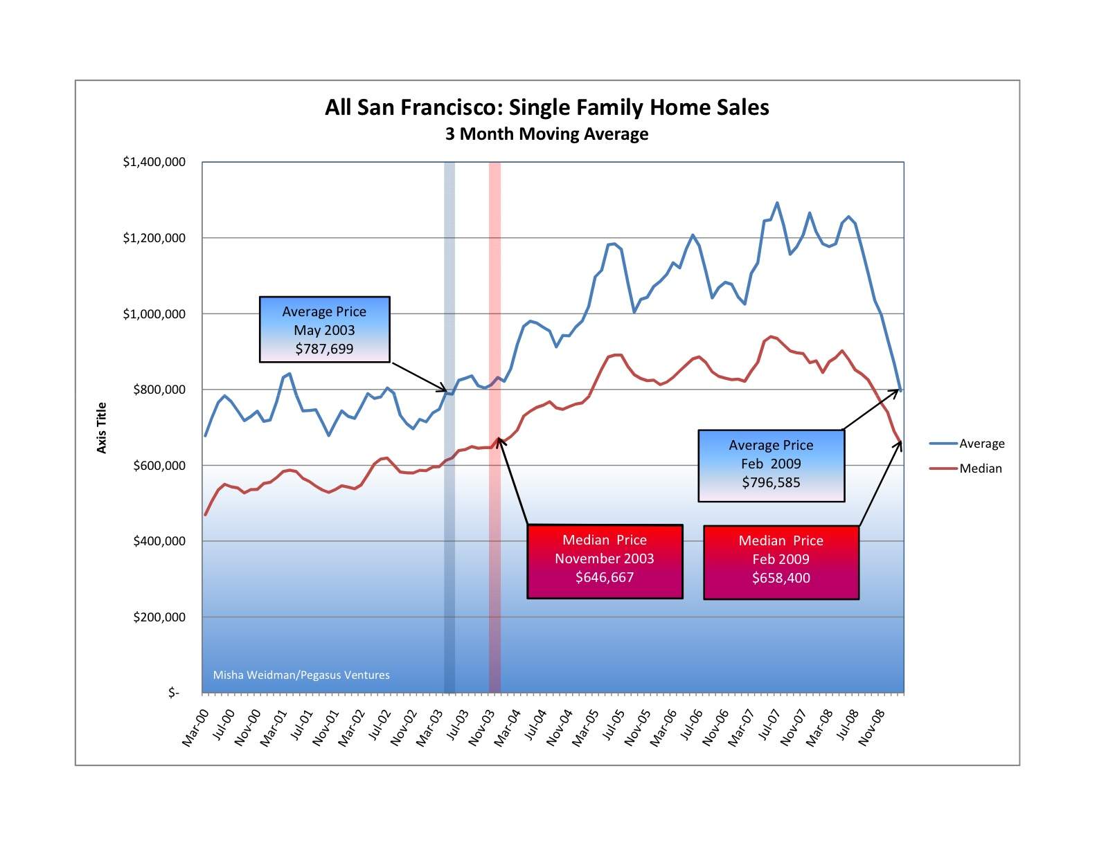
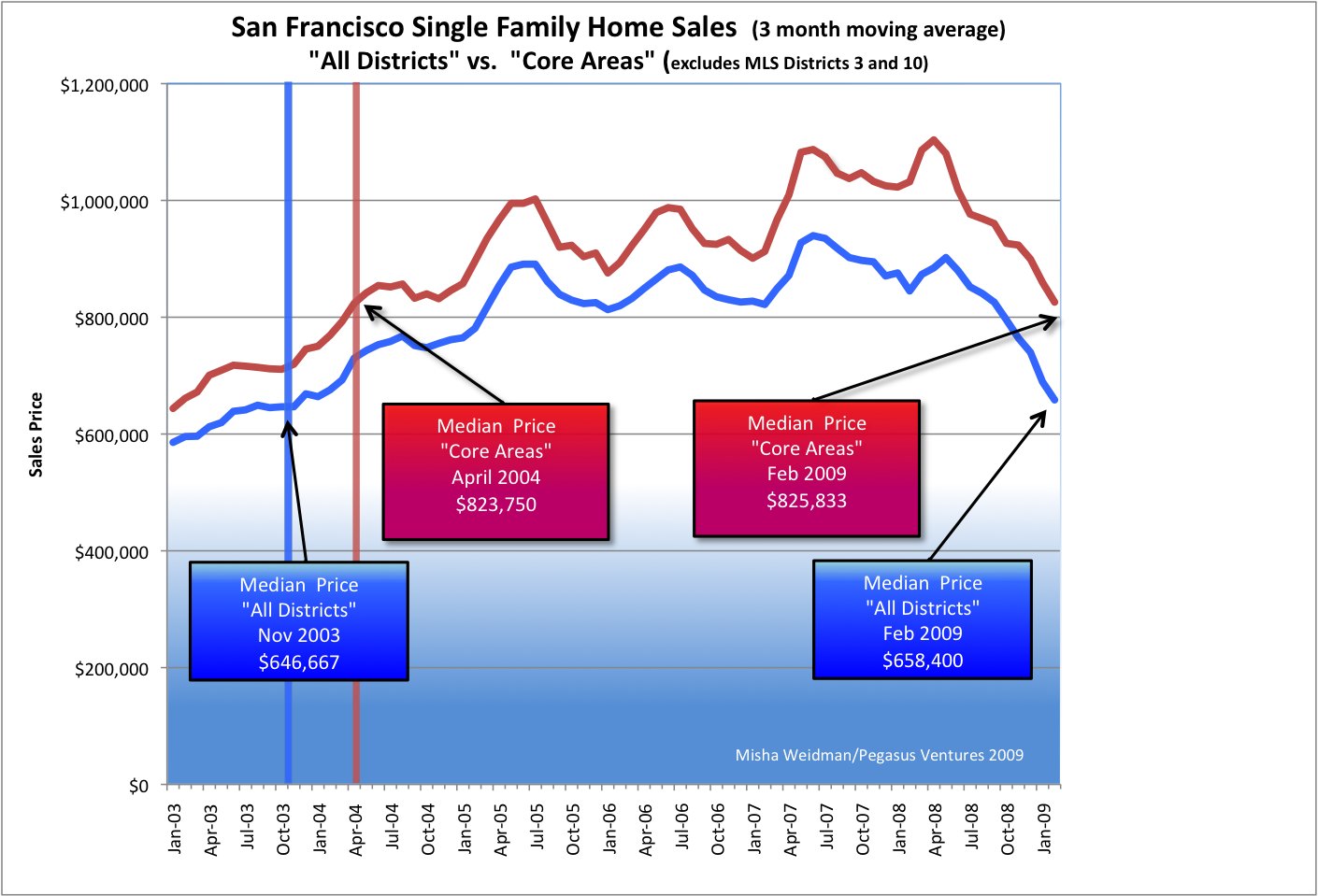
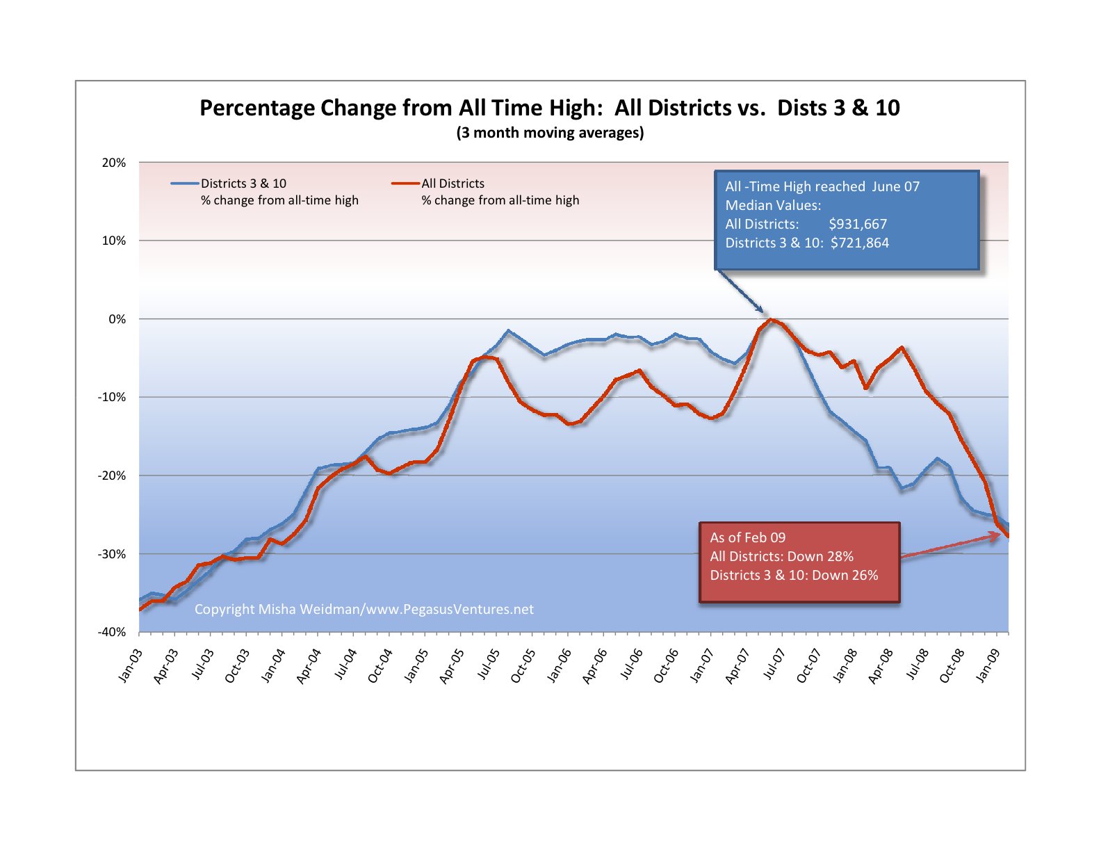
Recently, I blogged about the fact that condominiums seemed to be holding up better than single family homes in terms of their decline from their all-time highs.

At the same time, I noted that there was only about $100,000 difference in median value between condos and homes.  That seemed like a small delta and I was interested to see whether it was, historically speaking.  Turns out that it is.

Since, until recently (ahem!), home prices along with everything else have tended to go up, I decided not to look simply at the difference in price between condos and homes.  Instead, I converted the price difference to a percentage of the median value of condos sales for the given period.  This represents the “premium” for owning a home rather than a condo.  Here’s the result.

Average Premium for Home vs Condo

Sure enough, you’d normally expect to pay around 20% more for a home than for a condo.  But starting in 2008, the home “premium” started dropping significantly.  I believe that drop was a direct reflection of the housing market decline that began with homes and only subsequently spread to condos.  As I postulated in my blog, condo values possibly held up for longer as people got squeezed out of the single family home market by tightening credit standards.

But what about 2009?  The chart above shows the premium based on all sales for the year to date.  The picture looks a little different if you look at values on a monthly basis.

Average Premium for Home vs Condo 2009

Again this is consistent with my previous blog.  It suggests while that condo values may have held up longer, they too have fallen so that the premium paid for a home is now heading back to its historic norm.  Of course, the other possibility is that home prices are beginning to recover.  It may well be that both explanations are true.

Case Shiller Chimes in With Good News: US Down only 17%!

Picture 1

Case-Shiller published its closely watched indices yesterday.  Hooray! The broadest CS index shows that the rate of decline in the nation’s largest housing markets has reversed in recent months.  Now we’re only going down 16% year over year instead of 20%.

They also point out that we are now back to 2003 values, which also holds true of San Francisco.  Here’s my chart from an April blog:

Core Area Medians vs All Districts

Before you go out and celebrate, Case-Shiller has “San Francisco” down a whopping 26.1% year over year.  Why the quotes?  Because it’s really the “San Francisco-Oakland-Fremont, CA Metropolitan Statistical Area” and it includes ALL of Alameda, Contra Costa, Marin, San Mateo, and … San Francisco County. That’s 5 counties folks, a factoid often omitted even by such august publications as the New York Times (see today’s front page article).

Now here’s the “good” news.  My data says that the San Francisco we live in was down “just” 5.7% in June 09 year over year for homes.  Take a look under the Market Trends tab for annual and monthly data for the City and specific MLS Districts.  (By contrast, condos are down 15% year over year.  That also happens to be how much they’re down from their all-time highs, which occurred right about a year ago.  See my previous post.

Districts 3 and 10, R.I.P.

The Excelsior, Bayview, Hunter’s Point, Oceanview, Ingleside:  these are some of the neighborhoods included in the San Francisco Association of Realtors’  MLS (Multiple Listing Service) Districts 3 and 10.  It’s been suggested here and elsewhere  that perhaps these non-“core” San Francisco neighborhoods have been pulling down San Francisco’s home prices disproportionately.  The theory, plausible enough, is that these more modestly-priced neighborhoods would be feeling the effects of the economic slowdown more than the tonier “core” neighborhoods, whose denizens’ bank accounts might provide a little more padding against hard times.
I recently published a chart that compared the percentage change of Districts 3 and 10 from their all-time highs to that of the city as a whole.  Some readers of theFrontSteps expressed an interest in seeing what the chart would look like if you excluded those districts from the data set for the city as a whole.  (Districts 3 and 10 make up over 20% of the city’s single family home sales for the 5 year period covered by the chart.)  I aim to please, so I ran the numbers again and here are the results.
focus-on-dists-3-and-10-vs-all-dists

The chart confirms, once and for all, that however you want to cut it – with or without Districts 3 and 10 – home values for the the “core” San Francisco Districts have fallen almost as far as those for the outer Districts.  They just took a little longer to start falling, that’s all.

Bottom line:  We don’t have Districts 3 and 10 to kick around any more.  I’m going to start rolling out comparisons of specific districts and neighborhoods to the city as a whole (ie.  “All Districts”), starting with some that have supposedly weathered the market reasonably well.  I think you’ll find the results surprising.  I know I did.

Are San Francisco Home Values Rotten to the “Core”?

Not long ago I did a guest post at The Front Steps in which I showed that city-wide home prices had fallen back to November 2003 levels. Here’s the chart.

san-francisco-price-trends-2000-presentsmall

That prompted some discussion about whether the results would be different if you excluded home sales in some of San Francisco’s outlying areas, such as the Bayview and the Westlake districts. These and other neighborhoods are included in MLS (Multiple Listing Service) Districts 3 and 10. Here’s the official MLS district map.

mls-district-map

The thinking, mine included, was that San Francisco’s generally more expensive “core” areas would have held up better than the more modestly priced outer areas, where the economic downturn could be expected to have had a greater and more immediate impact.  Did they? I recently posted this chart at The Front Steps as a partial answer.

core-area-medians-vs-all-districts

What’s really interesting about this chart is how closely the “Core Areas” and “All Districts” price lines track each other. This isn’t altogether surprising since the “Core Areas” data overlaps with over 75% of the “All Districts” data.   The fact that “Core Area” prices are higher also isn’t surprising.

But have “Core Areas” been holding up better than the city as a whole?  Based on this chart, I thought the answer was “yes”, since it shows an increasing price divergence in favor of “Core Areas” starting around July 2007.

Still, the divergence was relatively subtle, so I decided to take another stab at answering the question. This time, I focused directly on Districts 3 and 10 and compared the results to the city as a whole. I also looked specifically at how far prices had fallen from their respective all-time highs. Here’s the resulting chart — note, this is single family homes only, not condos (click to enlarge) .
district-3-and-10-v-all-dist

In both cases, all-time highs were reached in June 2007. What this chart clearly confirms is that prices in Districts 3 and 10 really did fall further and faster than prices for the city as a whole. Initially, that is. Starting around July 2008, prices dropped off a cliff city-wide. As of February 2009, Districts 3 and 10 are actually doing slightly better than the city as a whole.

I will spare you the details of my travails with Excel, pivot tables, and generating median values for large data sets. Not fun – and the principal reason why I haven’t posted for a few weeks. However, I do think that this chart allows us to conclude that “Core Areas” haven’t performed substantially better or differently than the city as a whole. Much ado about nothing you say? Perhaps, but at least we’ve now established a baseline — sort of like the S&P 500 — against which to compare specific neighborhoods and areas.  Stay tuned.