Continued Improvement in the Housing Market or Borrowing from the Future?

CB104955

The National Association of Realtors (NAR) reported yesterday that existing home sales in October rose to their highest level in more than two years.  Nationally, sales were up 10.1% over September and up 23.5% year over year.

Most of the increase in sales, however, was not in the western region, where sales were  only up 1.6% from the previous month.  (Oh, the devil is always in the details.)  And more “good news”:  The western region median price of $220,200 — clearly this is not San Francisco — was down 14.7% year over year.

Not surprisingly, the article stresses the positive.  Inventories are shrinking, especially at the lower price levels where foreclosures and REOs are slowly being digested by the system.  Prices have fallen by the smallest amount in over a year (don’t you love that!).

You can argue that any press release by NAR is going to be self-serving, but its Chief Economist, Lawrence Yun, doesn’t mince words when he says that a lot of the sales surge was fueled  by the anticipated expiration of the First Time Homebuyer Tax Credit.  The $8,000 tax credit was originally scheduled to expire in November, but has now been extended  through April 30, 2010. Yun goes on to caution that “with such a sale spike, a measurable decline should be anticipated in December and early next year before another surge in spring and early summer.”

We can only hope that he’s right about that surge….

Measuring by the Foot: Does it Make a Difference?

Several readers and clients have asked me recently about price per square foot metrics.  Certainly, if you’re trying to figure out how much a home is worth, it helps to get a sense of value by knowing what houses (or condos) are going for in the area on a per square foot basis and multiplying that by the size of the house in square feet.  Elementary my dear Watson.

However, others have been curious about whether there might be a discontinuity between the median price of homes and the median price per square foot, and what that might mean, especially in the context of how much each has fallen from its all-time high.  So I decided to take a look.

The first thing I did was check how often price per square foot was not reported in the MLS (Multiple Listing Sales database) that brokers and other real estate tracking companies use to compile their sales data.  Frequently agents don’t report this because they don’t have any reliable data on how big the house is that was sold or they’re afraid of being sued if they’re wrong.  (I recently learned that when you buy a house in France, the seller must tell you how big it is, and if it’s smaller than stated, the Buyer has the right to adjust the price downwards. I wonder what happens if the house is bigger than expected.)

It turns out that in my database, which goes back to October 2002, price per square foot is reported about 80% of the time on single family home sales.  That’s sufficient to be reliable, so here are the results (click to enlarge).

Median Prices Homes vs Per SF

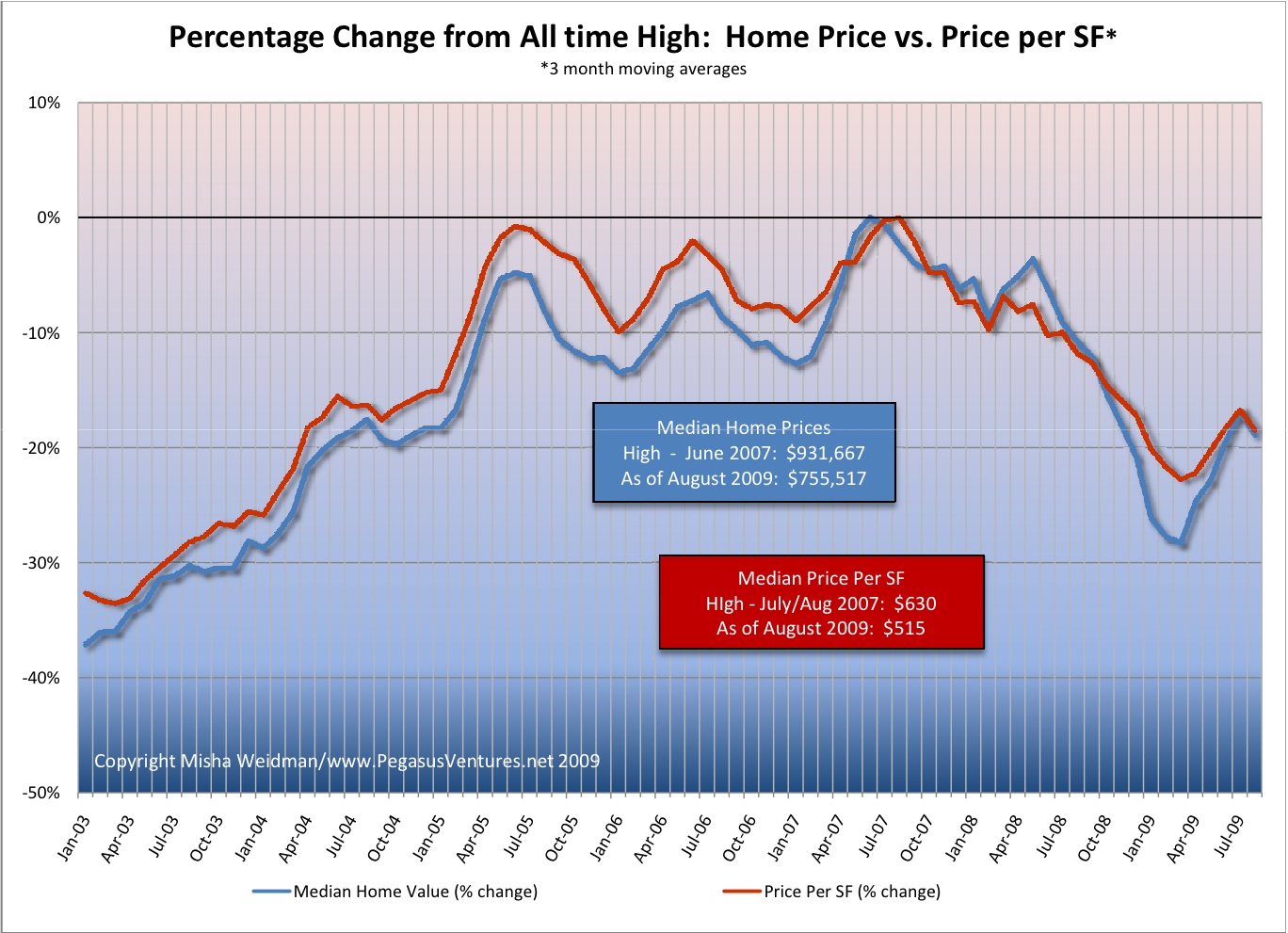
I would say that overall, and as you’d expect, price per home and per square foot have tracked pretty closely.  It is interesting that during the terrible market freeze of early 2009, the median home price dropped noticeably more steeply than the price per square foot.  There are several possible explanations.  One is that smaller homes were selling better than bigger ones.  Since home price can be reduced to the formula: Area (in square feet)  x Price per SF, if home prices are dropping out of step with a drop in price per square foot, then the Area multiplier must be getting smaller faster.  Furthermore, since smaller homes tend to be cheaper homes, this would give some support to the argument that the higher end of the market has been suffering more than the lower end.  Even if that’s true, it seems to have been a short-lived phenomenon given that both metrics are back in sync as of August.

But the truth is that a lot of factors determine the selling price of a house, not just its size.  Location, views, “curb appeal,” to name just a few.  So I don’t really know how much you can glean just from looking at the areas of disjunction.  For my part, I think this confirms that I’m on solid ground if I use median home prices to look at the state of the market over time.  On the other hand, it also suggests that price per SF could work just as well, and it would be more helpful for people looking to do a value calculation for a particular home.  So I might start using price per sf more frequently.  Please chime in with your thoughts and suggestions.

Noe Valley Postscript: Median Price Chart

I’ve been having an interesting discussion with a regular reader of theFrontsteps, where I first posted my chart on Noe Valley Percentage Change from All-Time High.  He disputes the fact that Noe Valley has fallen by 30% from its all-time high (reached in March of 2008) because he claims — I think — that March was aberrational.  I’ve looked again at the data for that month and I disagree.  What’s more I think that if you look simply at median prices (moving averages), they show a pretty extended upward trend from the beginning of 2006 through March 2008, with the exception of a dip during the Fall of 2007.  Here’s the chart (click to enlarge).  Enough said.  I’m moving on to another subdistrict.

noe-valley-median-prices

Revised Absorption Chart, but the results are the same, only worse

Thanks, Jean-Claude for making me take a second look at my methodology on my Absorption Chart.  I had anticipated your point about the lag between listing dates and sales but had unfortunately gotten the formula backwards in my chart — basically dividing inventory by lagging sales, rather than forward sales:  moral of the story:  don’t do this stuff at 1 in the morning.)  So I redid the chart with the correct formula inserted.  (Excel groupies its =4*(AVERAGE(listings month 1, 2, 3)/AVERAGE(sales months 2, 3, and 4)). The data points at the end of the chart are averaged over shorter periods due to the lack of forward data.

One can quibble about whether a 30 day lag on listings to sales is sufficient, but the average days on market for 2006, 2007, and 2008 were 29, 41, and 51 respectively.

Here’s the revised chart.  The median price line and the Absorption Rates line up beautifully, don’t they?  Until you remember that there’s supposed to be an inverse correlation between them.  True, there appears to be an inverse correlation over the last few months of 2008, but that could simply be due to the lack of forward data.  It certainly doesn’t negate the lack of correlation over the previous nearly 3-year period.

absorption-chart-revised

Stay tuned for a chart showing median price plotted against Days on Market