SF Home Prices at 2003 Levels

Sorry, folks, but it’s that bad — or good, depending on your perspective.

I tracked average and median prices going back to 2000 for the ten combined MLS districts that comprise the San Francisco Multiple Listing Service — the big database that realtors use to list properties and record sales information .  (The MLS District Map is here, on my Market Trends page.)  Here are the results (click to make the chart bigger):

san-francisco-price-trends-2000-presentsmall

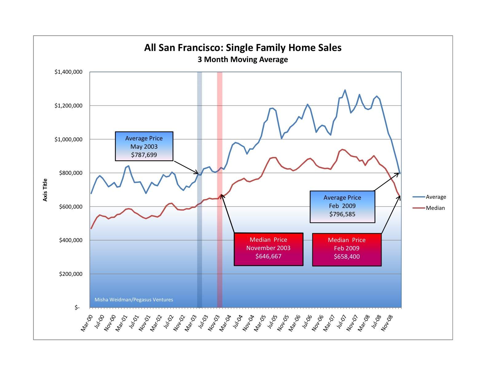
Pretty scary stuff, especially when you look at the suislide (a new word is born?) that started in June of last year and shows no signs of slowing down.

Before you head for the windows, or call your realtor (me!) to start looking for a house to buy, consider this:  as I’ve said before, there’s nothing so local as real estate.  It really does matter what neighborhood you’re talking about. This chart, while it does illustrate something meaningful about the overall SF market, doesn’t tell you anything about values in any particular neighborhood.  It lumps together data from neighborhoods as diverse as Hunter’s Point and Visitacion Valley in District 10, which has been slammed  for well over a year now, with neighborhoods like Noe Valley  in District 5 and St. Francis Wood  in District 4, both of which seem to be holding up pretty well.  Go to my Market Trends page to see the charts for individual districts.  I’ll be creating charts for individual neighborhoods within districts for future blogs.

And if it’s any consolation, SF real estate is holding up a heck of a lot better than the stock market, don’t-cha-know.  Today the S&P 500 closed at 682.55.  The last time it closed under 683 was on May 17, 1996.

Dataquick vs MLS: why the discrepancies?

In my October 27 blog discussing the Case-Shiller Index, I referred to Bay Area County stats from Dataquick that showed San Francisco’s median prices to be down 12.7% from a year previous (YOY) vs.  the 11.36% that I’d quoted in my October 23 blog.

The reason for the discrepancy?  Dataquick compiles its figures from the San Francisco County Recorder’s Office; my numbers come from the MLS.  Transactions like foreclosures or transfers between family members or between legal entities generally don’t involve agents or brokers so they don’t show up in the MLS.  They also tend to be at lower values because they are often at below market rates, so Dataquick’s numbers will always be somewhat lower than the numbers pulled from the MLS.  Thanks to Rick Campbell at the REReport for his quick response.

Update to Halloween Horror: Did it just get scarier….??

The day after I posted my take on the Case-Shiller Index, they came out with July’s report (they’re always trailing three month averages) showing a continuing decline in the San Francisco MSA.  Wait for it:  down 27.3% from July 2007.  Are we worried?  Not that much.  Why not?  Read my October 27 blog:  “San Francisco” means most of the Bay Area when it comes to the Case-Shiller Index.

You want scary?  Median prices are down 45% year over year in Contra Costa County.

Just How Bad Is It? (Answer: depends)

I’ve been digging a bit deeper into the raw data that’s used to generate the beautiful graphs you can find here and which I used to generate the MLS District graphs in my blog of a few days ago.

So I thought I’d check how September 08’s median home prices (condos will come later) compared to their all-time highs and to the median prices of a year ago, both by MLS District and for all of San Francisco.  I didn’t include District 8 (North-east) because it doesn’t have enough data to be useful, and I also didn’t include the southern-most districts of SF (3 and 10) because to be honest I don’t follow them closely. Here’s the result:

So clearly prices are down from their all-time highs across the board.  (Most districts were still hitting highs or near-highs well into 2007, by the way, and District 5, which includes Noe Valley had its top 3 highs in 2008!) )  But where the drops are really big (Districts 6 and 7 for example), that could simply be due to the fact that the all-time high was aberrational.

The percentage change from a year ago are interesting because you can see how some districts seem to be doing quite well.  Half up, half down.  Once again, though, with sales volumes down across the board, there are less data points and that can skew the numbers.  But it certainly seems like the tonier districts (1, 5 and 7) are holding up better than the others.  (Take a look at my graph from a coupla days ago to see how the districts compare over time.)

Bottom line(s)?

San Francisco single family homes are down over 11% from a year ago.

The more expensive neighborhoods seem to be doing ok.

What on earth does this chart mean? (Click to make it bigger)


I was wondering how prices in various MLS Districts in San Francisco were doing relative to each other and to San Francisco as a whole so I graphed the monthly median prices of single family homes in all but the southernmost districts (3 and 10) for January 2005 through September 2008 and came up with this beauty.  (Please click on it to enlarge.)

So, a couple of things jump out.  Northeast District 8 (the pale dotted line), which includes tony areas like Russian Hill and Telegraph Hill as well as the Financial District, is all over the place in terms of price swings.  There are very few transactions from month to month (sometimes none at all) because there are so few single family homes in those areas.  Bottom line:  forgeddaboutit.

Next, the black dotted line towards the bottom of the graph is the “All San Francisco” median.  That partly explains why it’s so “flat”, because it averages out the discrepancies between the high-priced and low priced areas, those that are doing well, those that are doing less well, etc.  One interesting thing to notice is that there are several MLS districts that closely track the All San Francisco median.  Those are Central West (District 2) and Central East (District 9).  Go here for a detailed map of the districts.

As you move further up the graph you can see the price spread or premium for the different districts.  Twin Peaks West (4) is just above the median.  Central (5), which includes my home area of Noe Valley, and Northwest (1) are more or less within the same range with Central showing a more consistent trend line.  Central North (6) is clearly more volatile, with prices bouncing above and below Districts 1 and 5.  I need to look more closely at the number of sales for District 6 but my hunch is that the volatility reflects two things: first, the single family homes in this District range from the pricey Painted Ladies of Alamo Square to much more modest homes near the Panhandle.   Finally, there’s North (7), which includes Pacific Heights, Presidio Heights and the Marina.  No surprise why that district’s prices soar above the others.

I’m going to slice and dice these statistics in other ways in future blogs.  Top on the list is a hard look at whether the market is as “bad” as the newspapers would lead you to believe.  But I want to close with a cautionary word.  Many of the MLS Districts are not necessarily homogenous.  I’ve already mentioned Central North (6), but you could make the same point about several of the other Districts too.   It’s just more proof that real estate is local, local, local.  What’s happening in Miami or Sacramento isn’t what’s happening in San Francisco — and, especially in a concentrated urban environment like San Francisco, you have to look at the numbers and think about them very very carefully.